
Themes
The user is our benchmark. We personalize services in order to offer every customer the best possible user experience tailored to their needs. We use themes so that we can also shape interfaces in line with user behavior. Themes are a combination of design elements, such as colours or typography, that determine the visuality of interfaces. Audi uses a dark and a light theme.
Brand communication
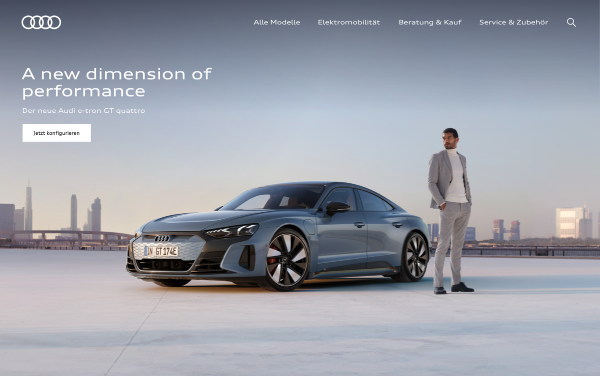
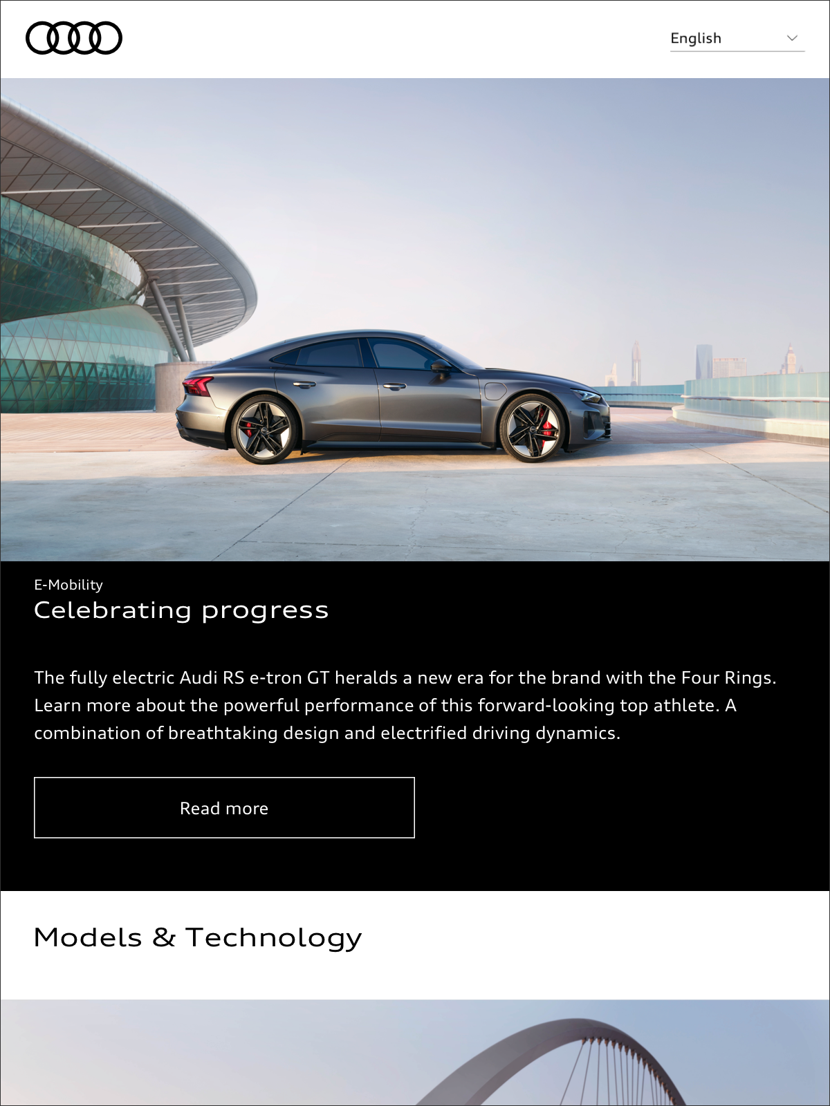
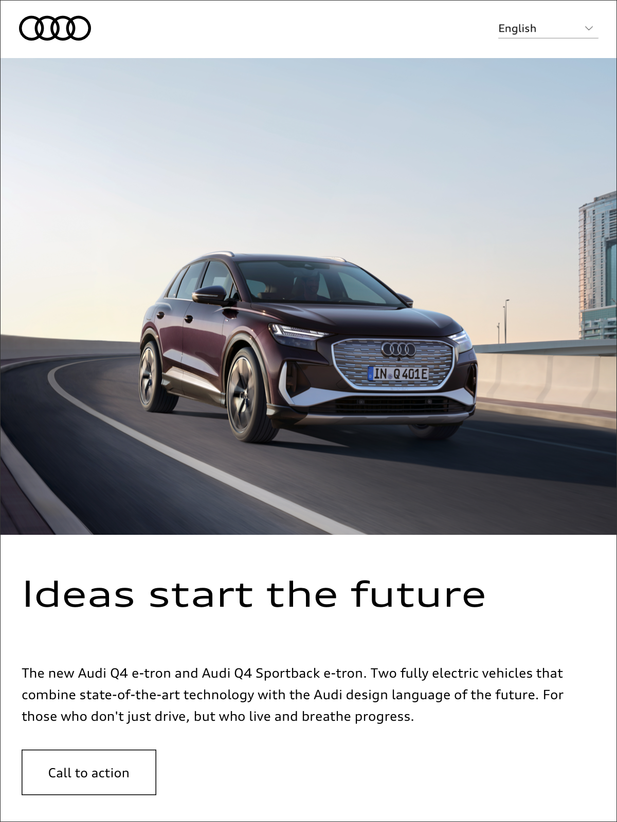
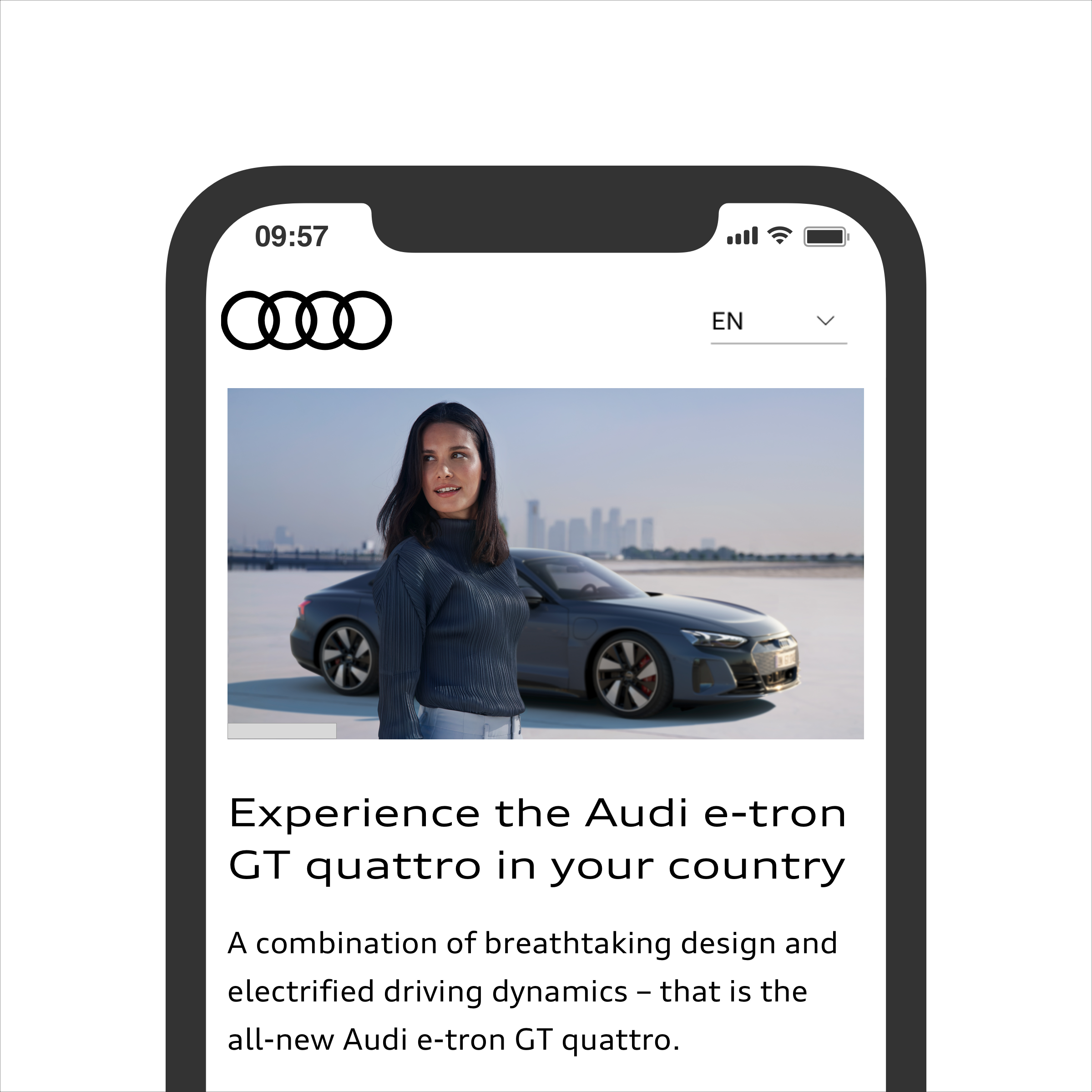
In direct communications with users, e.g. about Audi products, the brand is placed front and center. Here, Audi manages how the themes are used and thus controls the appearance that is created.
Although the light theme is mainly to be used, dark-theme elements can also be incorporated in order to create contrasts and trigger emotions in a targeted way through the interplay between light and dark.
Function
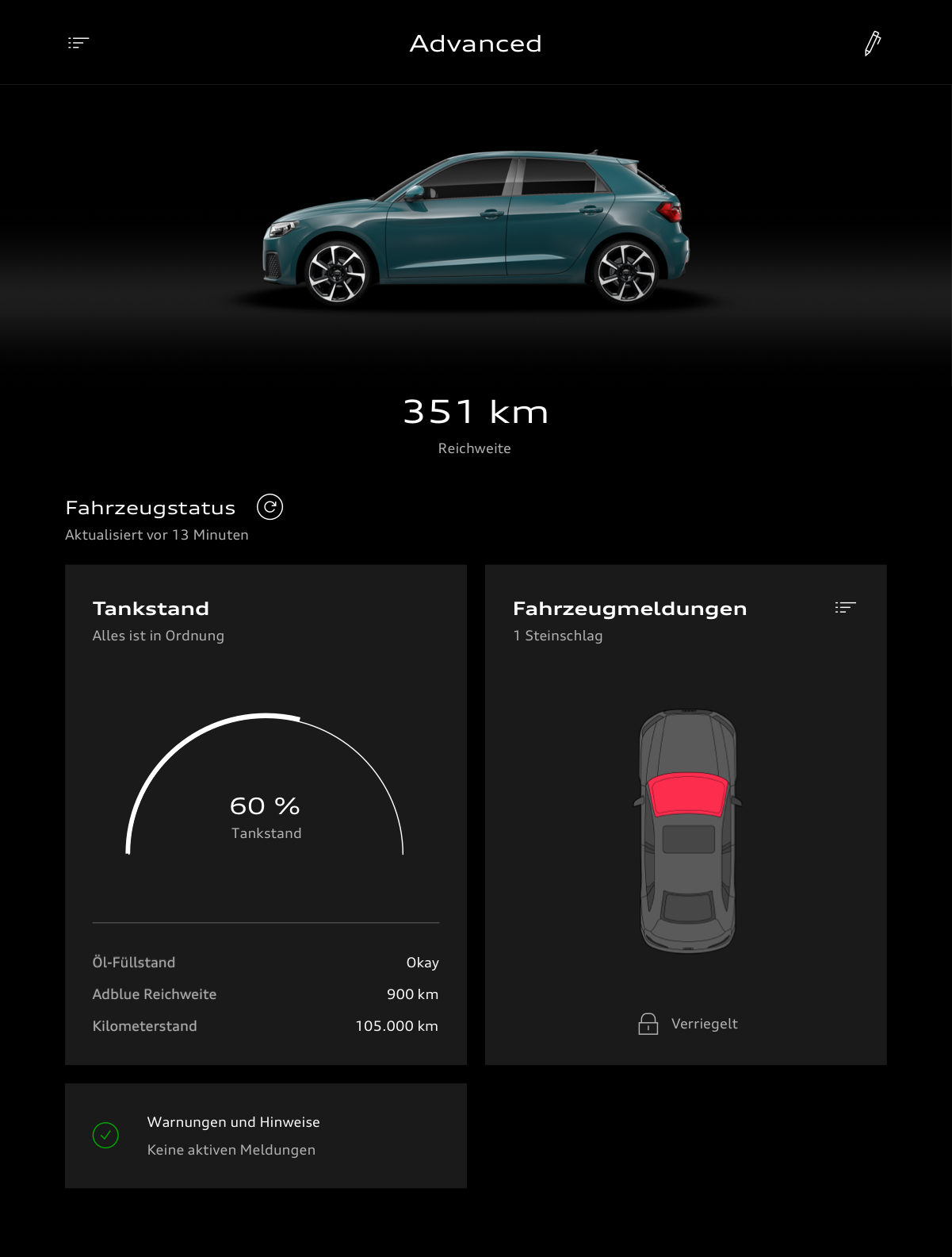
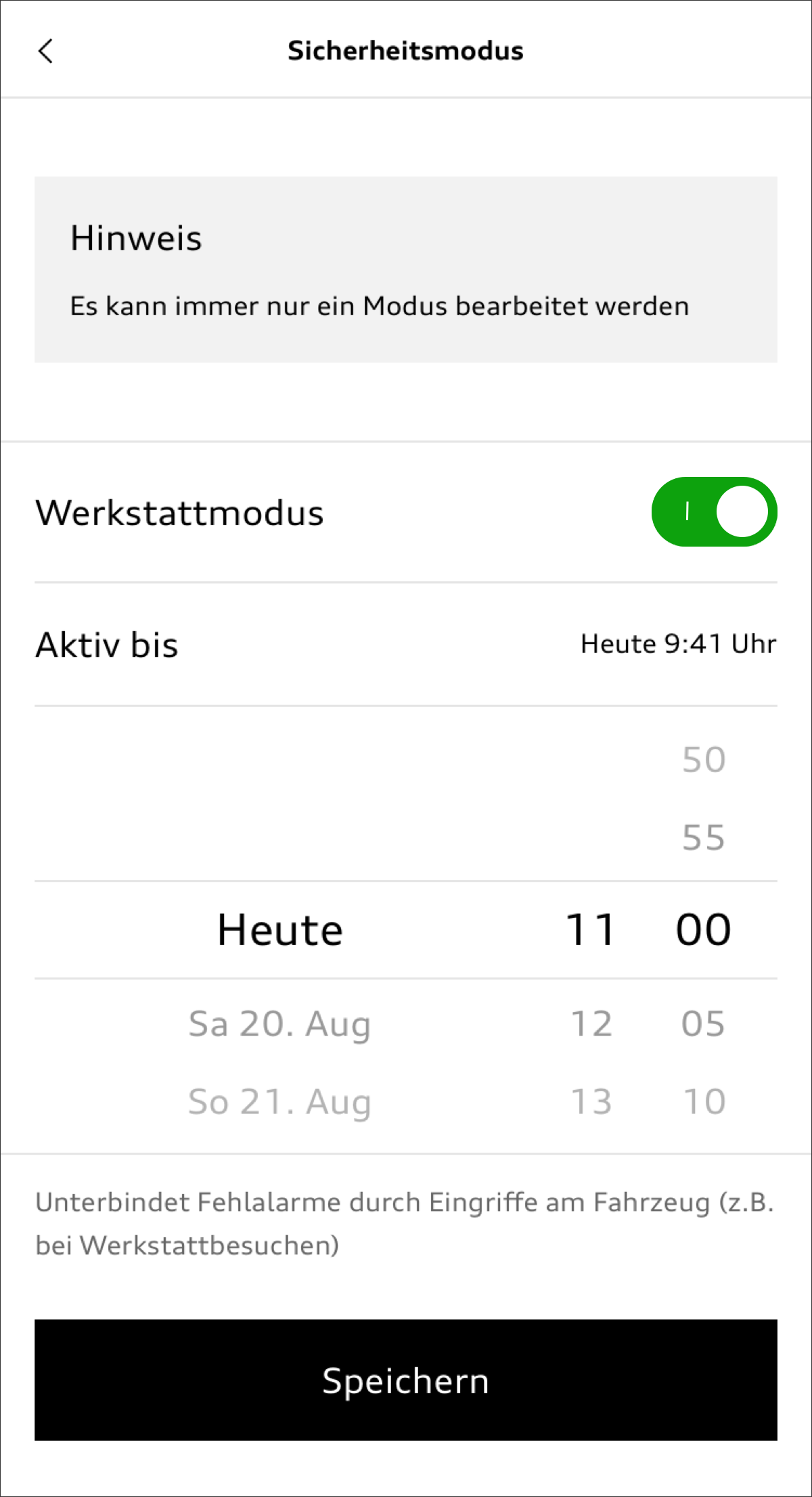
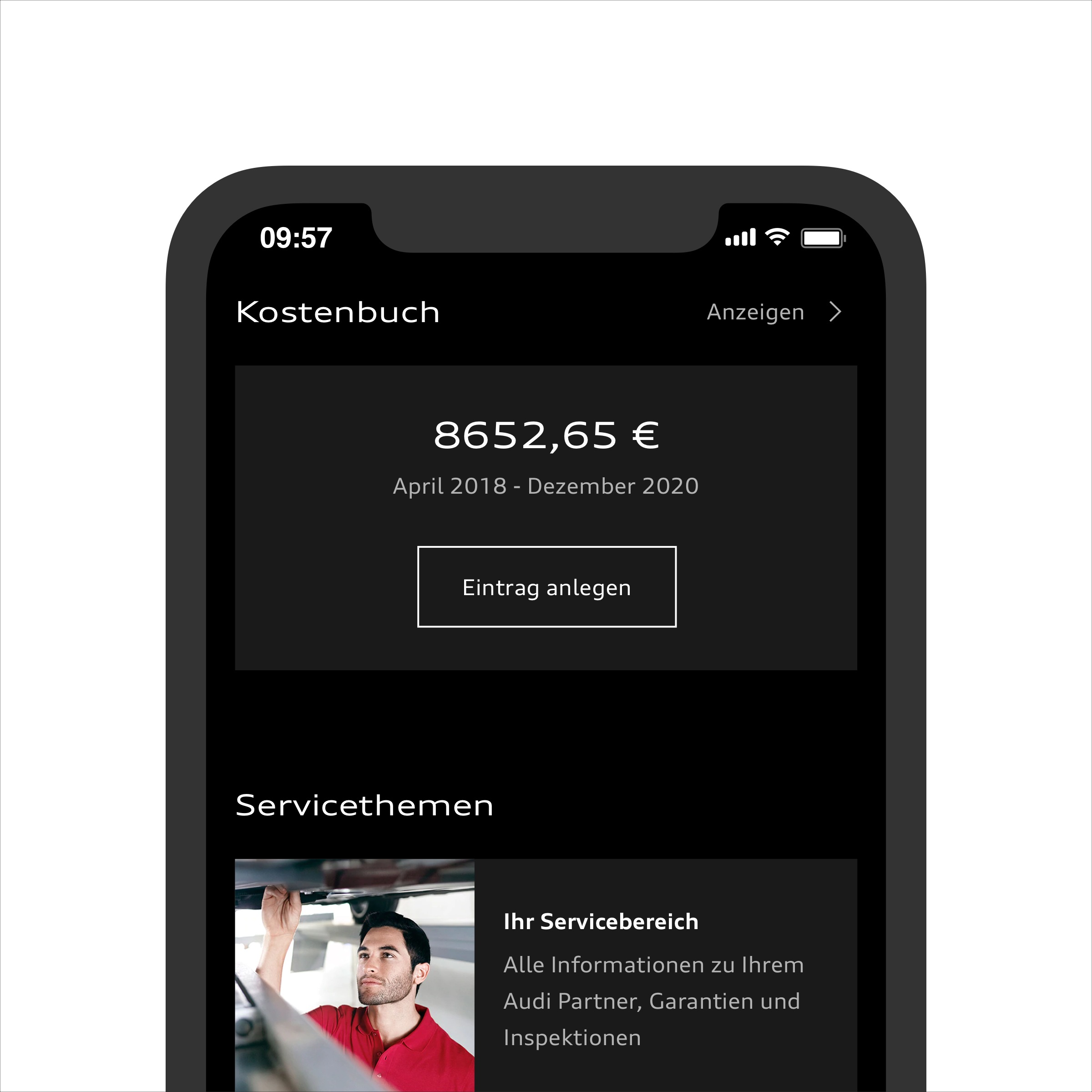
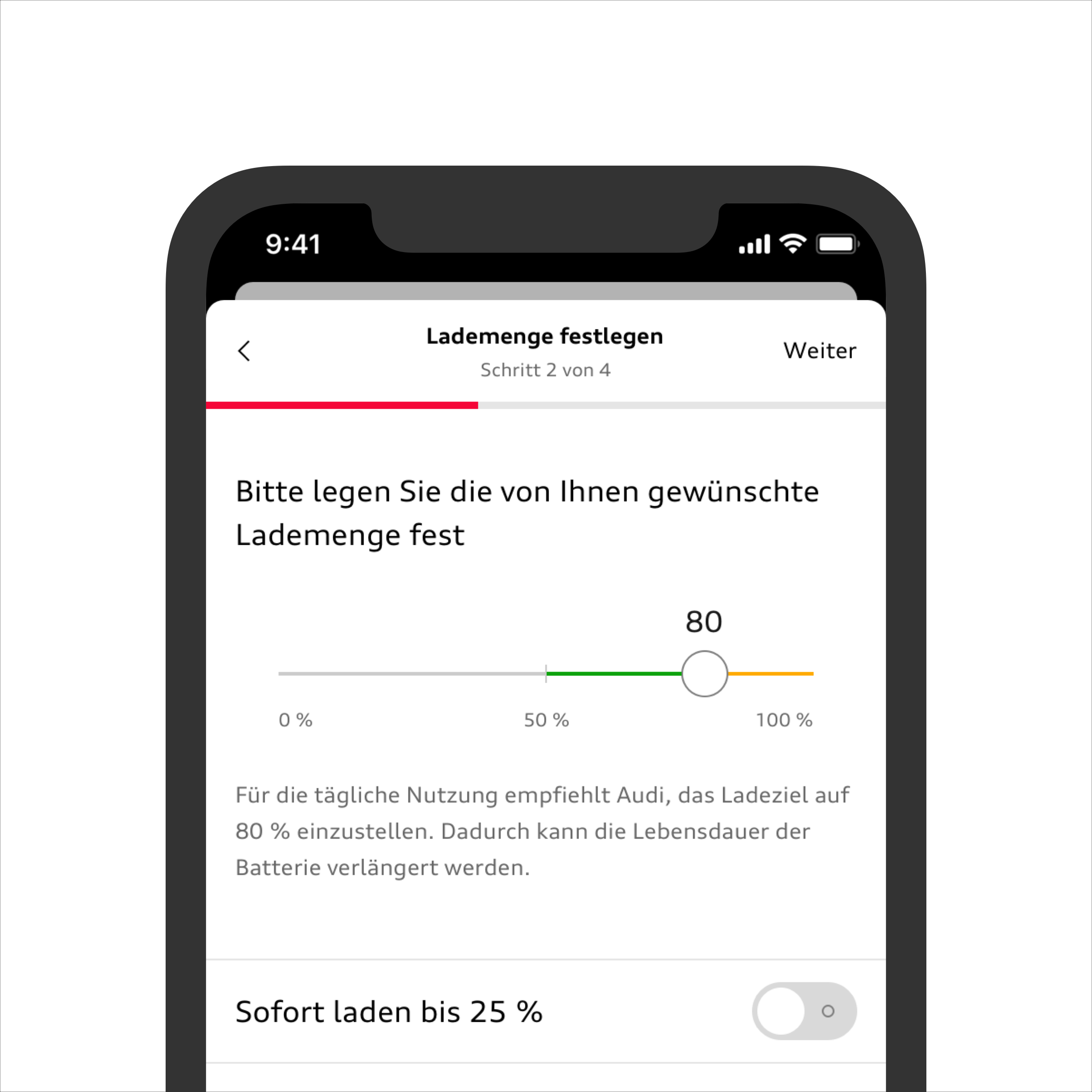
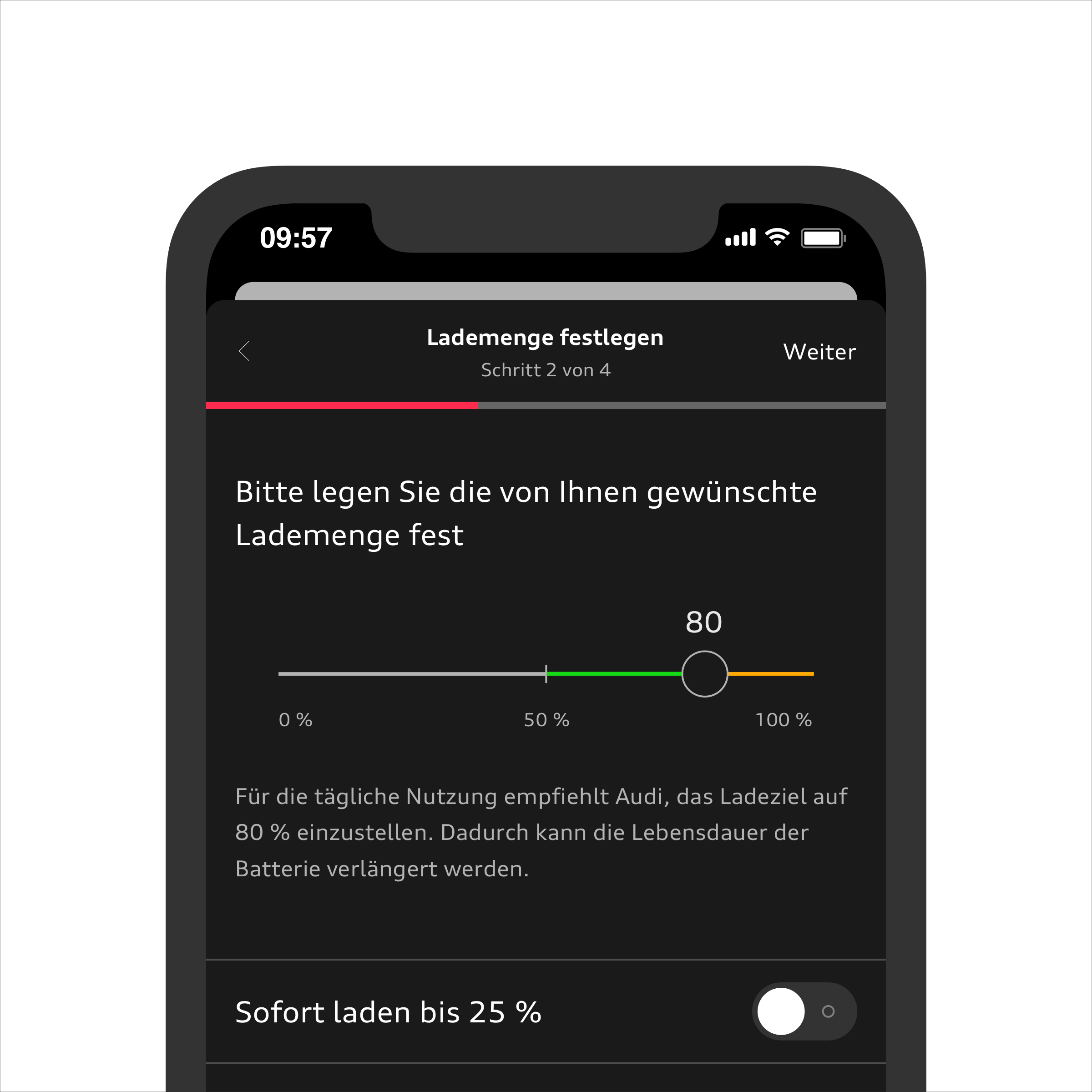
When the medium becomes a tool in itself and the focus is on functionality (e.g. in the case of the myAudi app), the brand takes a back seat so that every customer can be given a bespoke user experience. The user can thus switch as they like between the light and dark theme based on their preferences, habits, and requirements. The Audi light theme is the default setting.
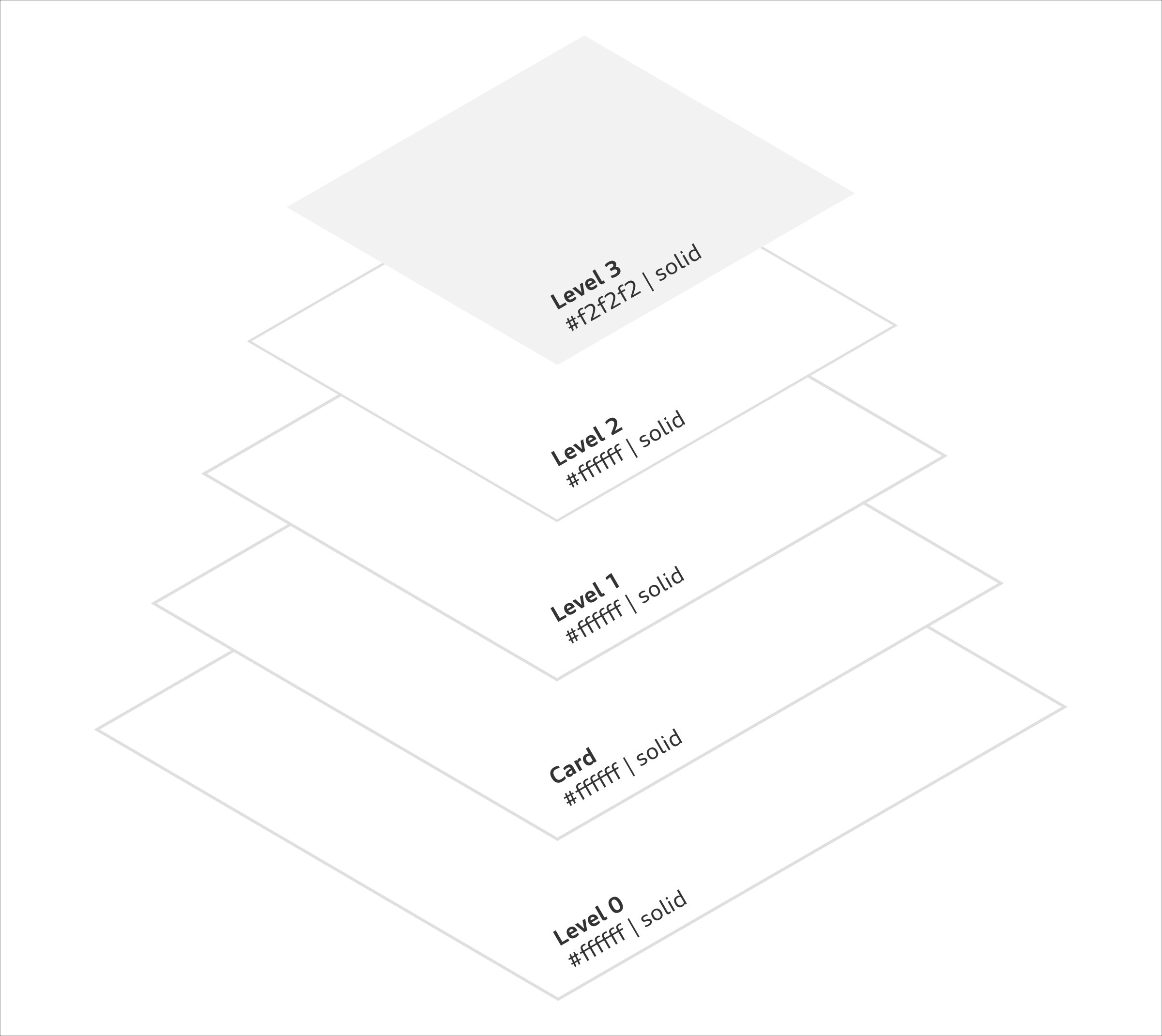
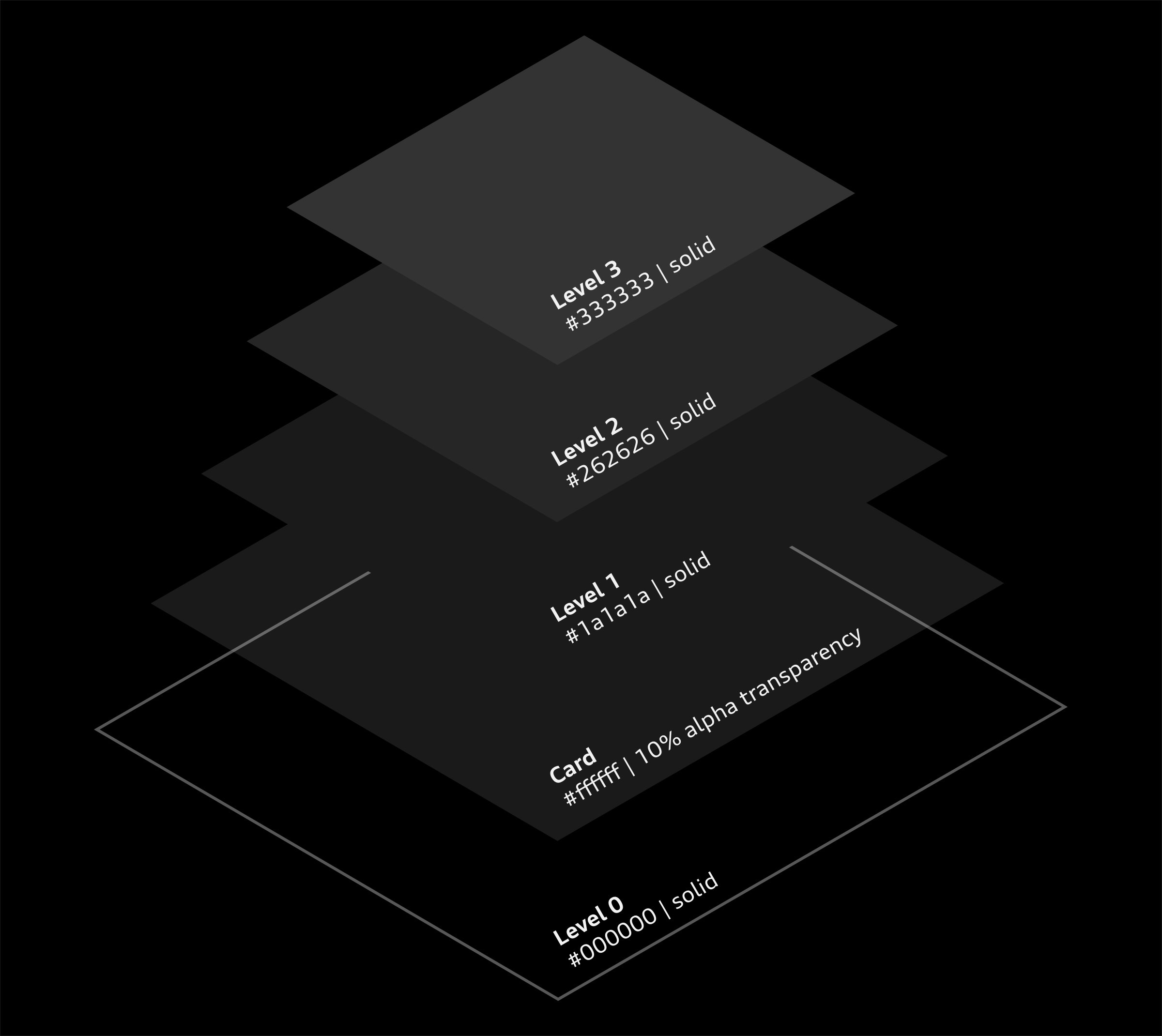
Elevations
Elevations give the interface a sense of three-dimensionality and depth. They establish clear hierarchies and help the user find their way around. For both themes, they create a visual appearance that is rich in contrast. Both the dark and light themes are characterized by a reduced colour palette.
Colours
The colour values are optimized for the respective theme in the case of Signal and Charging colours in order to ensure an accessible user experience. The Progressive Red is not used in the UI components and will remain unchanged if the theming changes.
Illustrations
Two different versions of illustrations are used within the themes. They appear with less white content in the dark theme than in the light theme in order to adapt harmoniously to their surroundings.
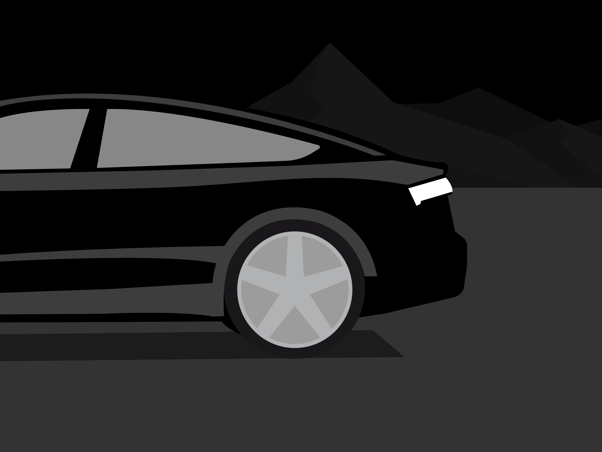
Images
The Audi imagery is presented unchanged within the two themes and blends harmoniously into the overall appearance conveyed by the themes.
