Responsive UI
Layout System
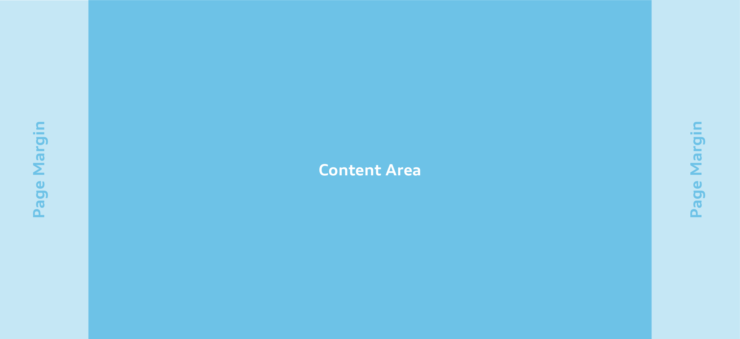
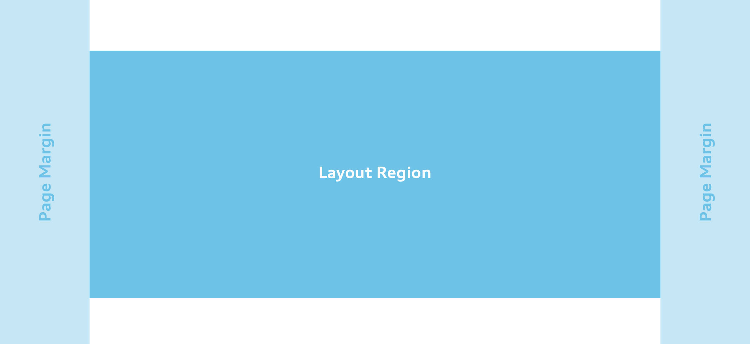
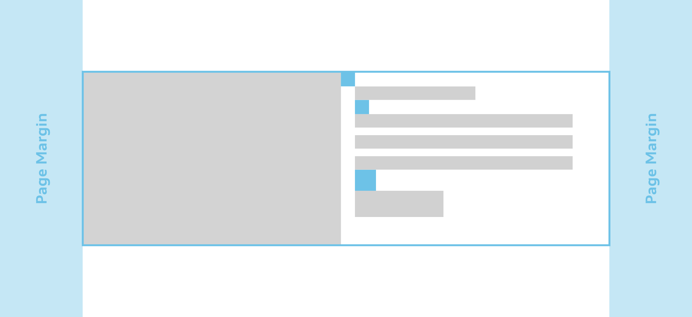
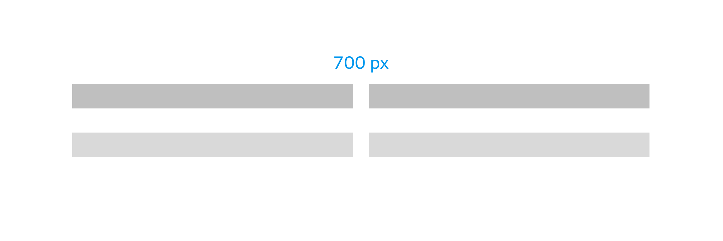
The Audi layout system guides designers to create unified design solutions and interfaces. With its responsive spacing matrix and clear layout guidelines, the Audi Layout System supports designs that work across all breakpoints and devices, as well as ensure consistency in the communication of the brand identity. The detailed documentation with examples is integrated in the Audi React Library and in the Audi Sketch Kit, which enables designers to work directly with it. The following terminology describes the layout system:
Performance
Audi websites are accessed all over the world using varying devices. In order to create pages that are quickly accessible for everyone, it is necessary to allow for poor devices and their internet access.
The question that must always be asked is whether the website is impressive on an older smartphone with a poor internet connection and high data costs.
Content and Functions
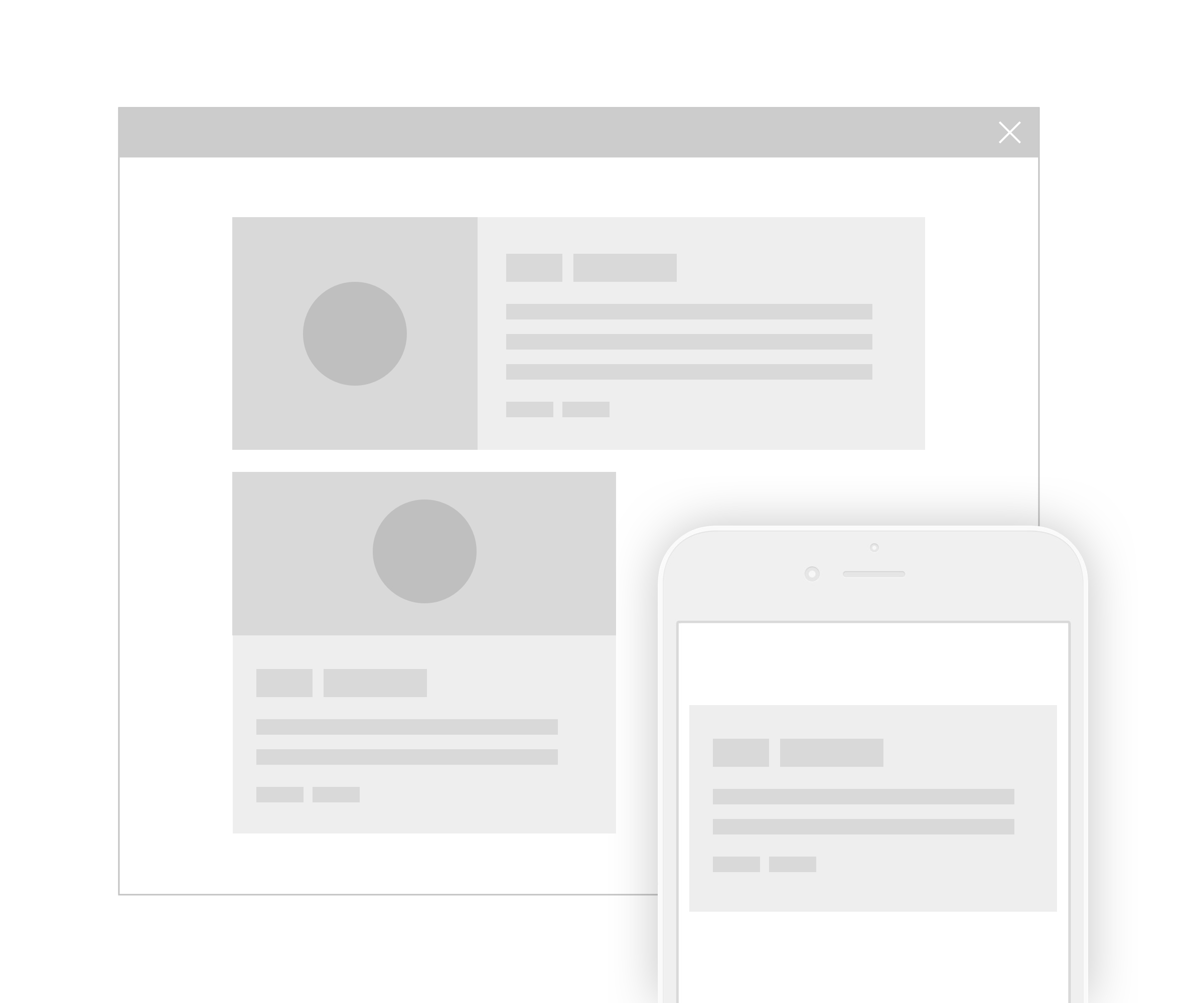
Content and functions are offered in equal measure on all devices and are optimised for display and use in differing resolutions.
No functions are omitted on mobile end devices: after all, resolution cannot be the only factor in deciding what the user wants.
If a piece of information or function seems superfluous on a small screen, it is worth asking whether it is needed in the first place.
The only exceptions here are devices with very limited facilities such as smart watches and of course native mobile applications.
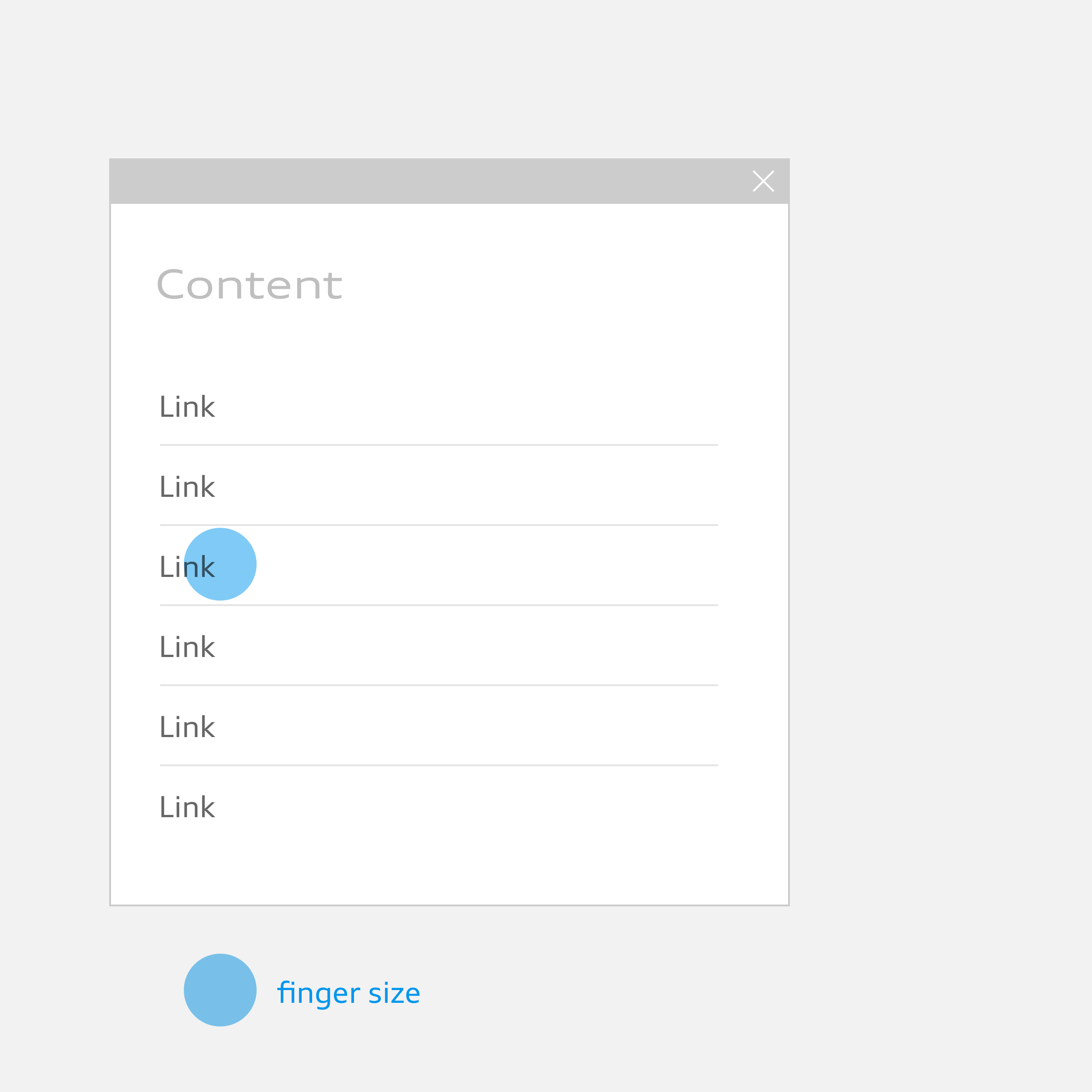
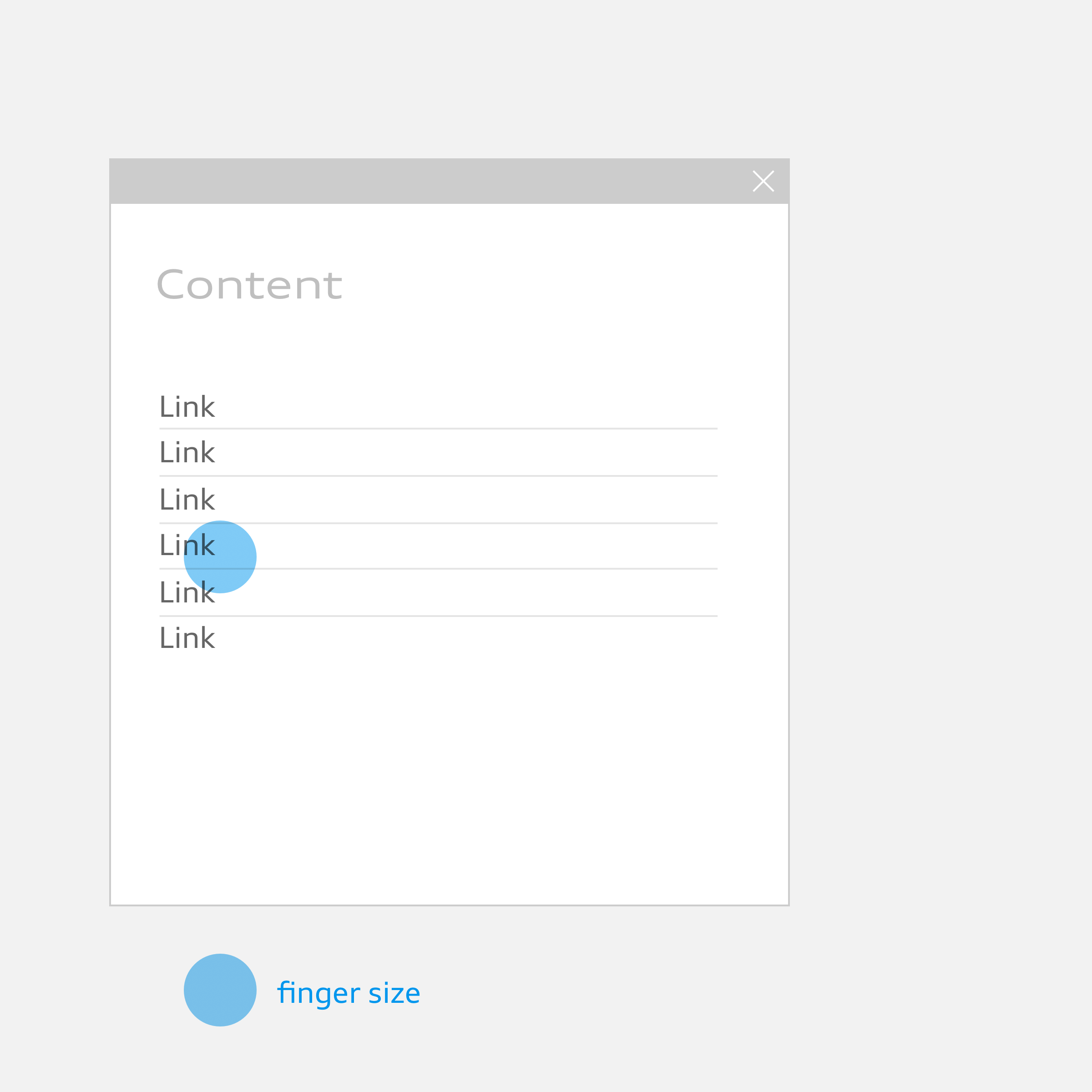
Element Queries
Adaptations are made to every element, module or layout as required so as to ensure optimum display in all resolutions. No global breakpoints are applied based on the screen sizes of certain devices.
This ensures independence from current resolutions, simplifies maintenance of the components and means that the design is the deciding factor when it comes to optimum display.
Flexibility
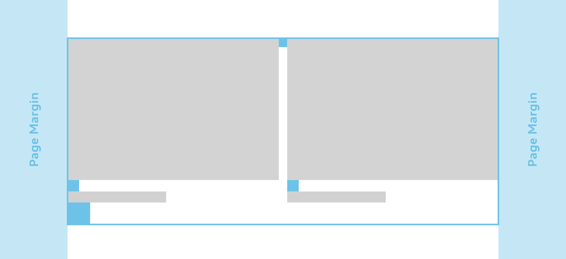
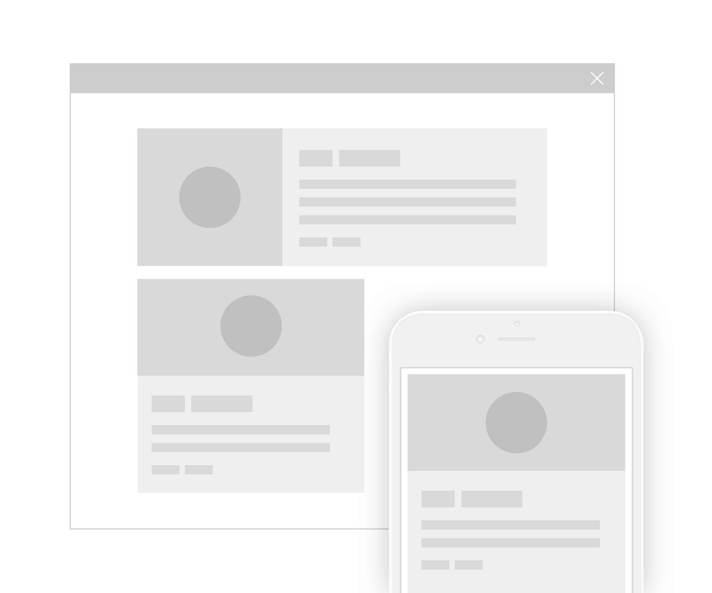
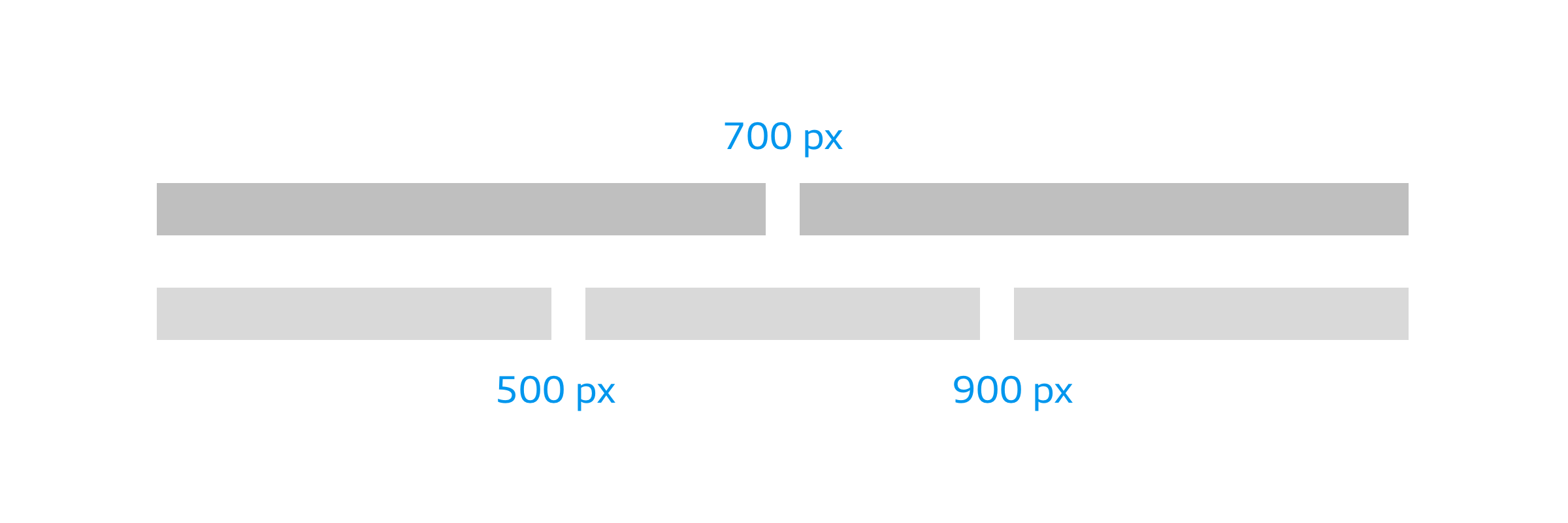
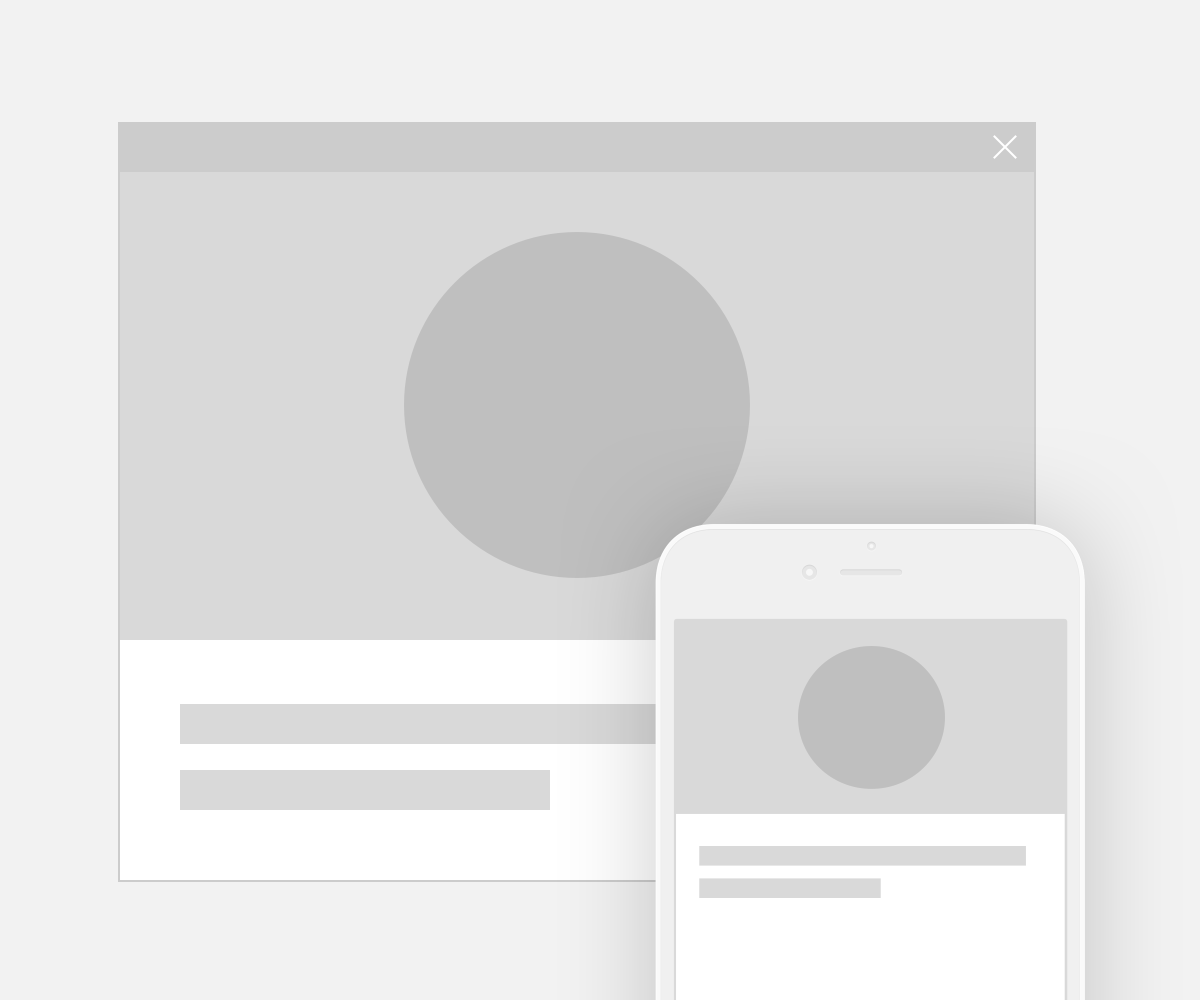
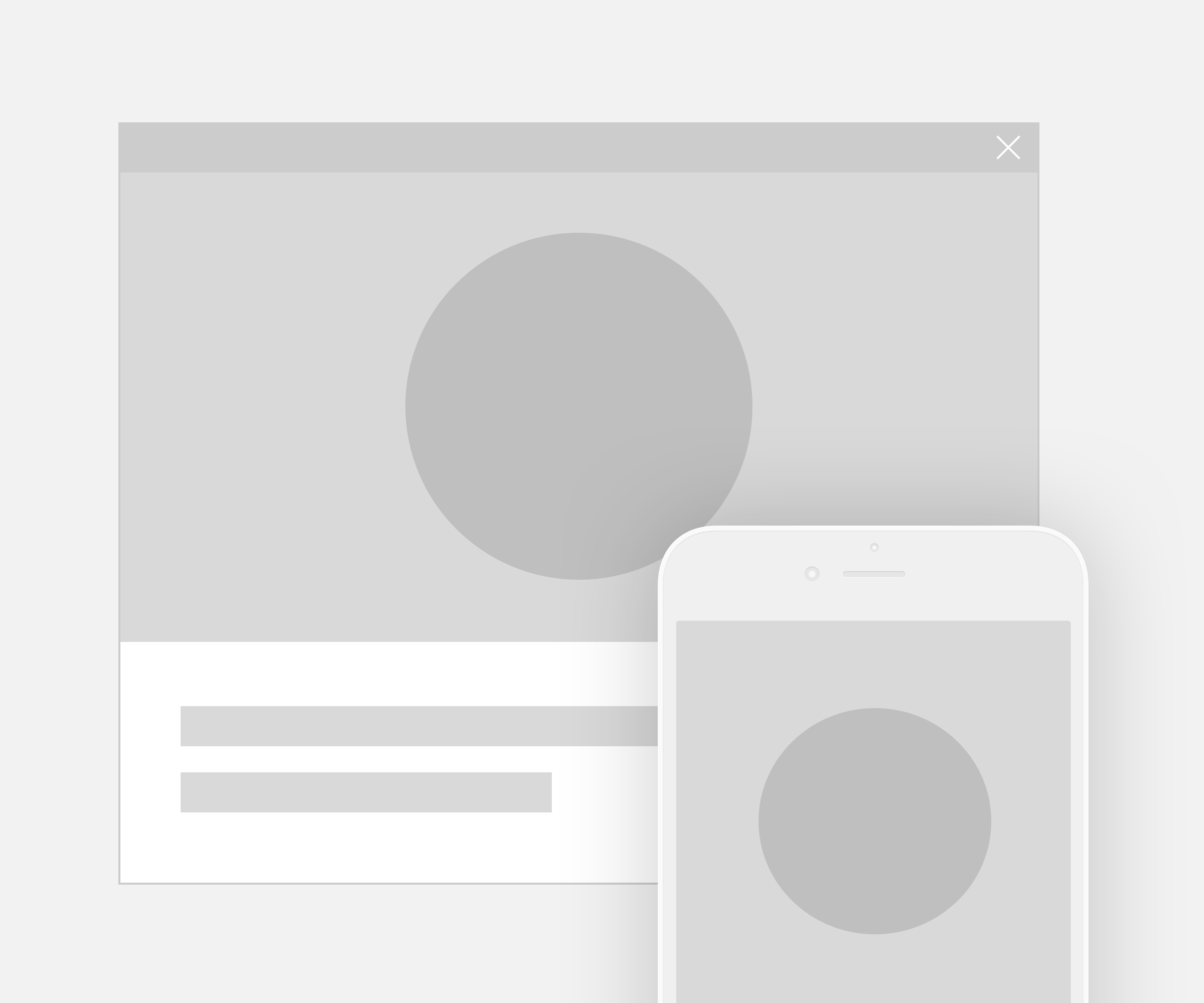
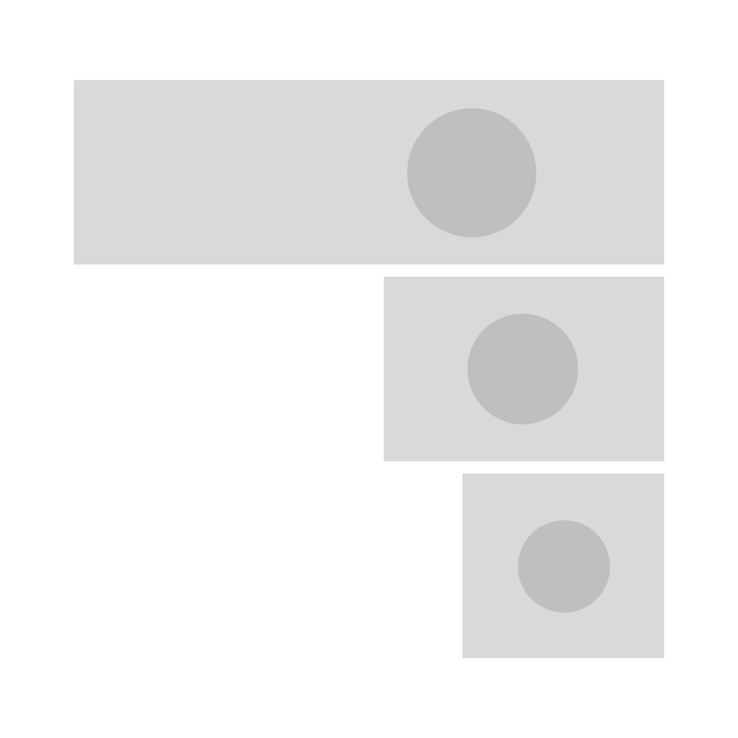
Videos or images are adapted to the layout depending on viewport size. In order to display content responsively, it must be prepared in such a way that the size can easily be changed and there is sufficient space available to trim the size of the visual material.
For example, images on large viewports have to be trimmed differently from images on small viewports; in the same way, background images adapt dynamically to the viewport ratio and look different on big viewports as compared to small ones.
