Table
Adopting Core Components
We have added new React components to the Audi CI to ensure a uniform appearance on the web. All existing React components can be found in the Audi React Library. Audi will continue to develop and add to this library.
Table
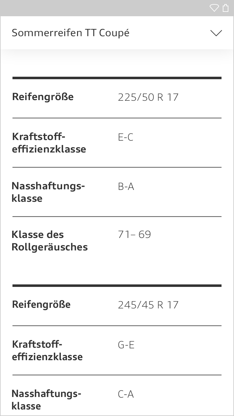
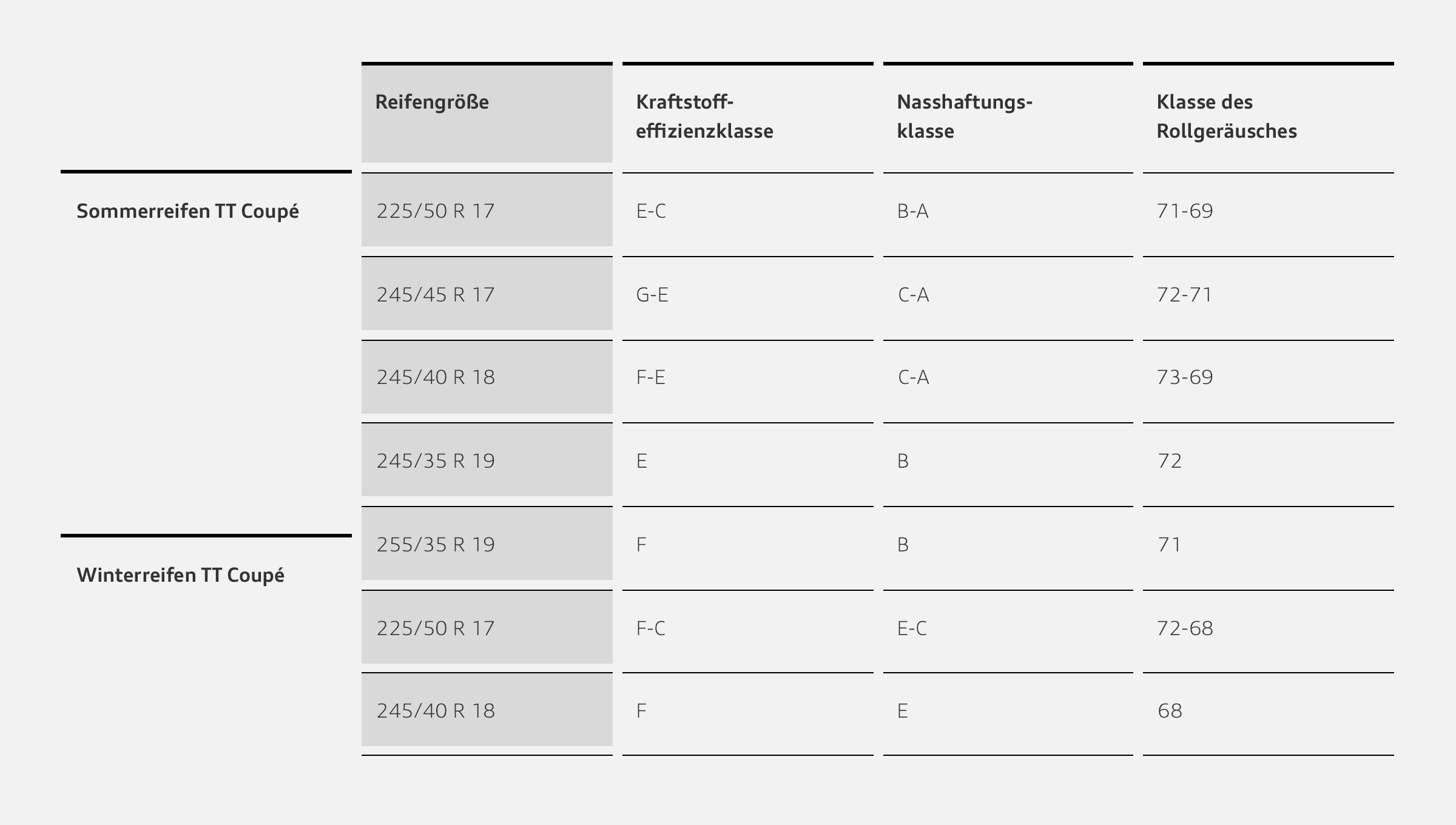
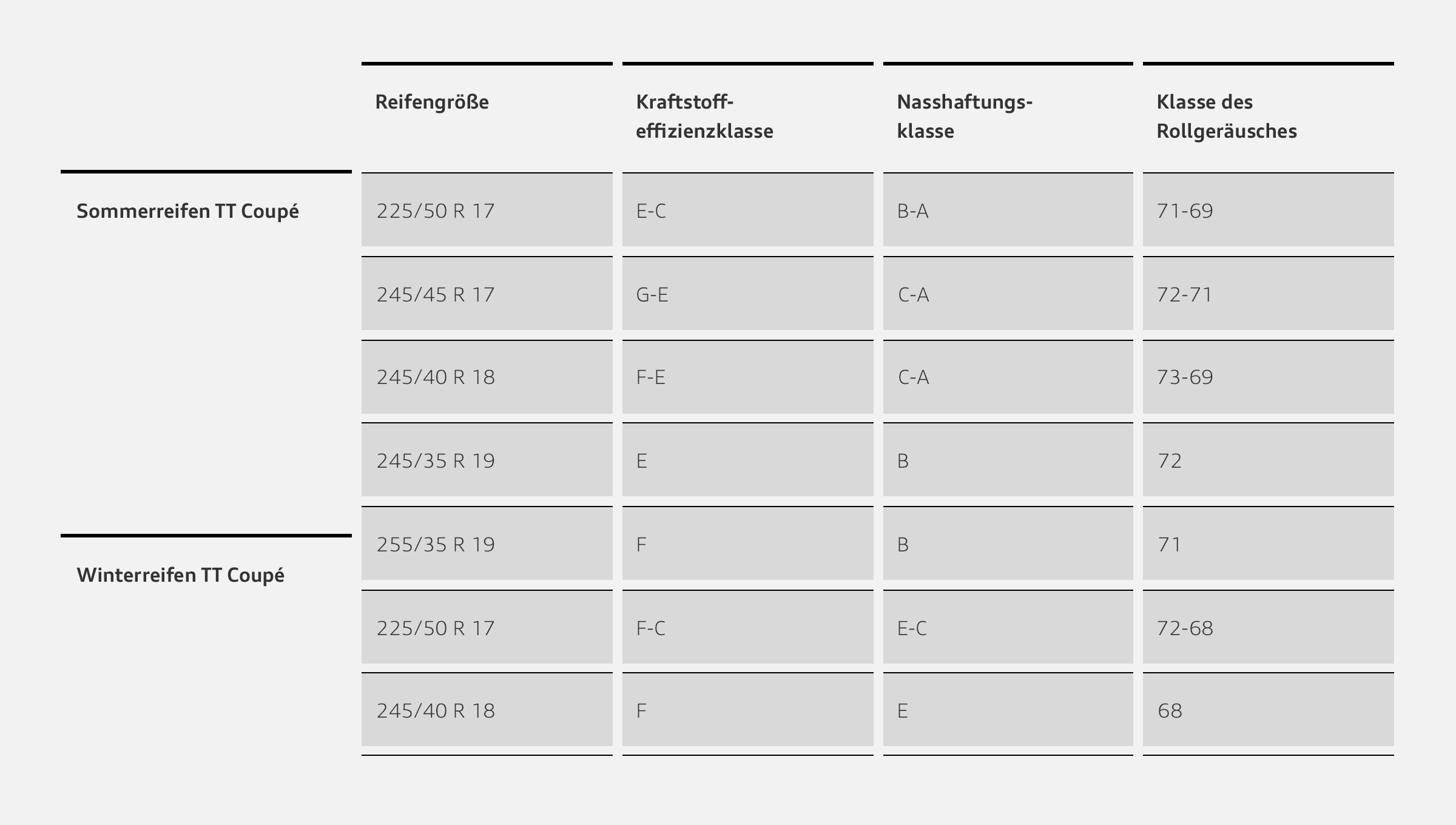
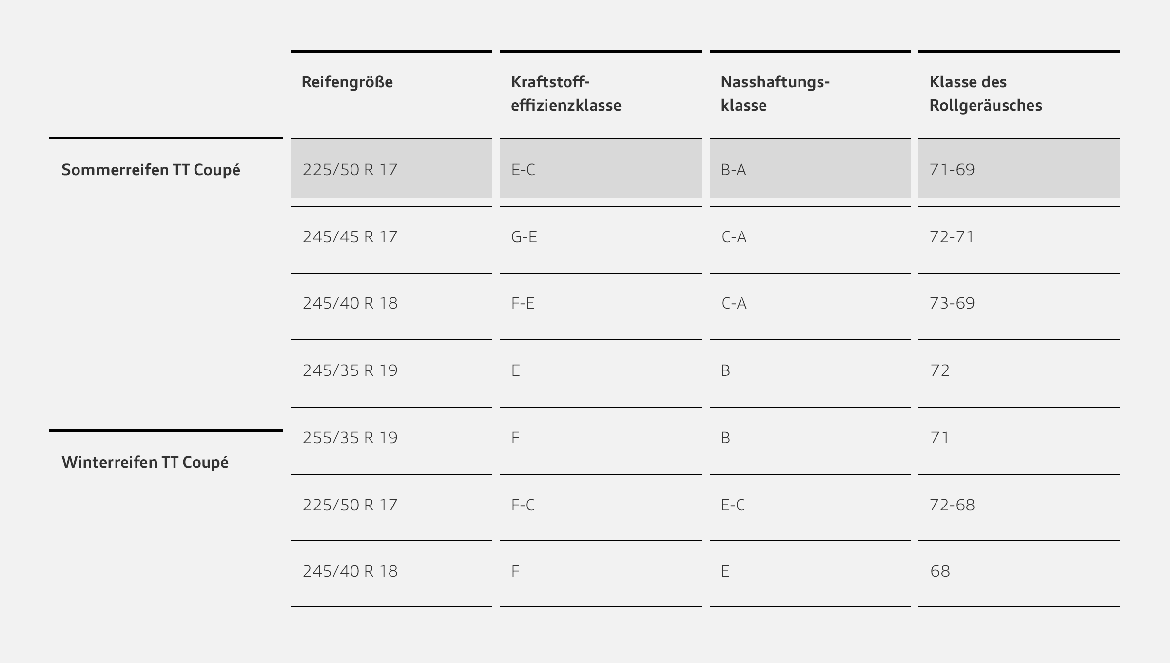
Tables can contain text and images as well as actions and other components.
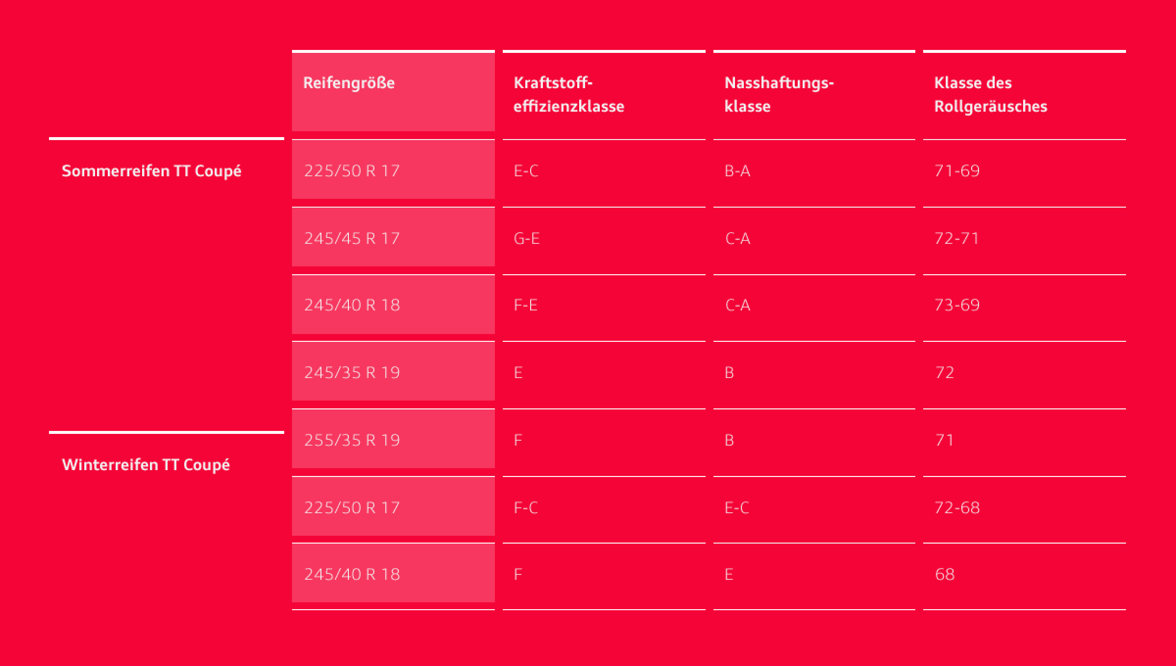
Tables consist solely of horizontal lines which are interrupted between the columns. The table head is highlighted with thicker lines. Individual columns, lines or cells can be graphically highlighted in the defined grey scales.
In the case of more extensive tables, a sorting by column function is recommended. Sorting capability is indicated by means of an arrow icon.
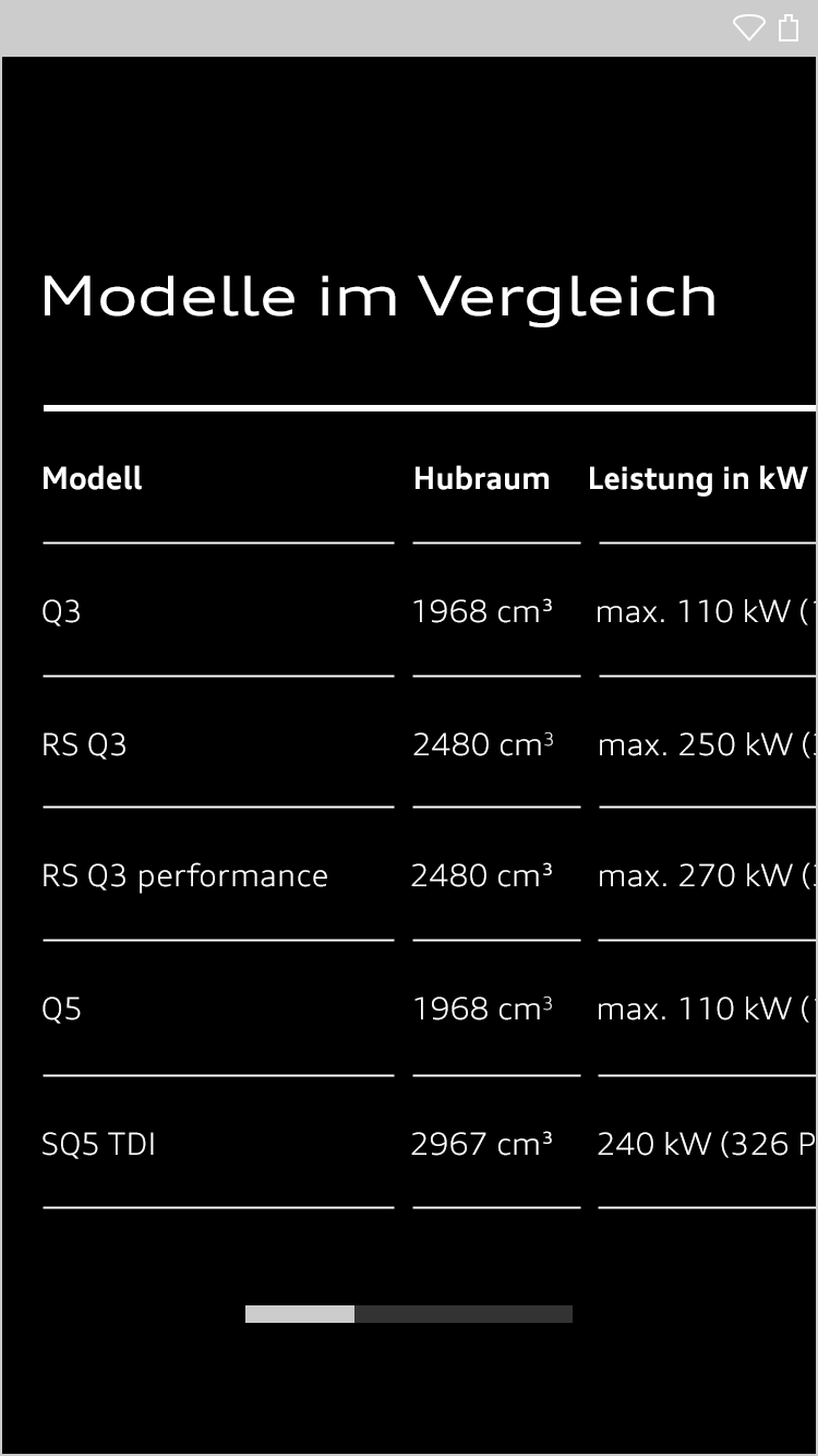
If a table becomes too wide for a viewport, it is possible to scroll horizontally through the columns or else the table is subdivided into several smaller, stacked tables.
| Header 1 | Header 2 | Header 3 | Header 4 |
|---|---|---|---|
| Footer 1 | Footer 2 | Footer 3 | Footer 4 |
| Row1, Column1 | Row1, Column2 | Row1, Column3 | Row1, Column4 |
| Row2, Column1 | Row2, Column2 | Row2, Column3 | Row2, Column4 |
| Row2, Column1 | Row2, Column2 | Row2, Column3 | Row2, Column4 |
<div class="aui-table aui-table--stretched">
  <table>
    <caption>Table caption</caption>
    <thead>
      <tr>
        <th>Header 1</th>
        <th>Header 2</th>
        <th>Header 3</th>
        <th>Header 4</th>
      </tr>
    </thead>
    <tfoot>
      <tr class="aui-table__cell--last-row">
        <td>Footer 1</td>
        <td>Footer 2</td>
        <td>Footer 3</td>
        <td>Footer 4</td>
      </tr>
    </tfoot>
    <tr>
      <td>Row1, Column1</td>
      <td>Row1, Column2</td>
      <td>Row1, Column3</td>
      <td>Row1, Column4</td>
    </tr>
    <tr>
      <td>Row2, Column1</td>
      <td>Row2, Column2</td>
      <td>Row2, Column3</td>
      <td>Row2, Column4</td>
    </tr>
    <tr>
      <td>Row2, Column1</td>
      <td>Row2, Column2</td>
      <td>Row2, Column3</td>
      <td>Row2, Column4</td>
    </tr>
  </table>
</div>| Header 1 | Header 2 | Header 3 | Header 4 |
|---|---|---|---|
| Row1, Column1 | Row1, Column2 | Row1, Column3 | Row1, Column4 |
| Row2, Column1 | Row2, Column2 | Row2, Column3 | Row2, Column4 |
| Row2, Column1 | Row2, Column2 | Row2, Column3 | Row2, Column4 |
<div class="aui-table aui-table--padded">
  <table>
    <caption>Table caption</caption>
    <thead>
      <tr>
        <th class="aui-table__cell--colored">Header 1</th>
        <th>Header 2</th>
        <th>Header 3</th>
        <th>Header 4</th>
      </tr>
    </thead>
    <tr>
      <td class="aui-table__cell--colored">Row1, Column1</td>
      <td>Row1, Column2</td>
      <td>Row1, Column3</td>
      <td>Row1, Column4</td>
    </tr>
    <tr>
      <td class="aui-table__cell--colored">Row2, Column1</td>
      <td>Row2, Column2</td>
      <td>Row2, Column3</td>
      <td>Row2, Column4</td>
    </tr>
    <tr class="aui-table__cell--last-row">
      <td class="aui-table__cell--colored">Row2, Column1</td>
      <td>Row2, Column2</td>
      <td>Row2, Column3</td>
      <td>Row2, Column4</td>
    </tr>
  </table>
</div>| Header 1 | Header 2 | Header 3 | Header 4 |
|---|---|---|---|
| Row1, Column1 | Row1, Column2 | Row1, Column3 | Row1, Column4 |
| Row2, Column1 | Row2, Column2 | Row2, Column3 | Row2, Column4 |
| Row3, Column1 | Row3, Column2 | Row3, Column3 | Row3, Column4 |
<div class="aui-table aui-table--responsive">
  <table>
    <caption>Table caption</caption>
    <thead>
      <tr>
        <th>Header 1</th>
        <th>Header 2</th>
        <th>Header 3</th>
        <th>Header 4</th>
      </tr>
    </thead>
    <tr>
      <td data-label="Header 1">Row1, Column1</td>
      <td data-label="Header 2">Row1, Column2</td>
      <td data-label="Header 3">Row1, Column3</td>
      <td data-label="Header 4">Row1, Column4</td>
    </tr>
    <tr>
      <td data-label="Header 1">Row2, Column1</td>
      <td data-label="Header 2">Row2, Column2</td>
      <td data-label="Header 3">Row2, Column3</td>
      <td data-label="Header 4">Row2, Column4</td>
    </tr>
    <tr class="aui-table__cell--last-row-responsive">
      <td data-label="Header 1">Row3, Column1</td>
      <td data-label="Header 2">Row3, Column2</td>
      <td data-label="Header 3">Row3, Column3</td>
      <td data-label="Header 4">Row3, Column4</td>
    </tr>
  </table>
</div>| Header 1 | Header 2 | Header 3 | Header 4 |
|---|---|---|---|
| Row1, Column1 | Row1, Column2 | Row1, Column3 | Row1, Column4 |
| Row2, Column1 | Row2, Column2 | Row2, Column3 | Row2, Column4 |
| Row3, Column1 | Row3, Column2 | Row3, Column3 | Row3, Column4 |
<div class="aui-table aui-table--stretched aui-table--responsive">
	<table>
		<caption>Table caption</caption>
		<thead>
			<tr>
				<th>Header 1</th>
				<th>Header 2</th>
				<th>Header 3</th>
				<th>Header 4</th>
			</tr>
		</thead>
		<tr>
			<td data-label="Header 1">Row1, Column1</td>
			<td data-label="Header 2">Row1, Column2</td>
			<td data-label="Header 3">Row1, Column3</td>
			<td data-label="Header 4">Row1, Column4</td>
		</tr>
		<tr>
			<td data-label="Header 1">Row2, Column1</td>
			<td data-label="Header 2">Row2, Column2</td>
			<td data-label="Header 3">Row2, Column3</td>
			<td data-label="Header 4">Row2, Column4</td>
		</tr>
		<tr class="aui-table__cell--last-row-responsive">
			<td data-label="Header 1">Row3, Column1</td>
			<td data-label="Header 2">Row3, Column2</td>
			<td data-label="Header 3">Row3, Column3</td>
			<td data-label="Header 4">Row3, Column4</td>
		</tr>
	</table>
</div>
Audi UI Kit – Integration into Sketch library
(supported until 30.06.2023)
To ensure designers are using the most up-to-date components and icons in their products, the Audi UI Kit was created as a sketch library. Integrate these UI Kits to get the latest Audi Sketch Libraries. Updates will be made regularly and users will be informed when new versions of the Librarys are available.
Audi UI Kit for Figma
To enable as many designers as possible to work with the Audi user interface components the UI Kit and icons is also offered for Figma. Updates are made regularly and all changes are documented for users in the changelog.
We strongly recommend to join the Audi Figma Workspace for being always up-to-date and to collaborate with others.The Audi Design Kits are already included into the Figma teams in the Audi Workspace. To get access to a team or project please reach out to us here.
In case you are not working directly in the Audi Figma workspace you find the latest version as download below.