Card
Cards contain elements and functions on a single topic and can be used as teasers for further content. They optionally show text, icons, an image or a video, links and triggers – either alone or in combination. The format, size and layout of a card are flexible within the layout structure. Cards can contain the brand colours as defined in the basics.
Card as an Interactive Block
An entire card can be created as an interactive block if it does not contain any other interactive elements. In this case it has a hover effect.
Headline
And, now Your Highness, we will discuss the location of your hidden Rebel base.
<div class="aui-card aui-color-white aui-color-text-dark">
  <div class="aui-card__body">
    <div class="aui-card__content">
      <h2 class="aui-headline-5">Headline</h2>
      <p class="aui-shortread">And, now Your Highness, we will discuss the location of your hidden <strong>Rebel base</strong>.</p>
    </div>
  </div>
</div>
Card with Interactions
In addition to text and images, cards can contain interactive elements such as buttons, icon buttons and text links. A hover effect across the entire card is omitted in this case.
Headline
And, now Your Highness, we will discuss the location of your hidden Rebel base.
<div class="aui-card aui-color-white aui-color-text-dark">
<div class="aui-card__body">
<div class="aui-card__content">
<h2 class="aui-headline-5">Headline</h2>
<p class="aui-shortread">And, now Your Highness, we will discuss the location of your hidden <strong>Rebel base</strong>.</p>
</div>
<div class="aui-card__content aui-card__content--bottom">
<div class="aui-button-group">
<button class="aui-button aui-button--primary aui-js-response" type="button">Action</button>
<button class="aui-button aui-button--secondary aui-js-response" type="button">Action</button>
</div>
</div>
</div>
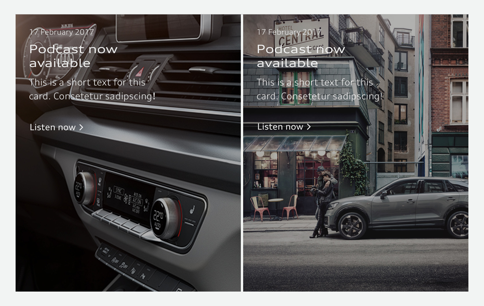
</div>Card with Background Image
Visuals are bled to the edge in cards. For improved readability of the content items placed on them, the image can be darkened with a transparent area by up to 30%. The differing display sizes of the card in varying viewport sizes has to be accounted for.
<a class="aui-card aui-card--action aui-card--image aui-color-black aui-color-text-light" style="background-image:url('http://dev.strichpunkt-design.de/audi/gui-kit/assets/content/card-390x480.jpg');background-position:100% 50%;" href="#">
<div class="aui-card__content">
<p class="aui-small">
31.07.2016
</p>
<h2 class="aui-headline-3">
Headline
</h2>
<p class="aui-shortread">
Card with background image
</p>
</div>
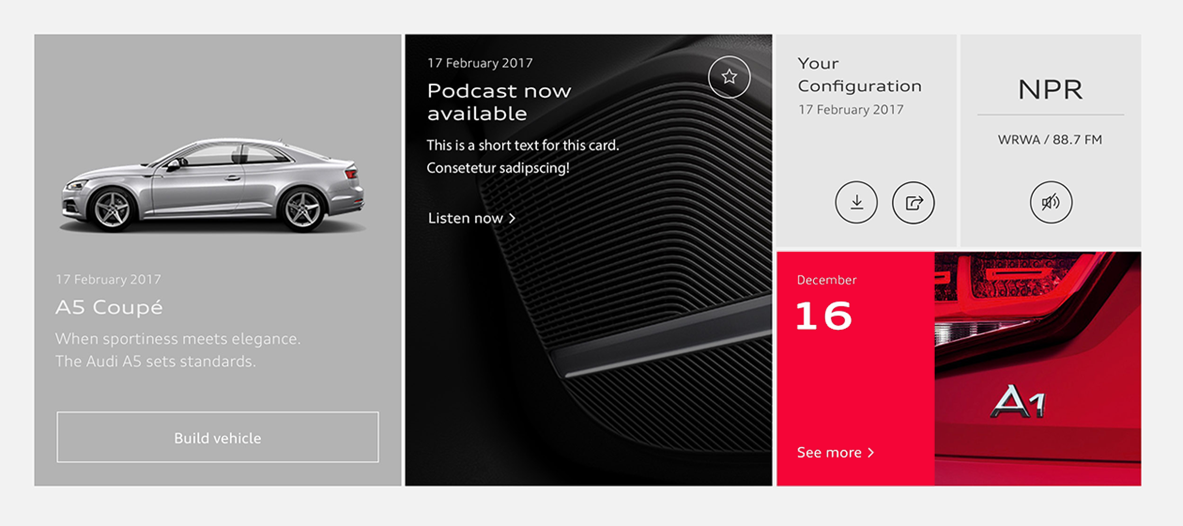
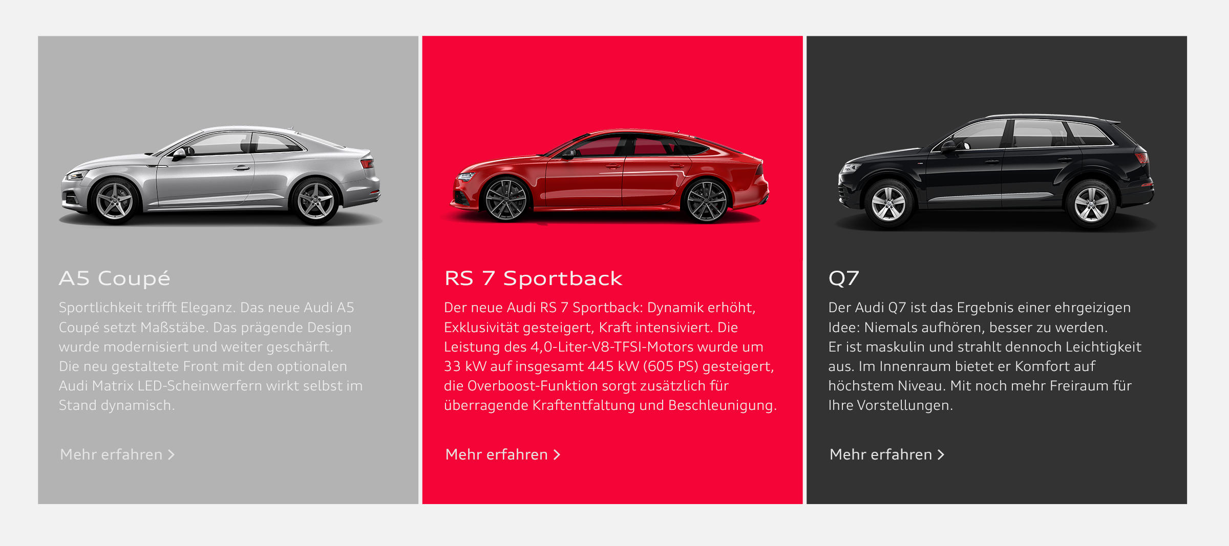
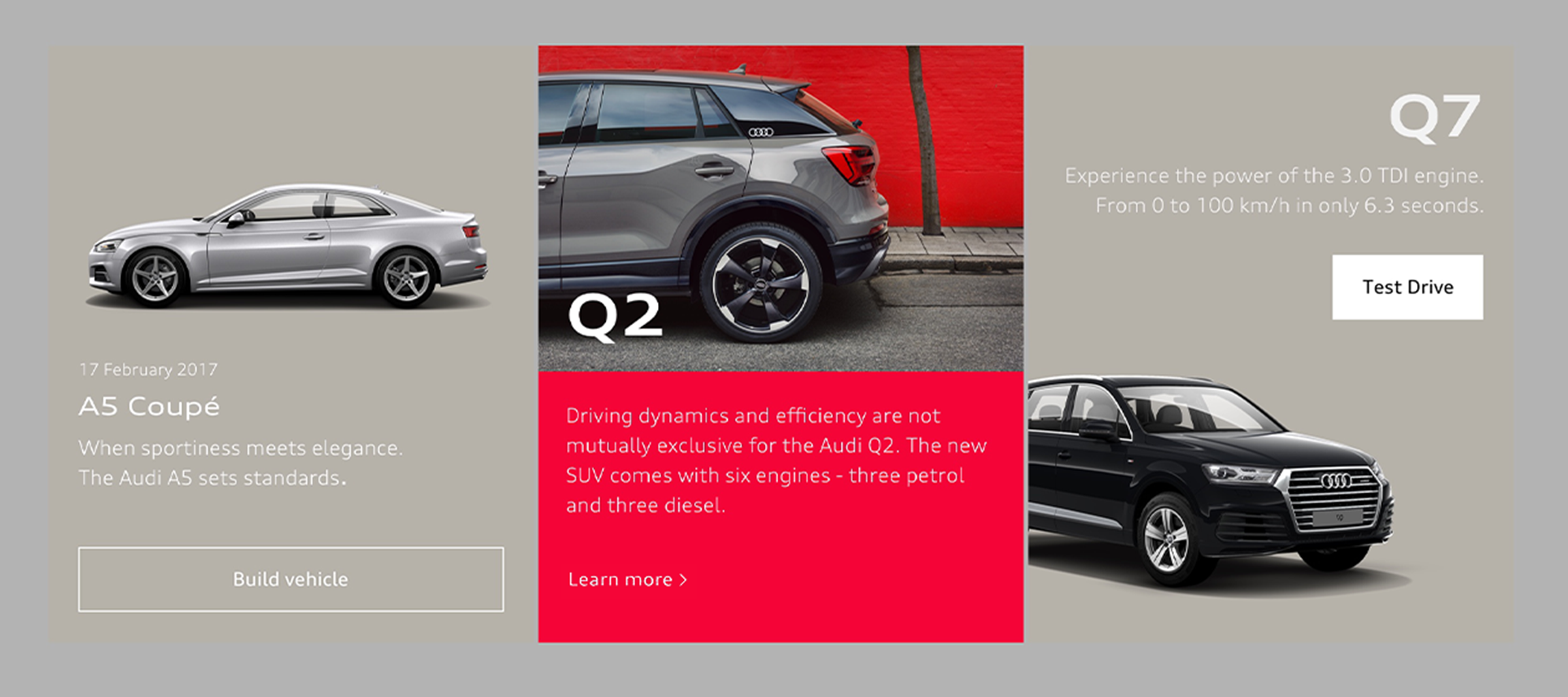
</a>Card Grid
Cards can be combined in identical or differing formats in grids or lists. They are placed at a narrow spacing from one another. For this reason, the recommend value for a defined basic unit is 0.25 rem (on this point, see Layout structure).
Grow and shrink
Use align-right and align-center on card content to align Button Group as you want.
December
24
Your Configuration
30.02.2025
A4
Your Model
<div class="abp-pattern__card-grid">
<div class="aui-card-grid">
<div class="aui-card-grid__item">
<a class="aui-card aui-card--action aui-card--image aui-color-black aui-color-text-light" style="background-image:url('http://dev.strichpunkt-design.de/audi/gui-kit/assets/content/card-390x480.jpg');background-position:100% 50%;" href="#">
<div class="aui-card__content">
<p class="aui-small">31.07.2016</p>
<h2 class="aui-headline-3">Headline</h2>
<p class="aui-shortread">Card with background image; clickable.</p>
</div>
</a>
</div>
<div class="aui-card-grid__item">
<div class="aui-card aui-color-white aui-color-text-dark">
<div class="aui-card__body">
<div class="aui-card__content">
<h2 class="aui-headline-5">Grow and shrink</h2>
<p class="aui-shortread">Use align-right and align-center on card content to align Button Group as you want.</p>
</div>
<div class="aui-card__content aui-card__content--bottom align-right">
<div class="aui-button-group">
<button class="aui-js-response aui-button aui-button--secondary" type="button">Action</button>
<button class="aui-js-response aui-button aui-button--secondary" type="button">Action</button>
</div>
</div>
</div>
</div>
</div>
<div class="aui-card-grid__item aui-card-grid__item--column">
<div class="aui-card aui-color-black aui-color-text-light">
<div class="aui-card__body">
<div class="aui-card__content">
<p class="aui-small">December</p>
<p class="aui-headline-1">24</p>
<button class="aui-js-response aui-button aui-button--text aui-theme-light" type="button">Text Button</button>
</div>
</div>
</div>
<div class="aui-card-grid">
<div class="aui-card-grid__item" style="width:50%;">
<div class="aui-card aui-color-white aui-color-text-dark">
<div class="aui-card__body">
<div class="aui-card__content">
<h6 class="aui-headline-6">Your Confi­guration</h6>
<p class="aui-small">30.02.2025</p>
</div>
<div class="aui-card__content aui-card__content--bottom">
<div class="aui-button-group aui-button-group--icons">
<button class="aui-button aui-button--round aui-button--icon aui-button--icon--large aui-js-response"><svg class="audiicon audiicon-large"><use xlink:href="#system-download-large"></use></svg></button>
<button class="aui-button aui-button--round aui-button--icon aui-button--icon--large aui-js-response"><svg class="audiicon audiicon-large"><use xlink:href="#system-download-large"></use></svg></button>
</div>
</div>
</div>
</div>
</div>
<div class="aui-card-grid__item" style="width:50%;">
<div class="aui-card aui-color-white aui-color-text-dark">
<div class="aui-card__body">
<div class="aui-card__content align-center">
<h6 class="aui-headline-2">
A4
</h6>
<p class="aui-small">
Your Model
</p>
</div>
<div class="aui-card__content aui-card__content--bottom align-center">
<button class="aui-button aui-button--round aui-button--icon aui-button--icon--large aui-js-response"><svg class="audiicon audiicon-large"><use xlink:href="#system-download-large"></use></svg></button>
</div>
</div>
</div>
</div>
</div>
</div>
</div>
</div>Audi UI Kit – Integration into Sketch library
(supported until 30.06.2023)
To ensure designers are using the most up-to-date components and icons in their products, the Audi UI Kit was created as a sketch library. Integrate these UI Kits to get the latest Audi Sketch Libraries. Updates will be made regularly and users will be informed when new versions of the Librarys are available.
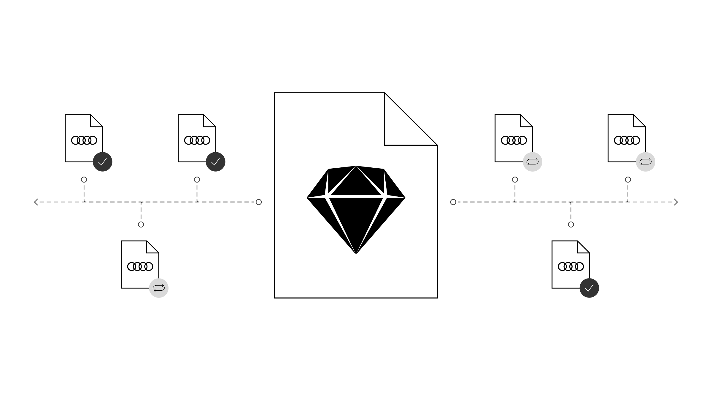
Audi UI Kit for Figma
To enable as many designers as possible to work with the Audi user interface components the UI Kit and icons is also offered for Figma. Updates are made regularly and all changes are documented for users in the changelog.
We strongly recommend to join the Audi Figma Workspace for being always up-to-date and to collaborate with others.The Audi Design Kits are already included into the Figma teams in the Audi Workspace. To get access to a team or project please reach out to us here.
In case you are not working directly in the Audi Figma workspace you find the latest version as download below.
