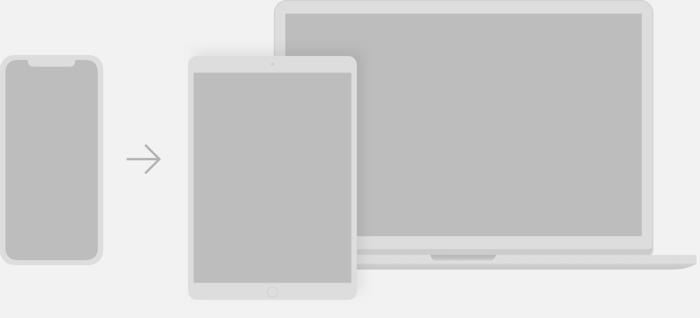
UI Introduction
Audi user interfaces are as varied as their uses – ranging from inspiring websites to applications for a particular service. The aim is to create varied solutions and a well-balanced, system-wide user experience – from the app to the vehicle. The basis for this is provided by a joint set of components, modules and animations.

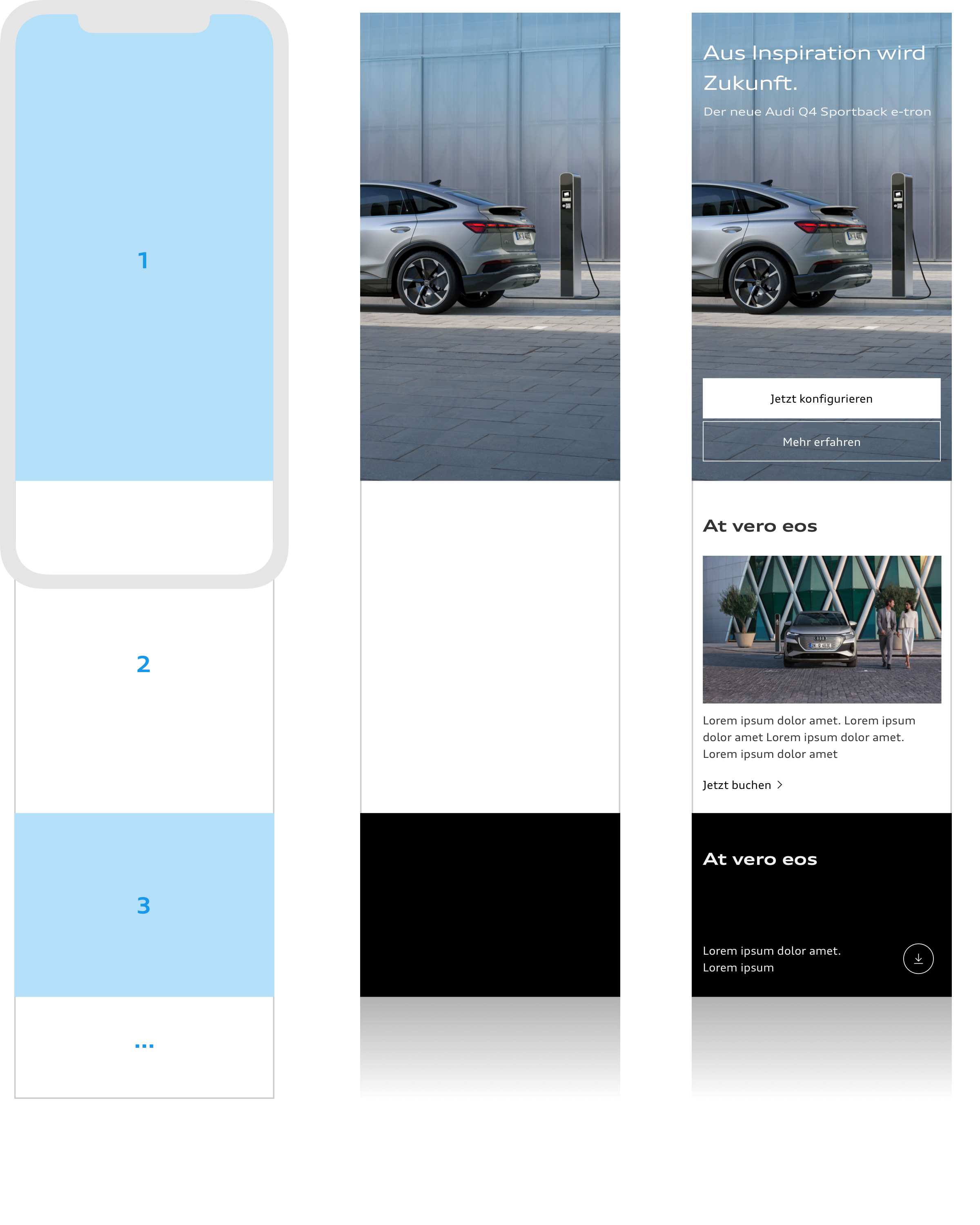
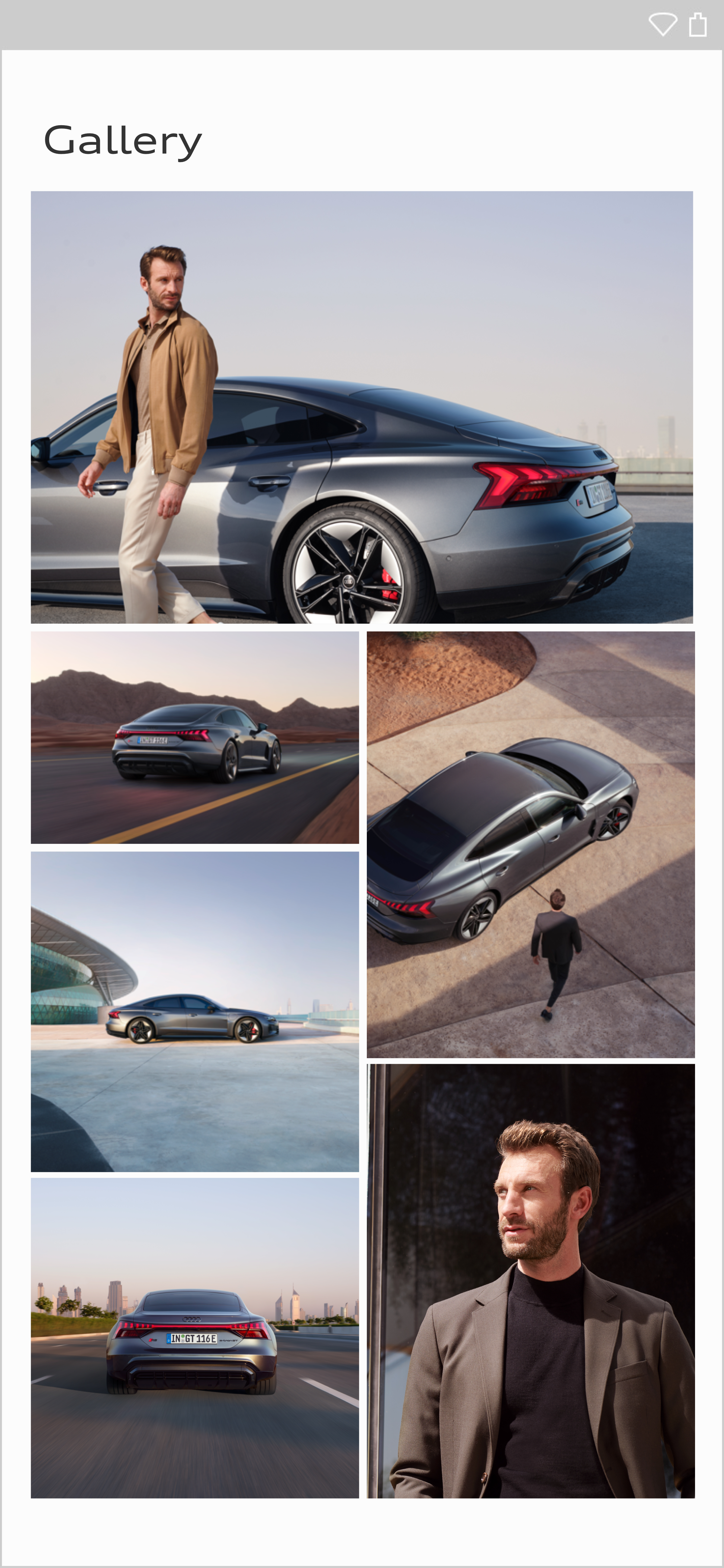
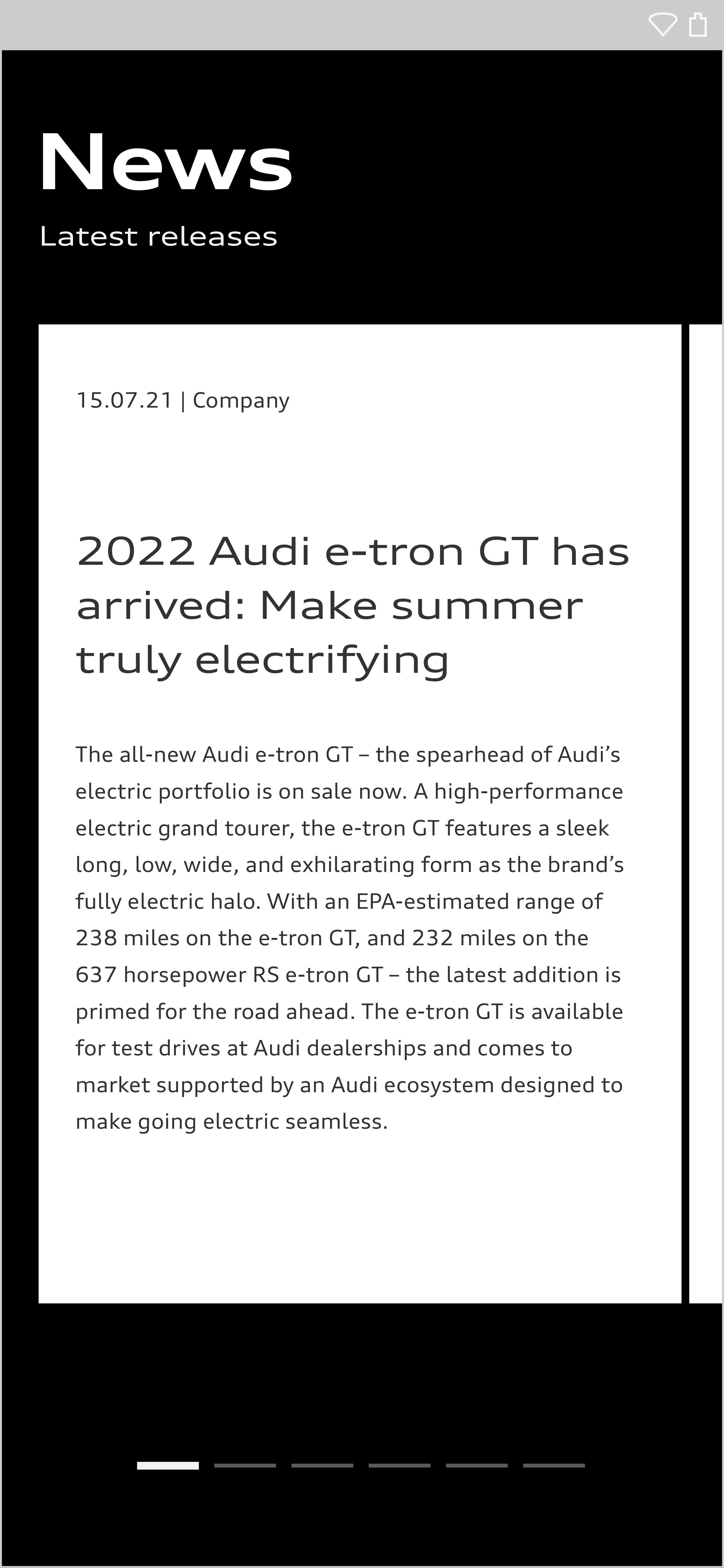
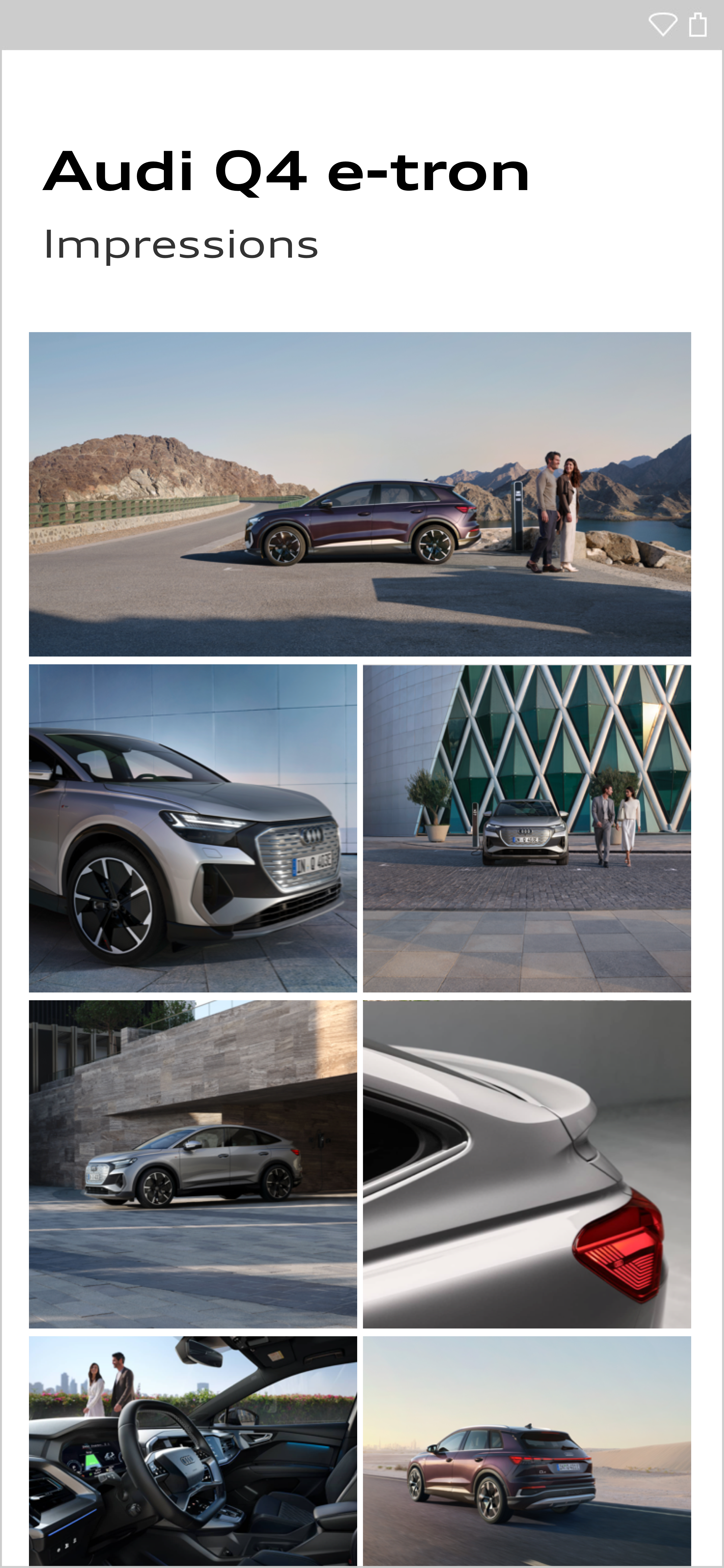
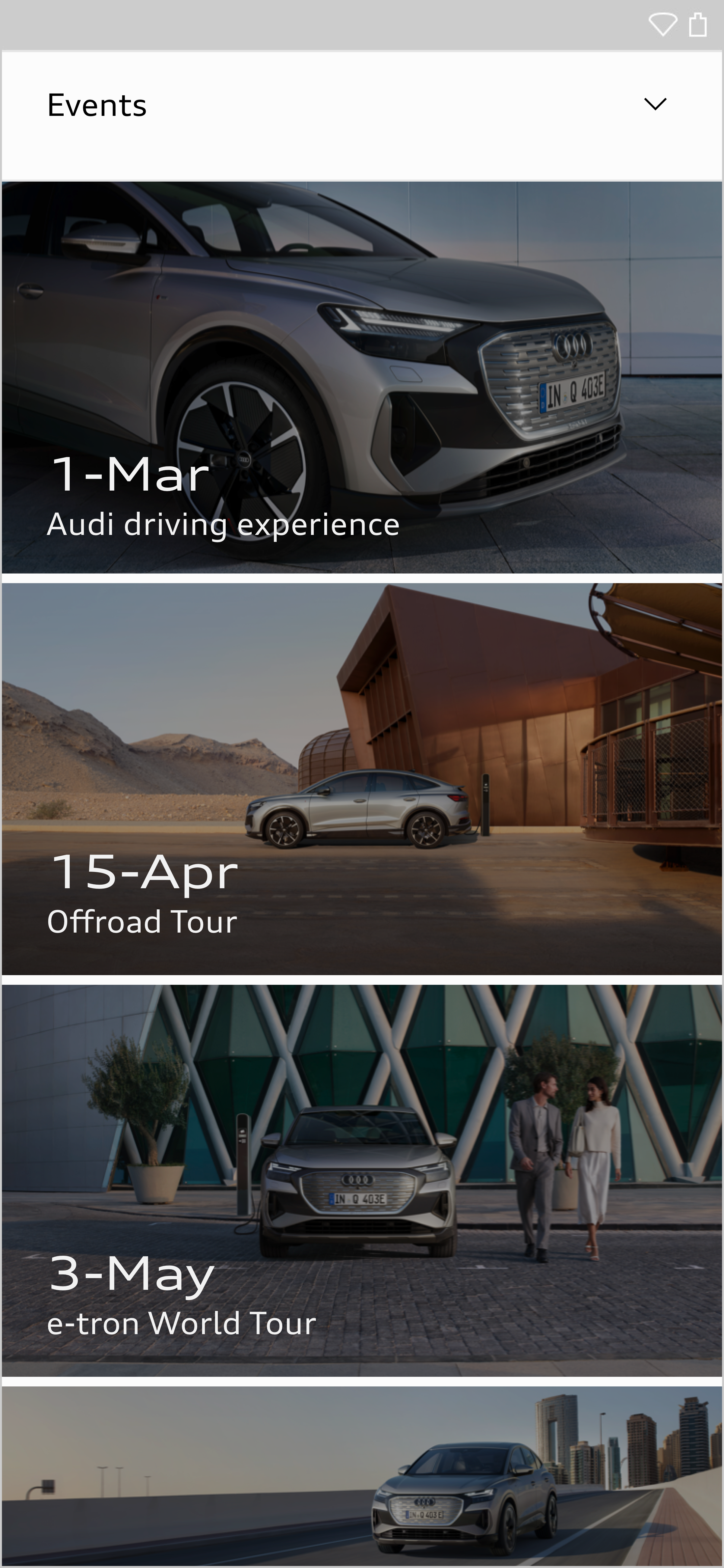
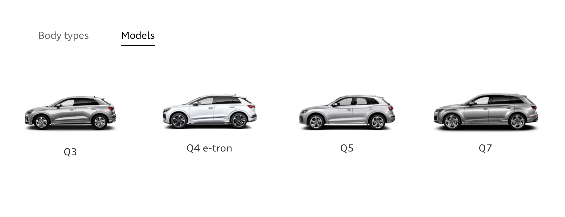
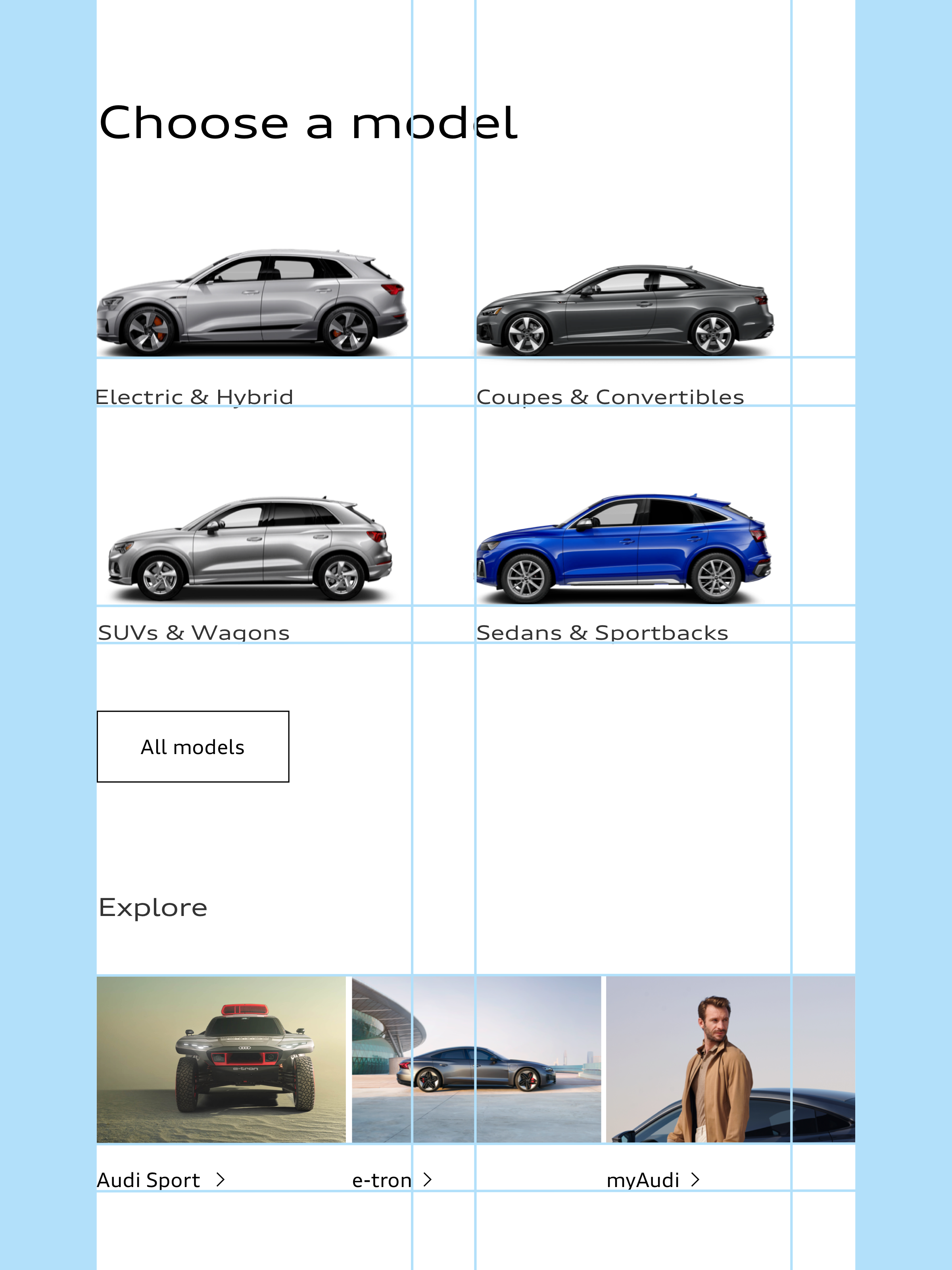
Structuring by means of tiles
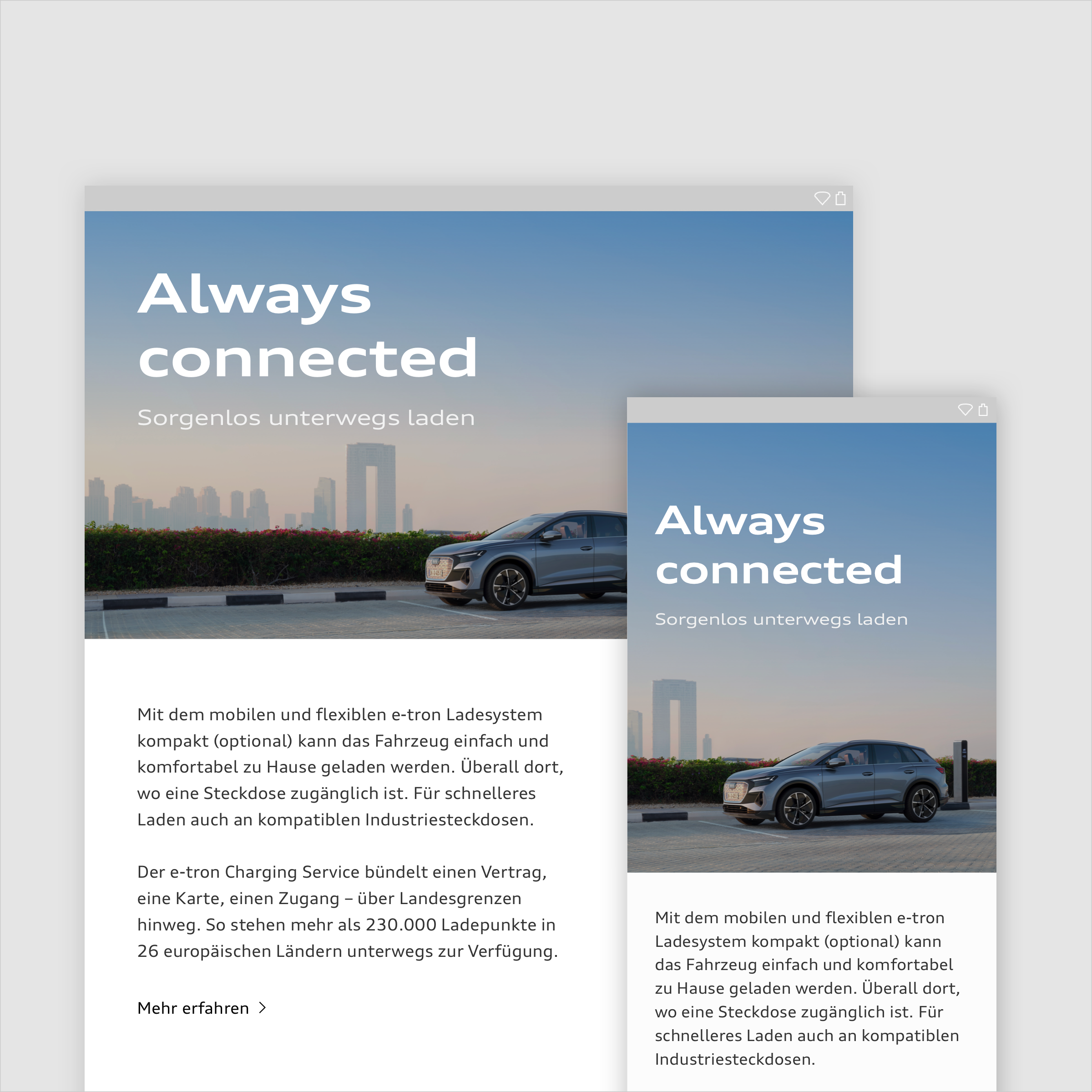
Content can be displayed inside rectangular tiles. Tiles are used in the brand colours. They can be separated from one another using narrow padding.
It is also possible to place an image in a tile which covers the full space. When doing so, ensure that there is sufficient contrast to the background on which the tile is placed, in order to clearly separate the colours from one another.
The tiles can in turn be divided in themselves according to the layout structure. This means that tiles may include both an image and a colour field. If tiles are assigned one or more functions, they are known as cards. Cards can be used both in the brand colours and in grey scale.
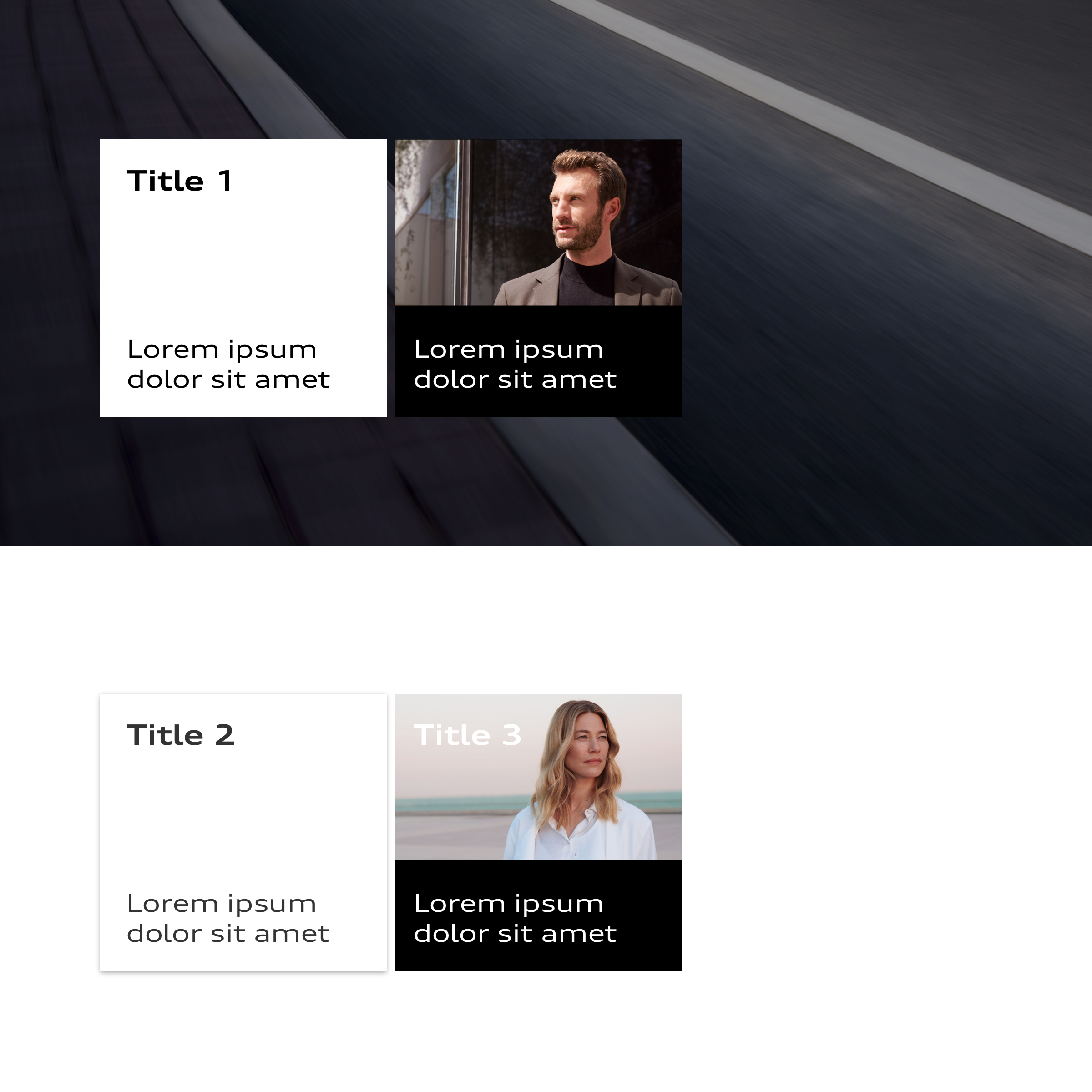
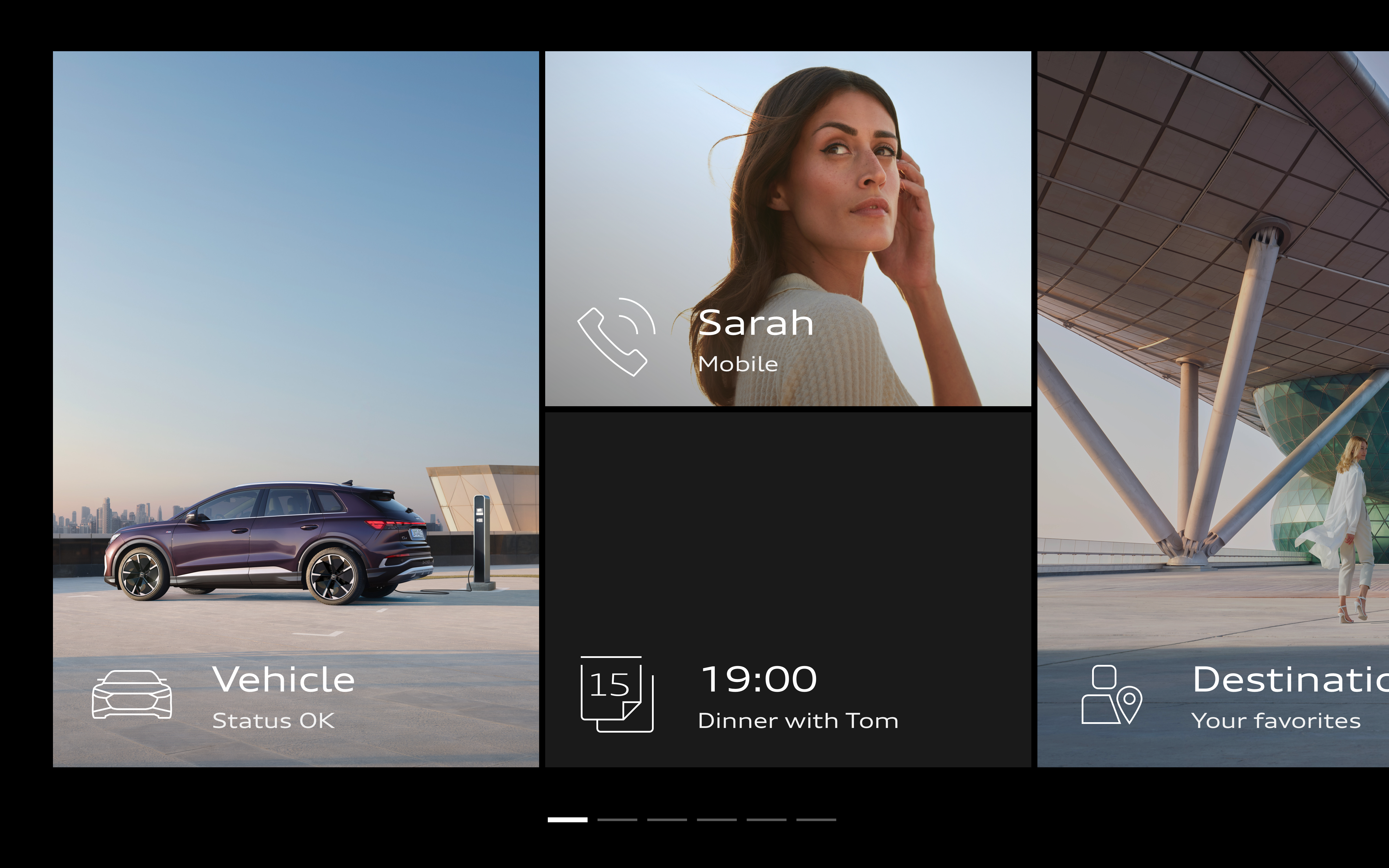

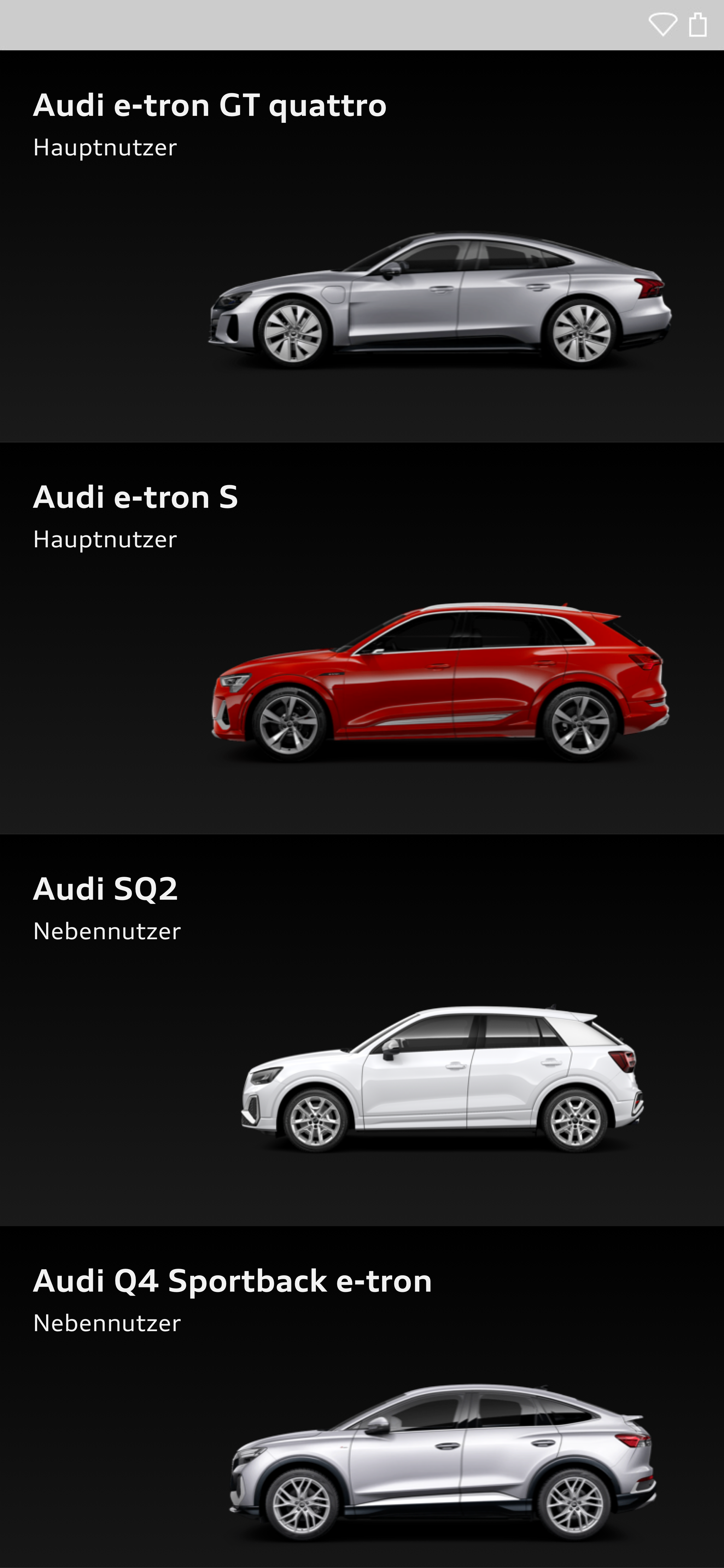
Hierarchical Structure and Highlighting
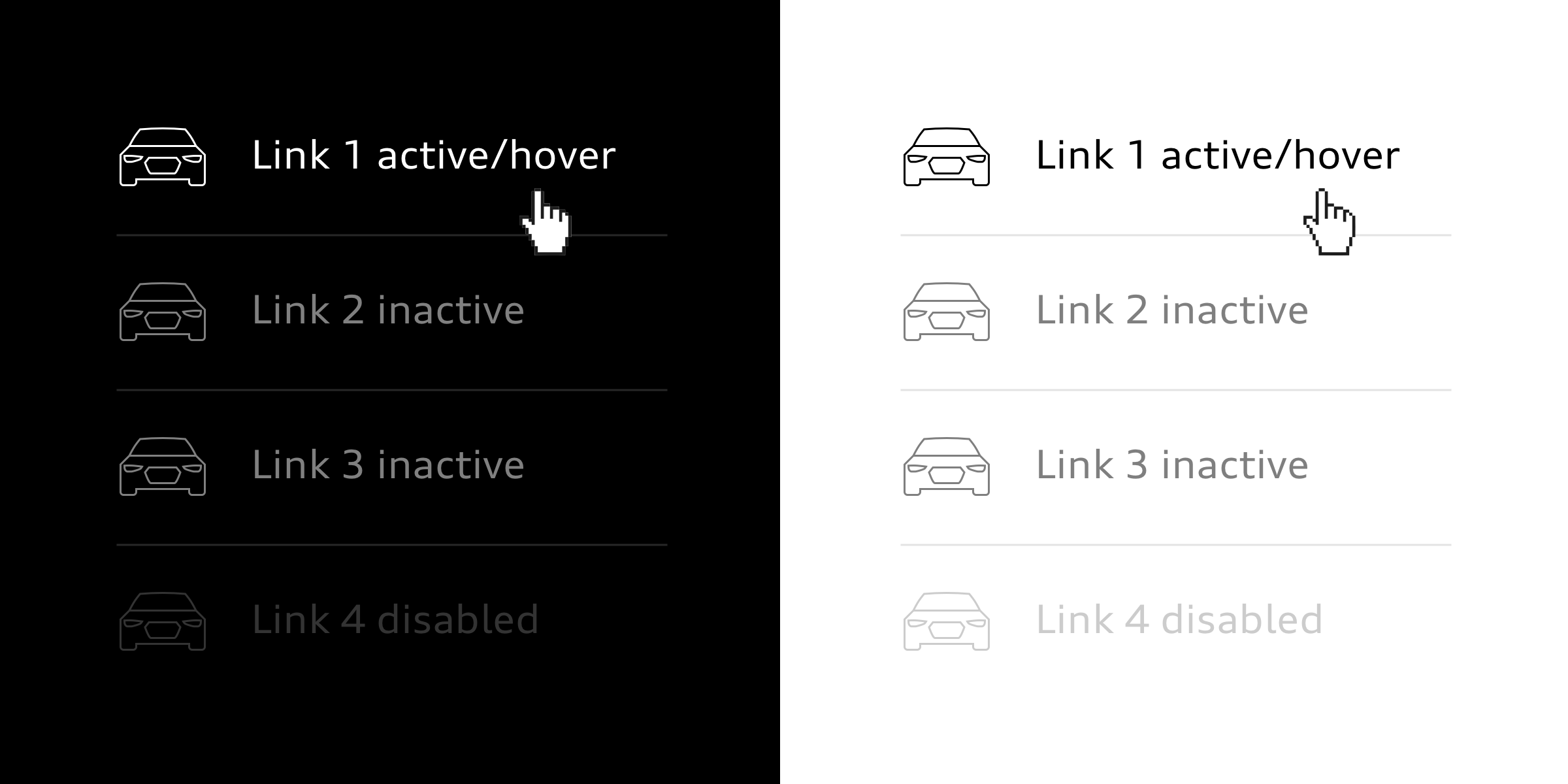
Elements and content items that are important to the user are highlighted by means of their size and placement.
In this way, the relevance and status of elements is conveyed through the way they contrast with their background. Active and important elements contrast starkly with the background. Inactive and less important elements exhibit a less marked contrast.
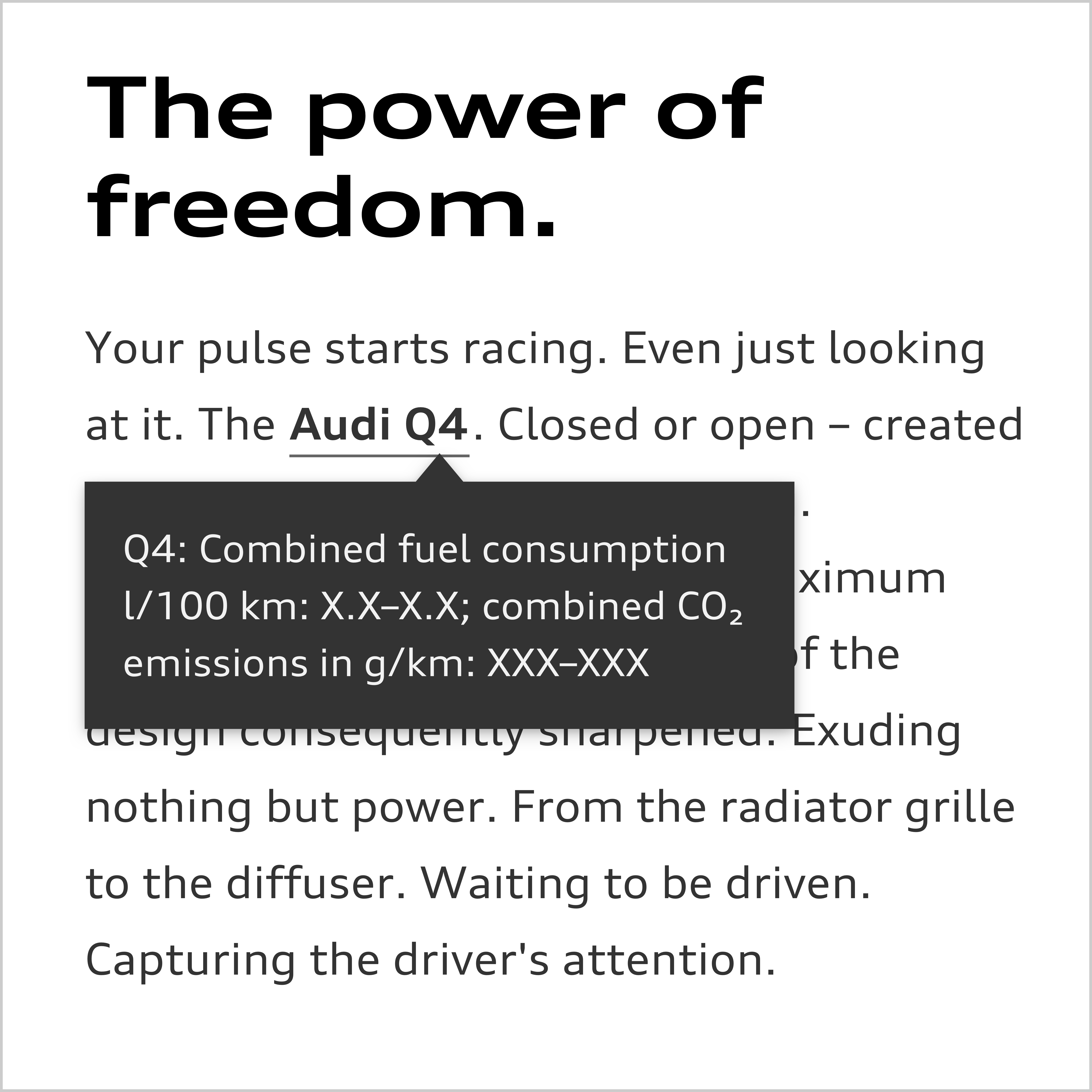
Superimpositions
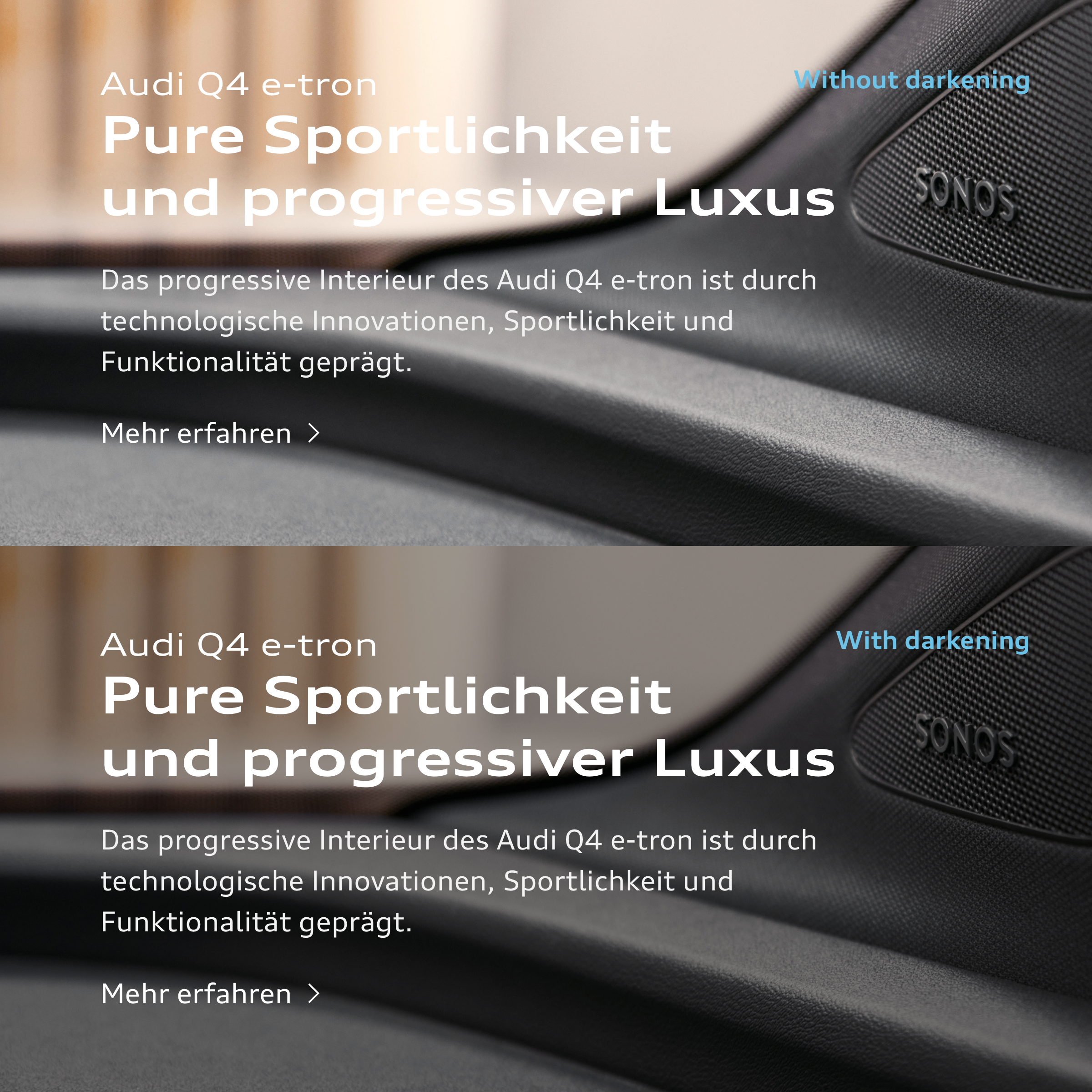
Superimpositions should be avoided as a general rule for purely design-based reasons. From a functional point of view, superimpositions are often necessary, e.g. in the case of a sticky header. Here the block which is one level above the layout is given a subtle soft shadow.
If the superimposing block is to be shifted into focus, the background is darkened with 90 % black. One example of this is modals.
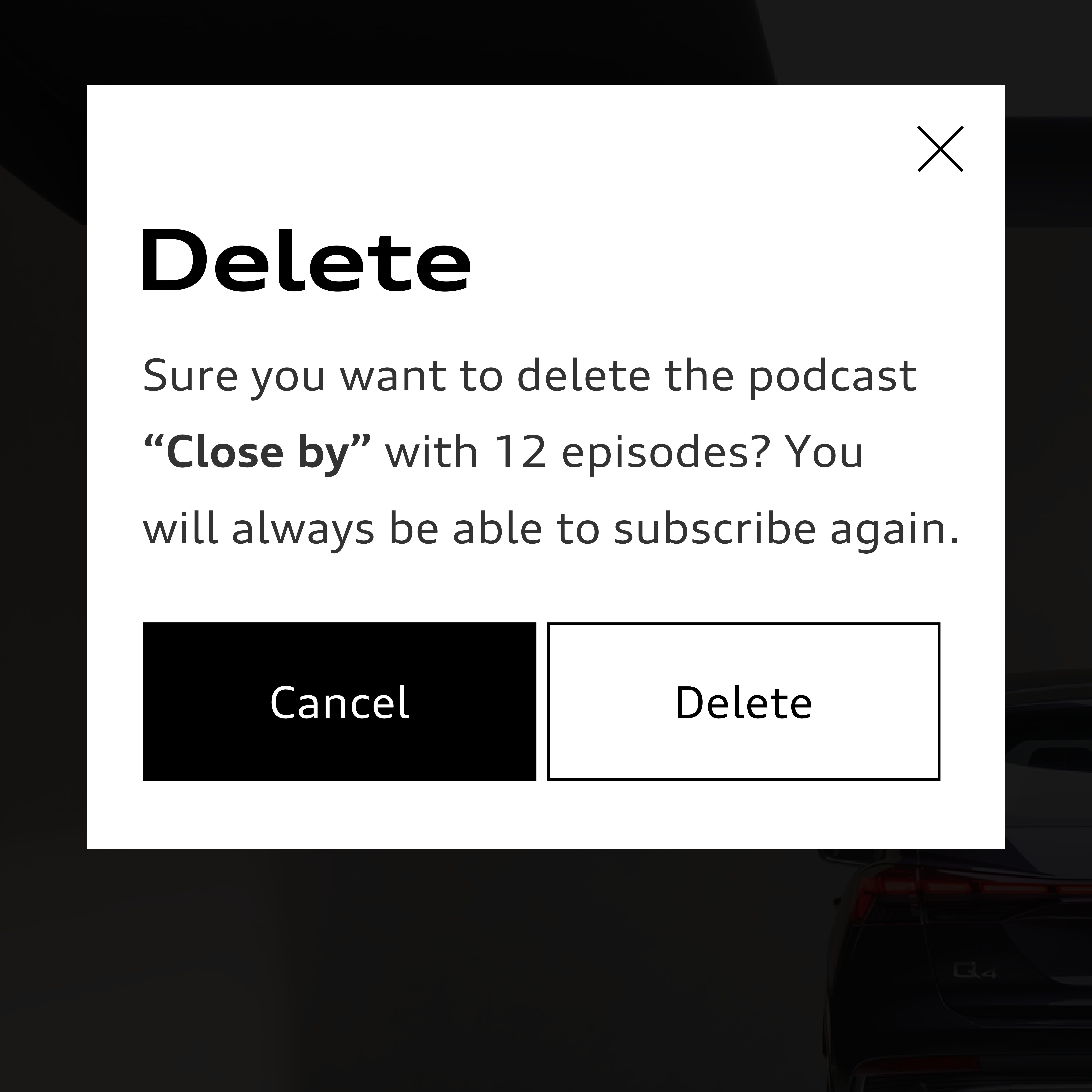
- The shadow used is as subtle as possible. It is only an aid for separating two white, overlapping fields.
- It is always made up of two shadows: a short one and a long one. The long, soft shadow creates space and depth. The short shadow reinforces the clear separation of blocks.
- The shadow is not offset. As a result it is the same on all four sides in the case of an block that is not bled to the edge.
- The shadow can be individually adjusted in size and opacity depending on background, context and viewport. It remains as subtle as possible, however.
- Display of the shadow in the browser and application should be checked since the same shadow definition produces different results in different layout programmes in some cases.
Basic definition in CSS
(box shadow: horizontal offset, vertical offset, soft focus/size, spread, colour and opacity):
- box shadow: 0 0 [2px–4px] 0 rgba(0, 0, 0, [0.03–0.1]), 0 0 [20px–80px] 0 rgba(0, 0, 0, [0.03–0.15]);
Examples of adaptations of the basic definition:
- box-shadow: 0 0 2px 0 rgba(0, 0, 0, 0.05), 0 0 40px 0 rgba(0, 0, 0, 0.05);
- box-shadow: 0 0 4px 0 rgba(0, 0, 0, 0.03), 0 0 60px 0 rgba(0, 0, 0, 0.09);
- box-shadow: 0 0 2px 0 rgba(0, 0, 0, 0.05), 0 0 20px 0 rgba(0, 0, 0, 0.05);


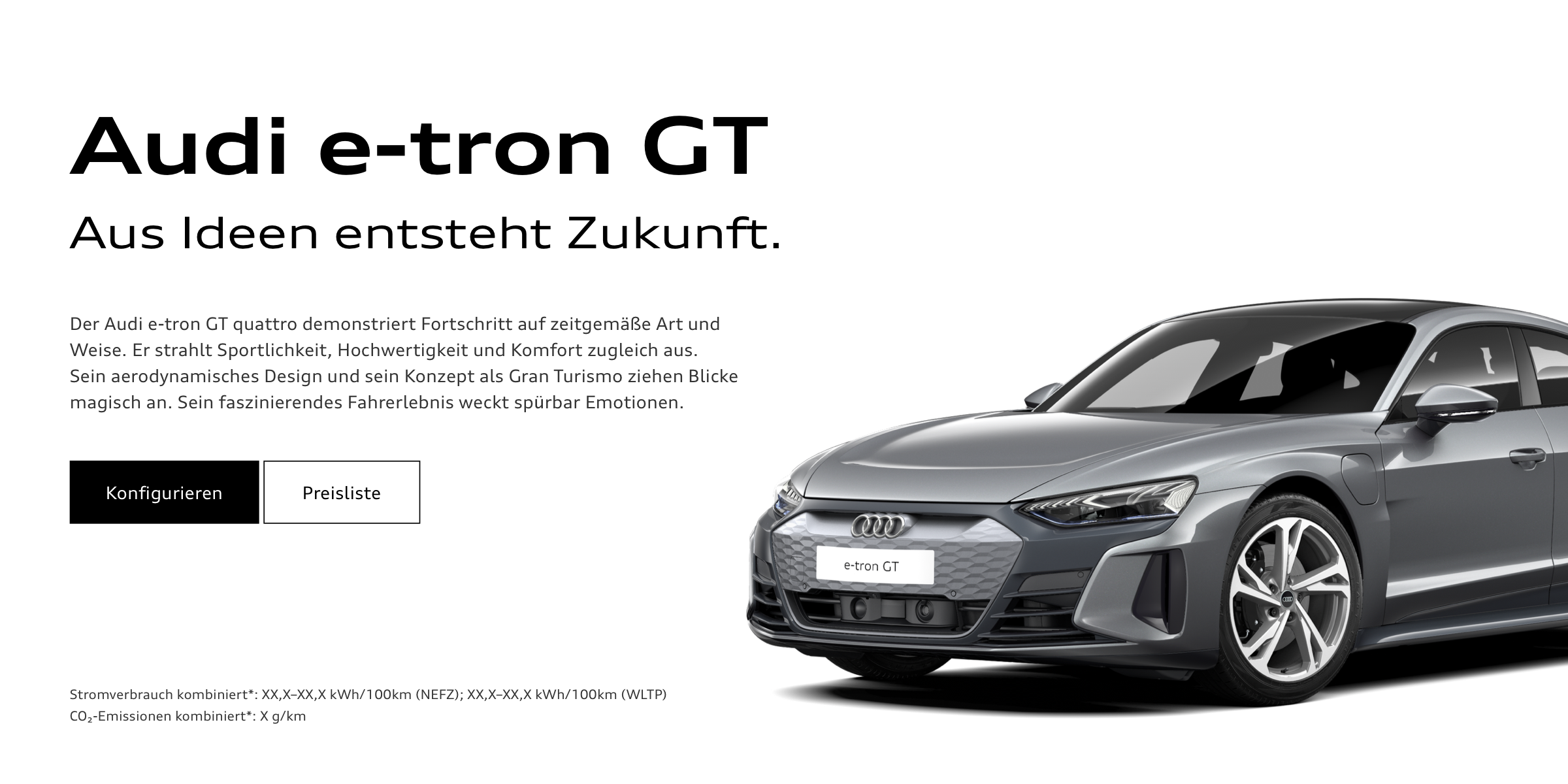
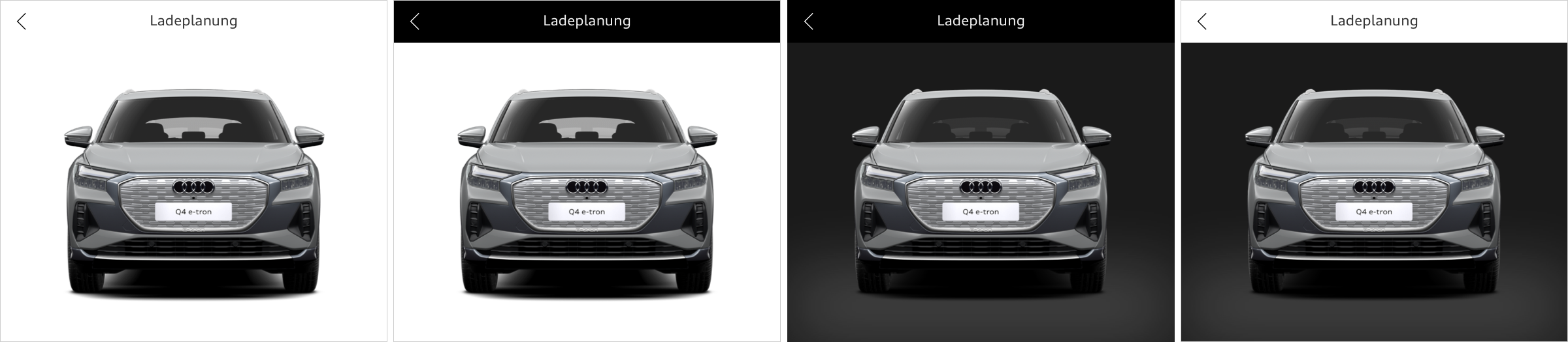
The gradient for cut-out images is applied at an angle of 90° from top to bottom. Possible colours are white, black and grey tones from the colour palette. The lighter colour is always 5 %–10 % lighter than the darker one. In the case of a gradient lighter than 30 % black, the darker shade is at the bottom. With a darker gradient, the reverse applies and the lighter shade is at the bottom.


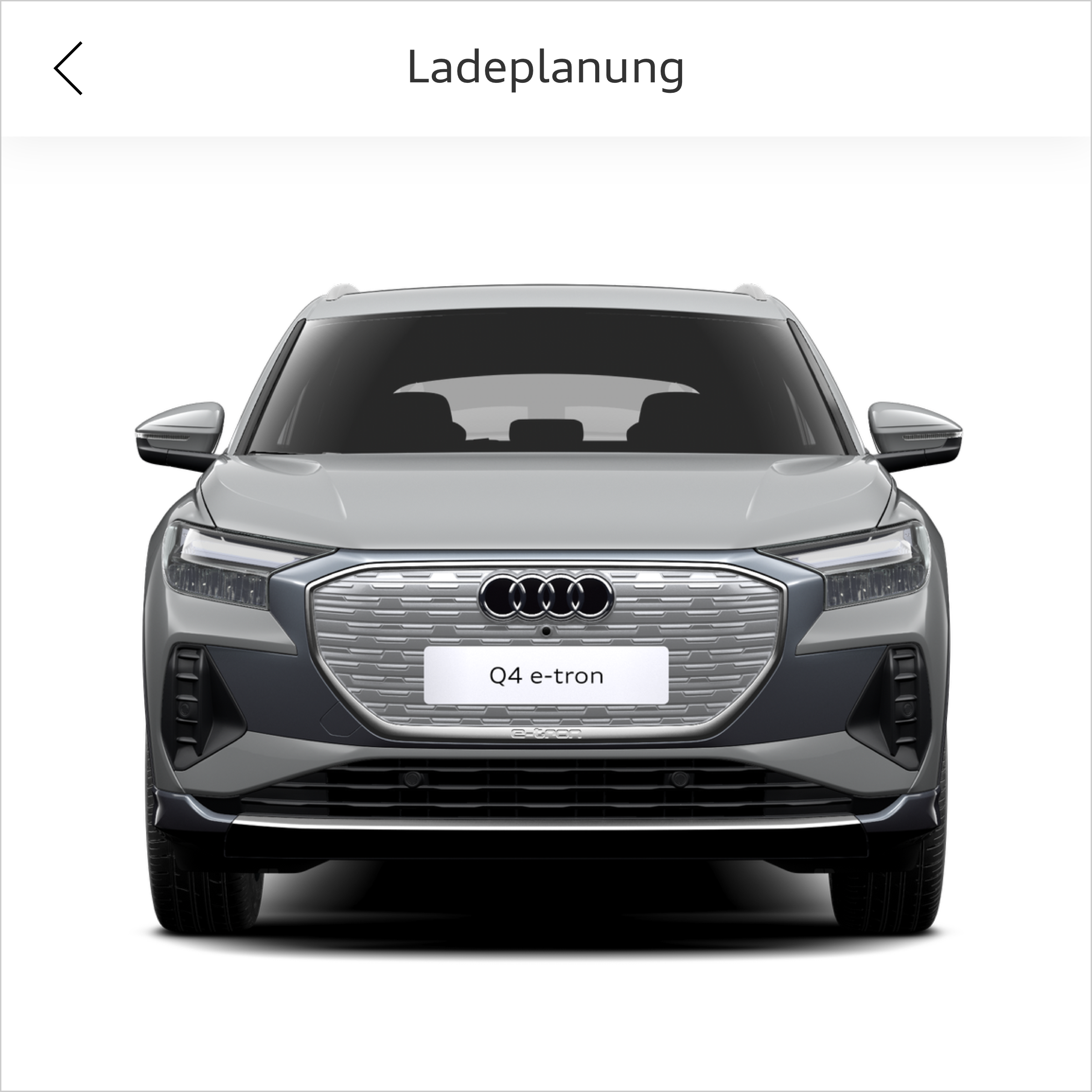
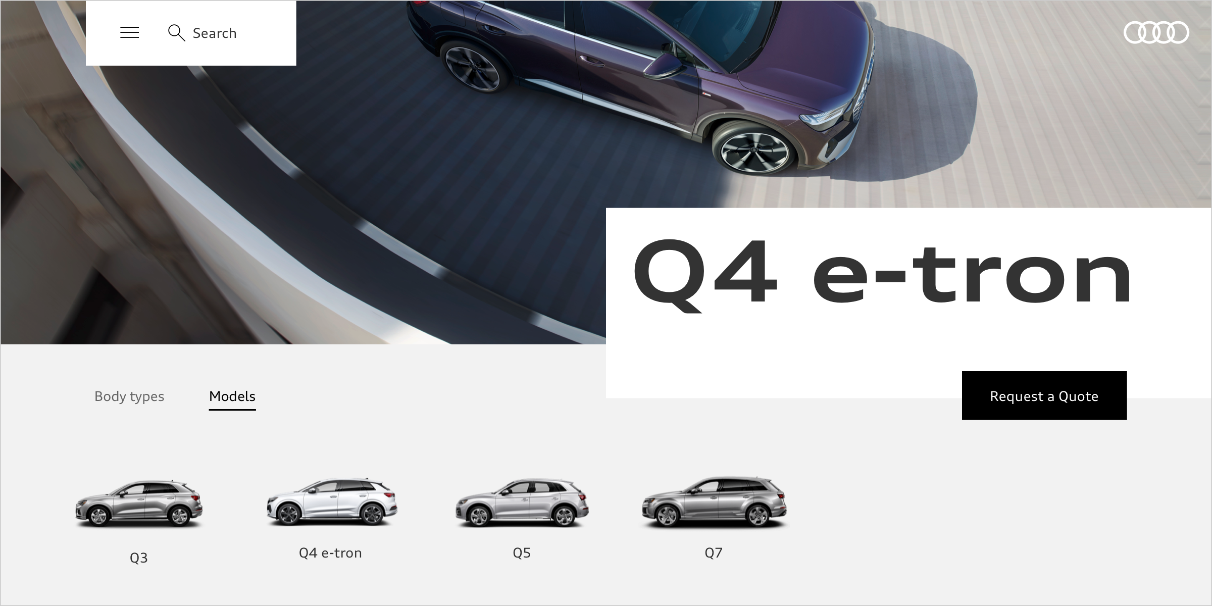
Placement of the Rings
The rings are placed prominently in the splash screen of an app, in the header or in navigation menus. On the following screens and on subpages, the rings do not have to be permanently visible.
Typographic elements and icons are placed vertically or horizontally to the inner edges of the rings.
Size of Text and Components
Type sizes and some components are designed to be adaptable in size to viewport width and purpose. In this way the layout can be kept compact with small viewports and a generous overall look can be created for large viewports. The size of the components is linked to the defined basic type size in question.


Animations
Animations give a dynamic and lively character to an app. They are used to fulfil functional tasks in the interface and to improve the user experience: they guide the user through an app, help to provide visual orientation between two views, give feedback in interactions, support visual cues and give information about a status. Overall, they provide a high-quality feeling.
Audi UI Kit – Integration into Sketch library
(supported until 30.06.2023)
To ensure designers are using the most up-to-date components and icons in their products, the Audi UI Kit was created as a sketch library. Integrate these UI Kits to get the latest Audi Sketch Libraries. Updates will be made regularly and users will be informed when new versions of the Librarys are available.
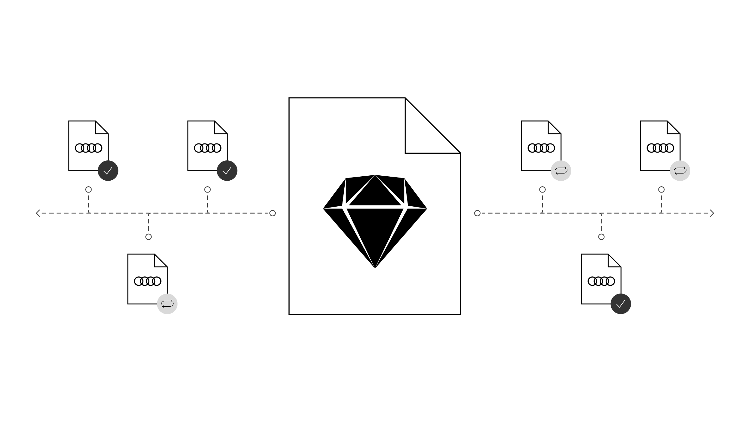
Audi UI Kit for Figma
To enable as many designers as possible to work with the Audi user interface components the UI Kit and icons is also offered for Figma. Updates are made regularly and all changes are documented for users in the changelog.
We strongly recommend to join the Audi Figma Workspace for being always up-to-date and to collaborate with others.The Audi Design Kits are already included into the Figma teams in the Audi Workspace. To get access to a team or project please reach out to us here.
In case you are not working directly in the Audi Figma workspace you find the latest version as download below.