Pagination
Adopting Core Components
We have added new React components to the Audi CI to ensure a uniform appearance on the web. All existing React components can be found in the Audi React Library. Audi will continue to develop and add to this library.
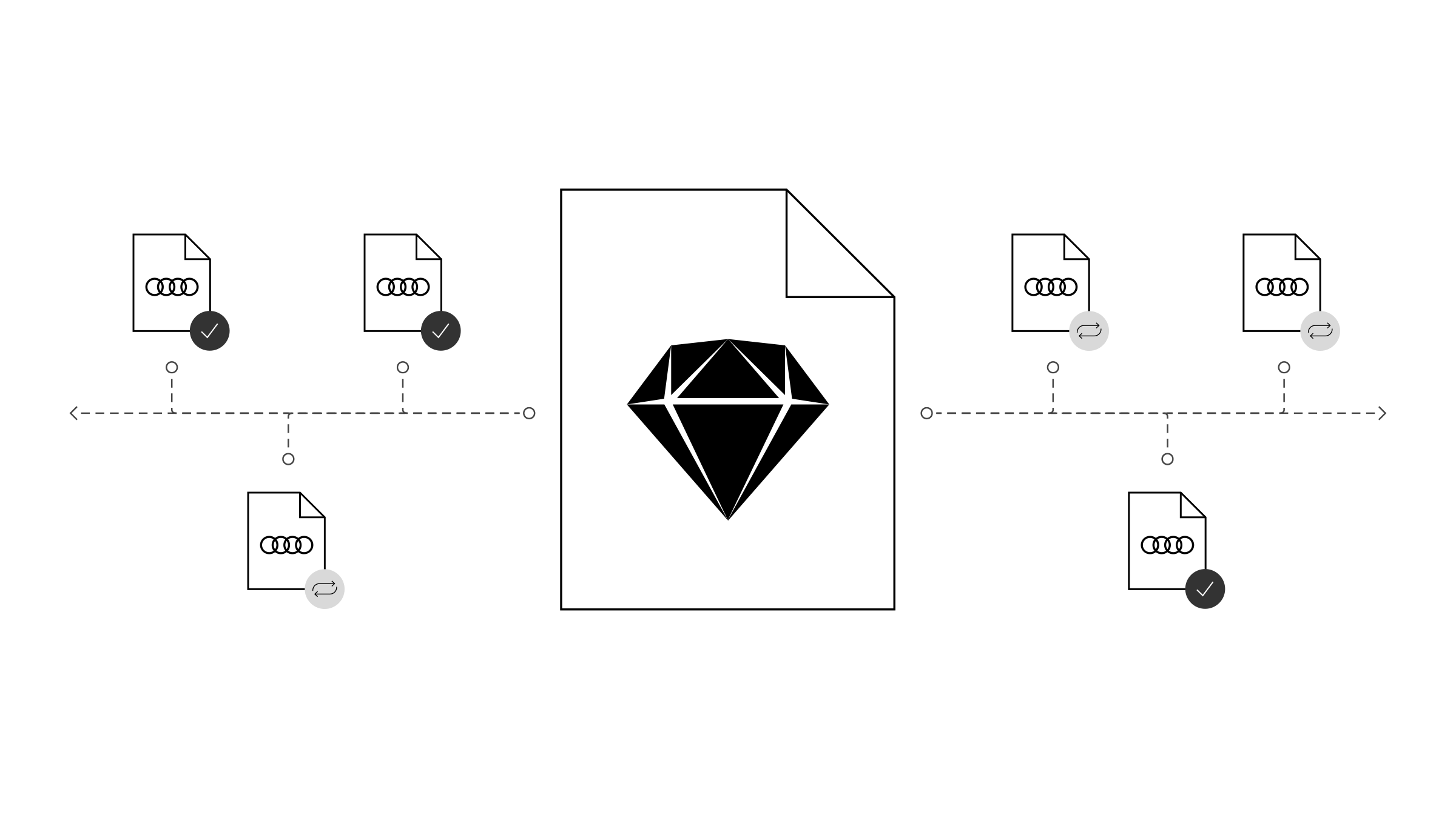
Pagination communicates the number of elements (images, articles, commentaries, pages …) that can be loaded within a given context. It shows the user where they are and enables direct access to previous and subsequent content item. It is possible to number pages and views or simply symbolise them by means of graphic elements.
The size of the pagination components depends on the basic type size used, which can adapt to the viewport width in question. As such, the size of the components is flexible. They are available in a dark and a light version.
Pagination
Pagination is used for changing larger page content items. It can be shown in steps or without steps.
The step-based display shows all available and directly selectable pages or content items as well as the current position. The current position is shown by means of underlining and a strong contrast.
<nav class="aui-pagination aui-js-pagination">
	<ul class="aui-pagination__items">
		<li class="aui-pagination__item">
			<a class="aui-pagination__prev" href="#0">
				<i class="aui-pagination__prev-icon">
					<svg viewBox="0 0 8 13"><path d="M1.5,1 l6,6 l-6,6" /></svg>
				</i>
				<span class="aui-sr-only">Previous</span>
			</a>
		</li>
		<li class="aui-pagination__item">
			<a class="aui-pagination__link" href="#0">1</a>
		</li>
		<li class="aui-pagination__item">
			<span class="aui-pagination__ellipsis">…</span>
		</li>
		<li class="aui-pagination__item">
			<a class="aui-pagination__link" href="#0">9</a>
		</li>
		<li class="aui-pagination__item">
			<a class="aui-pagination__link is-active" href="#0">10</a>
		</li>
		<li class="aui-pagination__item">
			<a class="aui-pagination__link" href="#0">11</a>
		</li>
		<li class="aui-pagination__item">
			<span class="aui-pagination__ellipsis">…</span>
		</li>
		<li class="aui-pagination__item">
			<a class="aui-pagination__link" href="#0">20</a>
		</li>
		<li class="aui-pagination__item">
			<a class="aui-pagination__next" href="#0" disabled>
				<i class="aui-pagination__next-icon">
					<svg viewBox="0 0 8 13"><path d="M1.5,1 l6,6 l-6,6" /></svg>
				</i>
				<span class="aui-sr-only">Next</span>
			</a>
		</li>
	</ul>
</nav>
<style media="screen">
	body {
		background-color: #f2f2f2;
		padding: 50px;
	}
</style>
The stepless display shows the current position and the total number of pages or content items. The user can only navigate forwards or backwards in a linear fashion by means of arrows. This means that direct selection of a particular page or content item is not possible. The current position is emphasised by means of a strong contrast.
<nav>
	<ul class="aui-pager">
		<li class="aui-pager__item">
			<a class="aui-pager__prev" href="#0">
				<i class="aui-pager__prev-icon">
					<svg viewBox="0 0 8 13"><path d="M1.5,1 l6,6 l-6,6" /></svg>
				</i>
				<span class="aui-sr-only">Previous</span>
			</a>
		</li>
		<li class="aui-pager__item">
			<span class="aui-pager__pagination"><span class="aui-pager__current">4</span>/10</span>
		</li>
		<li class="aui-pager__item">
			<a class="aui-pager__next" href="#0">
				<span class="aui-sr-only">Next</span>
				<i class="aui-pager__next-icon">
					<svg viewBox="0 0 8 13"><path d="M1.5,1 l6,6 l-6,6" /></svg>
				</i>
			</a>
		</li>
	</ul>
</nav>

<style media="screen">
	body {
		background-color: #f2f2f2;
		padding: 50px;
	}
</style>
<nav>
	<ul class="aui-pager">
		<li class="aui-pager__item">
			<a class="aui-pager__prev" href="#0">
				<i class="aui-pager__prev-icon">
					<svg viewBox="0 0 8 13"><path d="M1.5,1 l6,6 l-6,6" /></svg>
				</i>
				<span class="aui-sr-only">Previous</span>
			</a>
		</li>
		<li class="aui-pager__item">
			<a class="aui-pager__next" href="#0">
				<span class="aui-sr-only">Next</span>
				<i class="aui-pager__next-icon">
					<svg viewBox="0 0 8 13"><path d="M1.5,1 l6,6 l-6,6" /></svg>
				</i>
			</a>
		</li>
	</ul>
</nav>

<style media="screen">
	body {
		background-color: #f2f2f2;
		padding: 50px;
	}
</style>
Indicator
The indicator shows the user’s position in a series of items. For example, it is used for media content that is shown in a slideshow. The indicator is placed horizontally below the media content in a centred position. For a quantity of 7 slides or more, one of the other paginations is recommended.
- 1 Lorem ipsum dolor sit amet, consectetur adipisicing elit, sed do eiusmod tempor incididunt ut labore et dolore magna aliqua. Ut enim ad minim veniam, quis nostrud exercitation ullamco laboris nisi ut aliquip ex ea commodo consequat. Duis aute irure dolor in reprehenderit in voluptate velit esse cillum dolore eu fugiat nulla pariatur. Excepteur sint occaecat cupidatat non proident, sunt in culpa qui officia deserunt mollit anim id est laborum.
- 2
- 3
- 4
- 5
- 6
<div class="aui-indicator aui-js-indicator">
  <ul class="aui-indicator__items">
    <li class="aui-indicator__item"><a class="aui-indicator__trigger"><span class="aui-indicator__dot" class="is-active">1 Lorem ipsum dolor sit amet, consectetur adipisicing elit, sed do eiusmod tempor incididunt ut labore et dolore magna aliqua. Ut enim ad minim veniam, quis nostrud exercitation ullamco laboris nisi ut aliquip ex ea commodo consequat. Duis aute irure dolor in reprehenderit in voluptate velit esse cillum dolore eu fugiat nulla pariatur. Excepteur sint occaecat cupidatat non proident, sunt in culpa qui officia deserunt mollit anim id est laborum.</span></a></li>
    <li class="aui-indicator__item"><a class="aui-indicator__trigger"><span class="aui-indicator__dot">2</span></a></li>
    <li class="aui-indicator__item"><a class="aui-indicator__trigger"><span class="aui-indicator__dot">3</span></a></li>
    <li class="aui-indicator__item"><a class="aui-indicator__trigger"><span class="aui-indicator__dot">4</span></a></li>
    <li class="aui-indicator__item"><a class="aui-indicator__trigger"><span class="aui-indicator__dot">5</span></a></li>
    <li class="aui-indicator__item"><a class="aui-indicator__trigger"><span class="aui-indicator__dot">6</span></a></li>
  </ul>
</div>
Audi UI Kit – Integration into Sketch library
(supported until 30.06.2023)
To ensure designers are using the most up-to-date components and icons in their products, the Audi UI Kit was created as a sketch library. Integrate these UI Kits to get the latest Audi Sketch Libraries. Updates will be made regularly and users will be informed when new versions of the Librarys are available.
Audi UI Kit for Figma
To enable as many designers as possible to work with the Audi user interface components the UI Kit and icons is also offered for Figma. Updates are made regularly and all changes are documented for users in the changelog.
We strongly recommend to join the Audi Figma Workspace for being always up-to-date and to collaborate with others.The Audi Design Kits are already included into the Figma teams in the Audi Workspace. To get access to a team or project please reach out to us here.
In case you are not working directly in the Audi Figma workspace you find the latest version as download below.
