
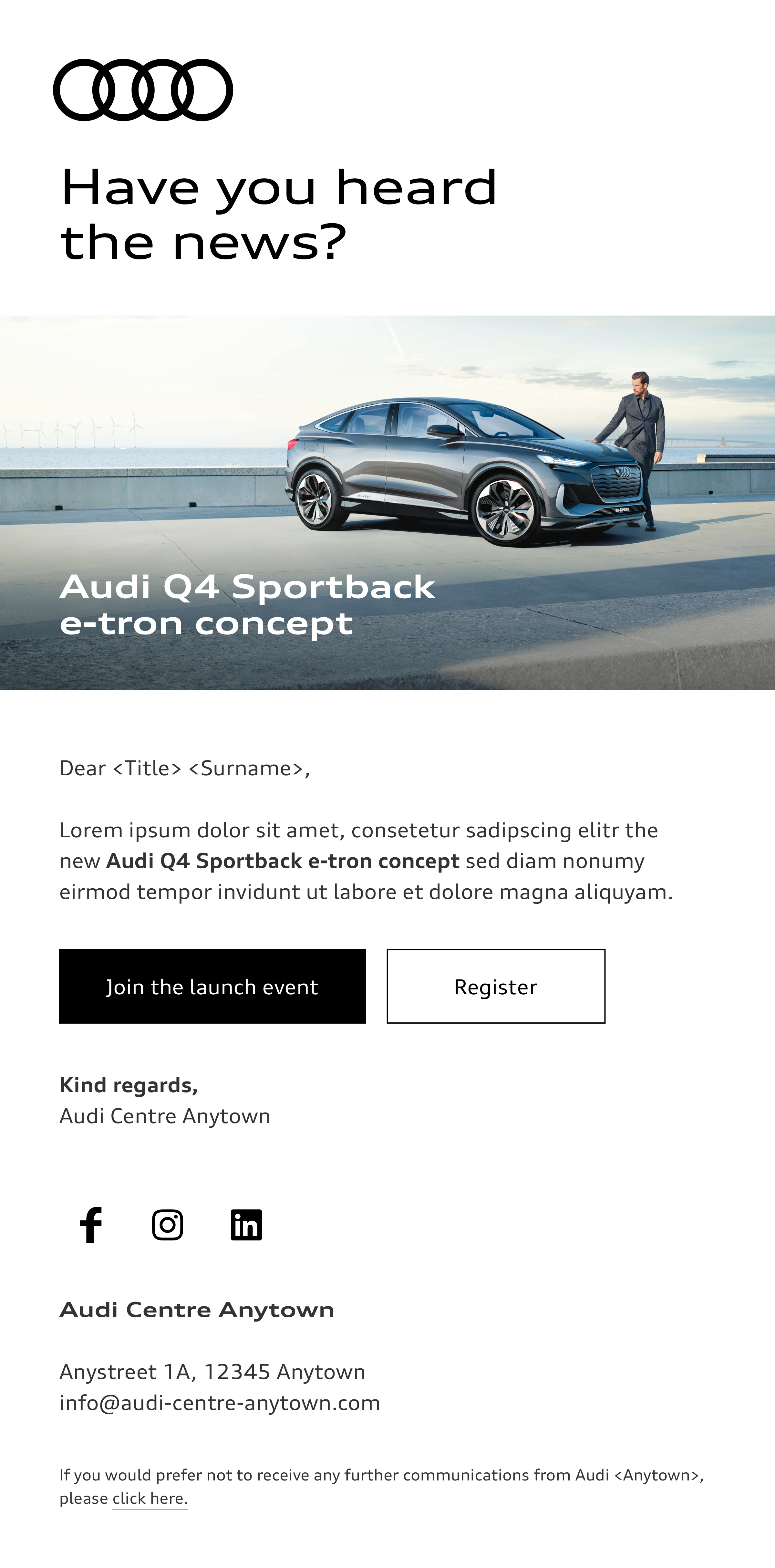
Newsletter
Basics
When preparing newsletters, the brand elements (rings, colours, typography, imagery, layout structure and icons) are employed as described in the Basics chapter. Particular attention must be paid to the correct use of buttons and text styles in newsletters.
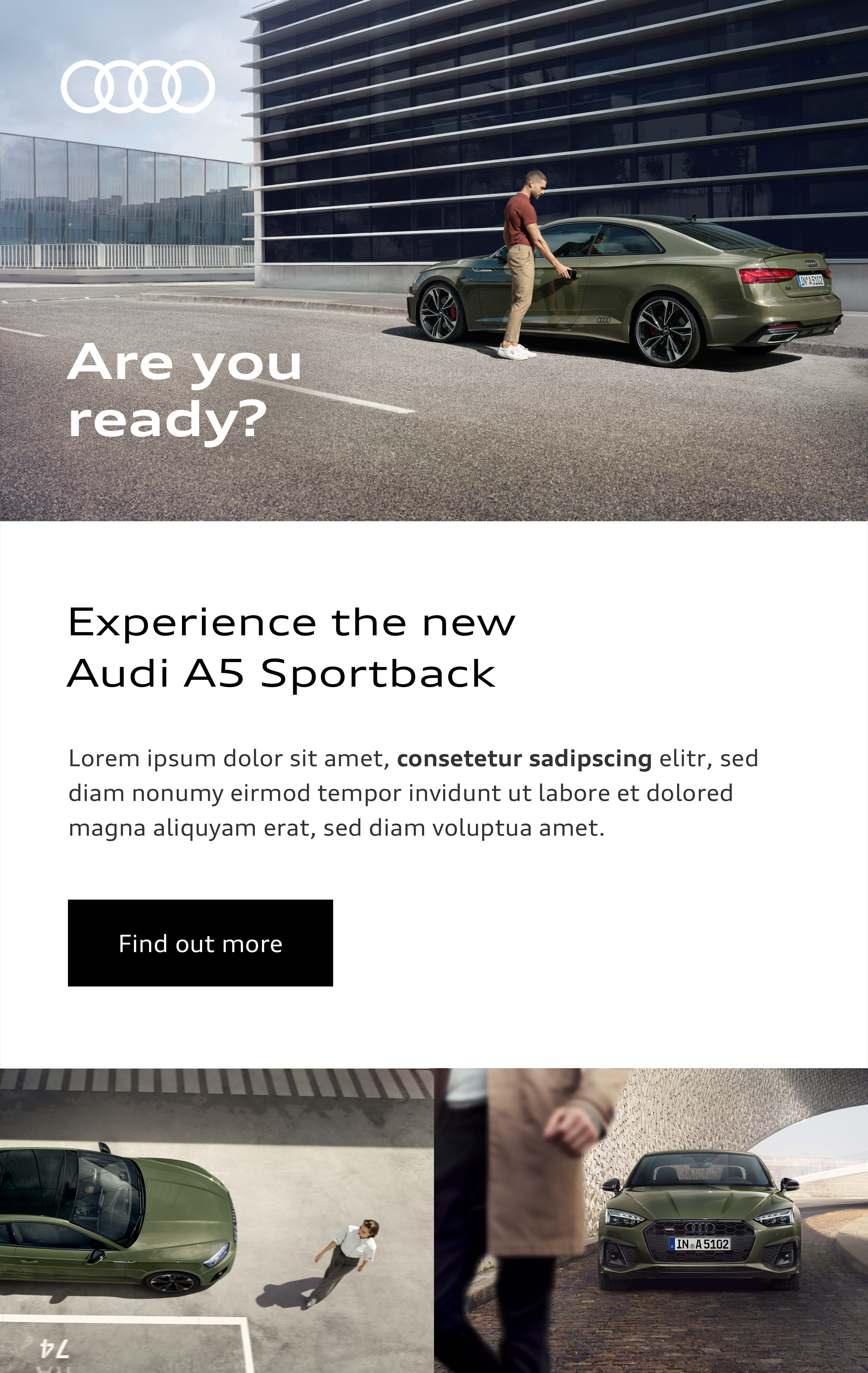
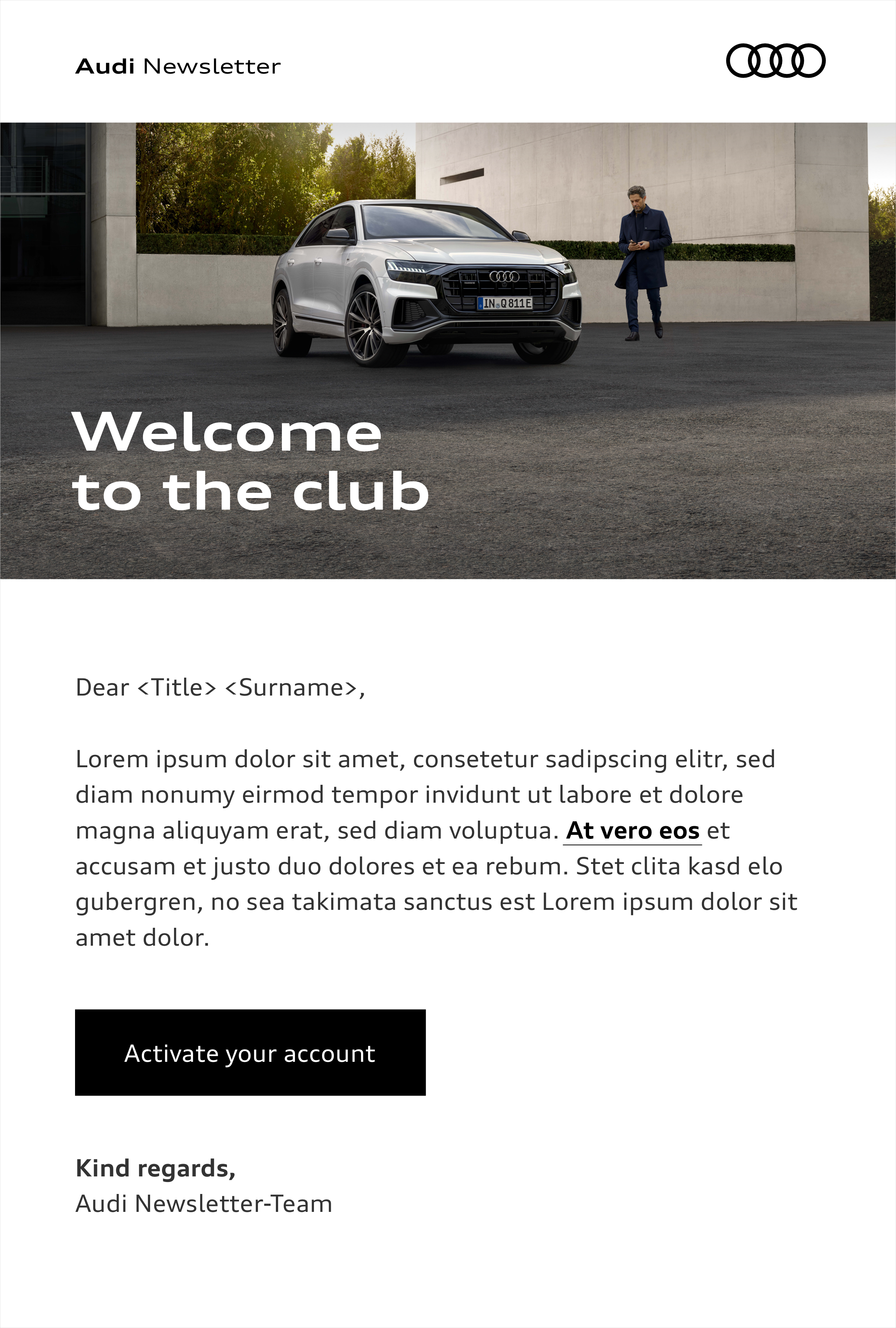
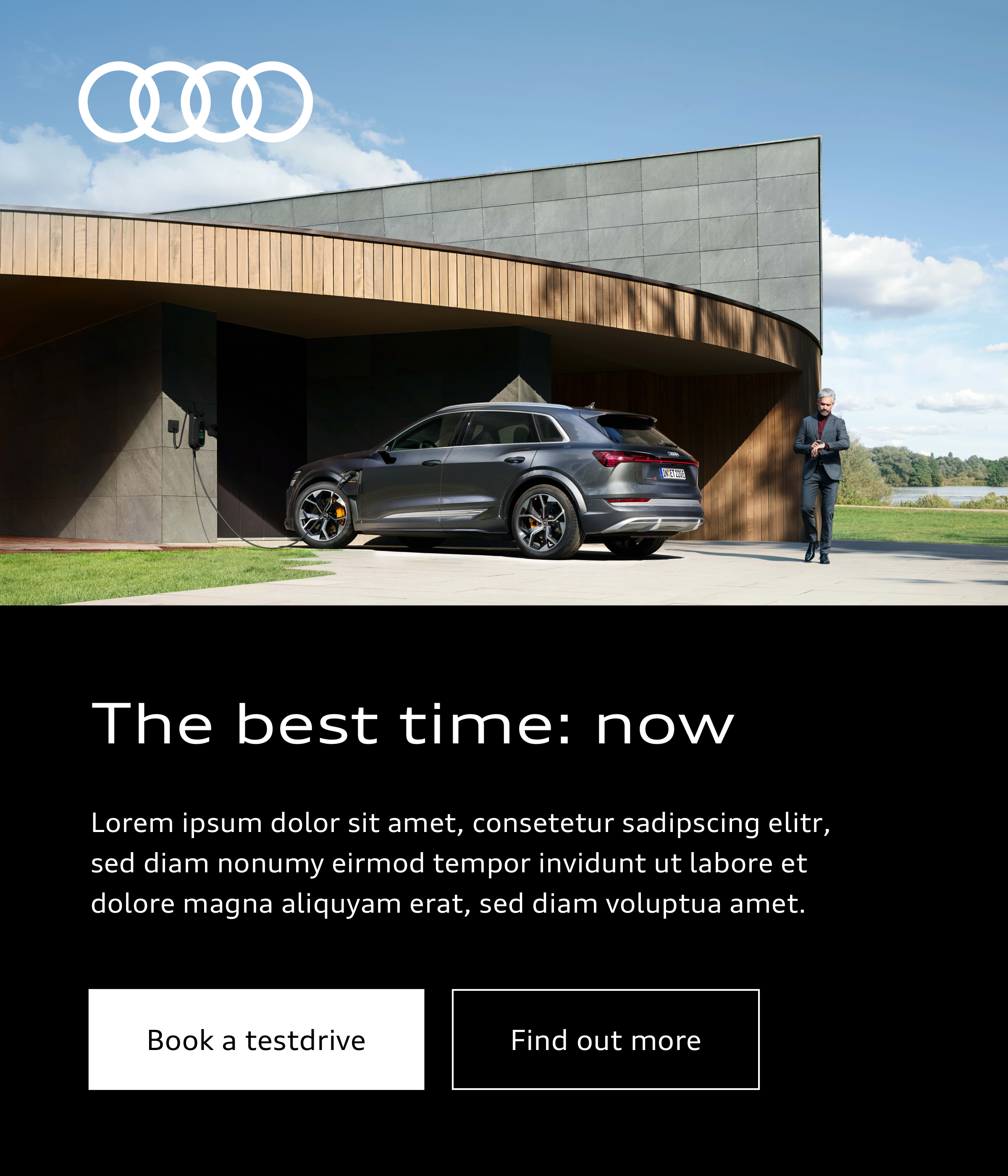
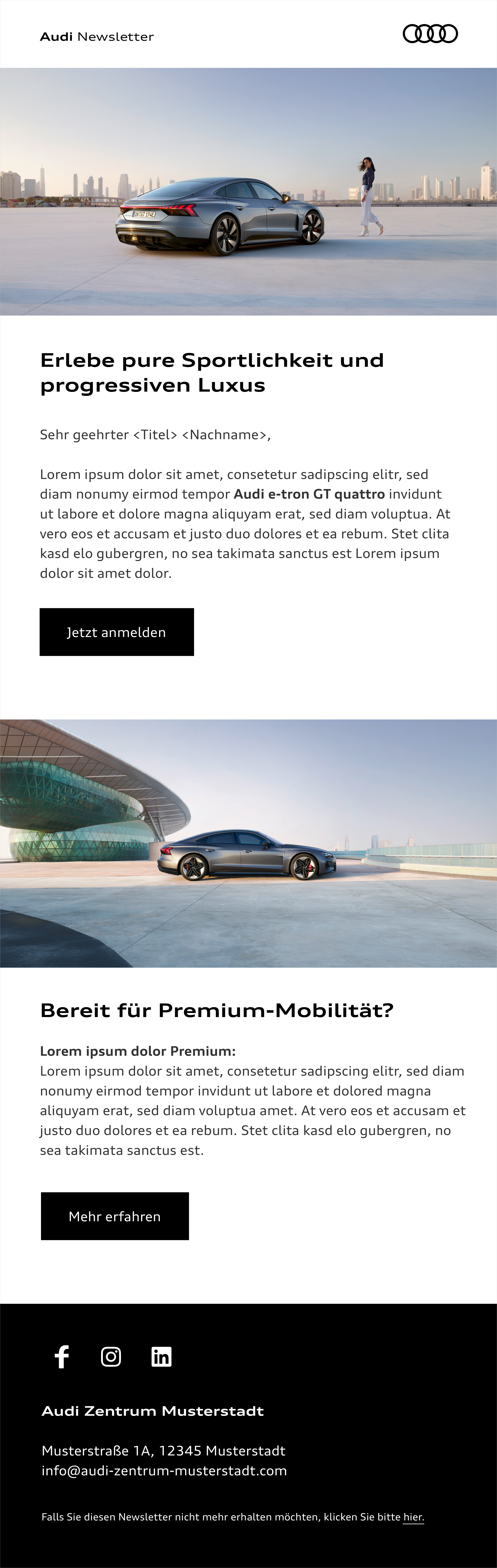
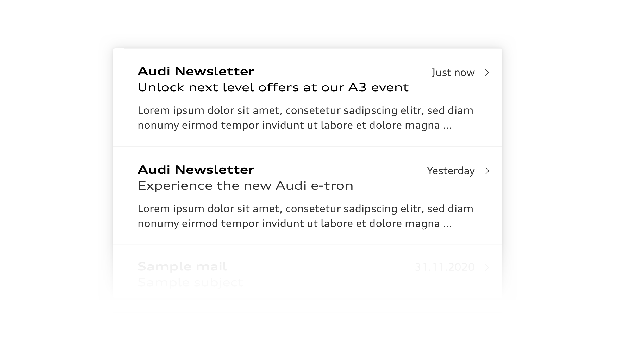
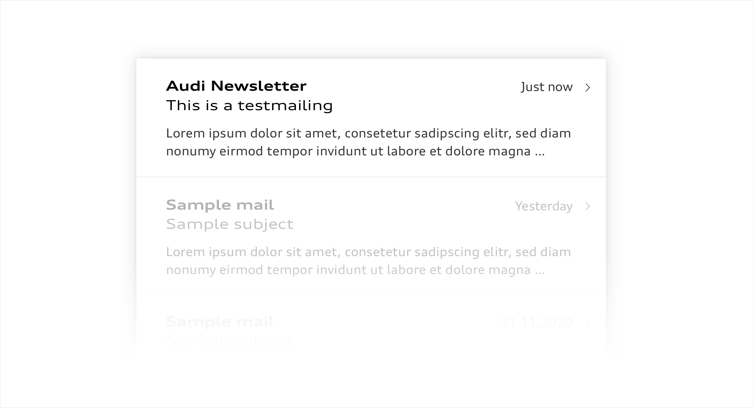
Newsletters are normally made up of the following contents:
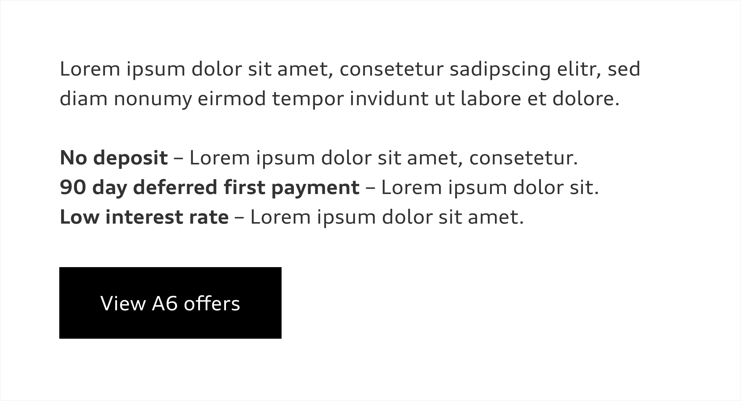
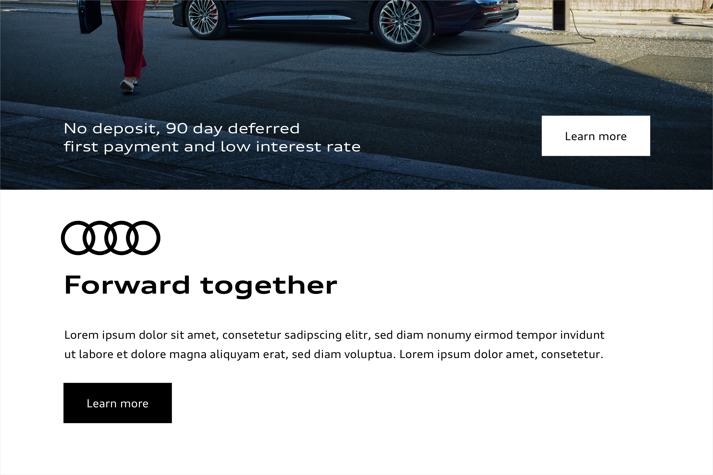
- an appealing header image with a meaningful headline,
- a short introduction in which the core message of the newsletter is communicated,
- an information section with a manageable amount of copy, images and calls to action,
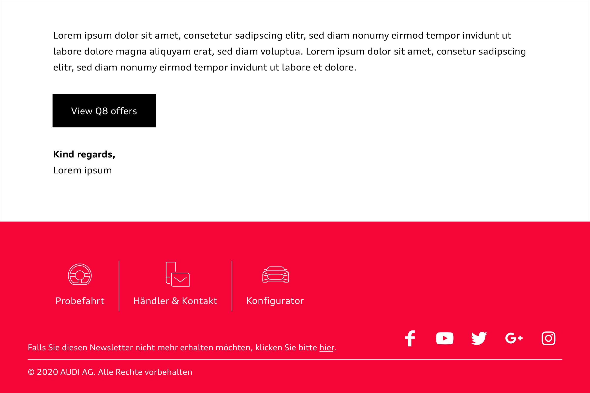
- a footer with links for making contact as well as all the necessary legal information (country-specific).
Use of typefaces
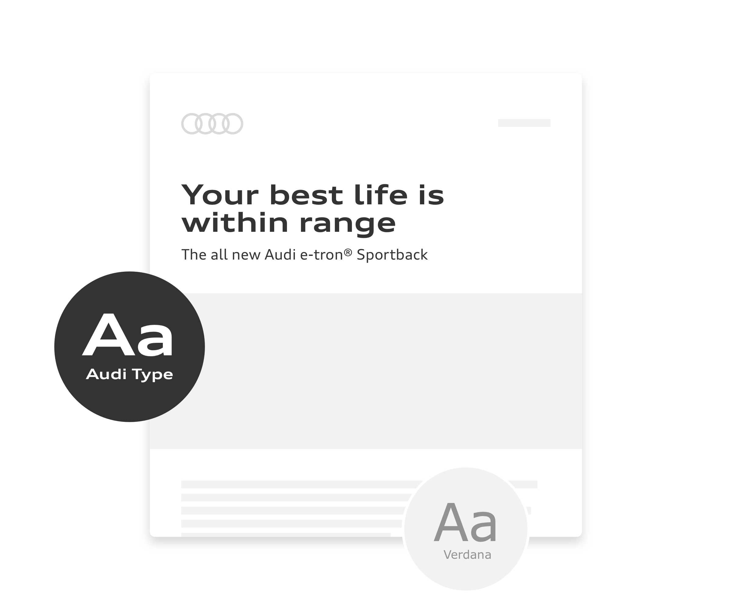
Audi Type Extended is used for headlines and sublines. The requirements for using further styles and specifications on matters such as colours can be taken from the Text Styles guide. In order to ensure optimum compatibility with all email clients, the system typeface Verdana can be used for all body copy as a fallback. The same size recommendations apply here as for Audi Type. Only Audi Type styles are used in images.
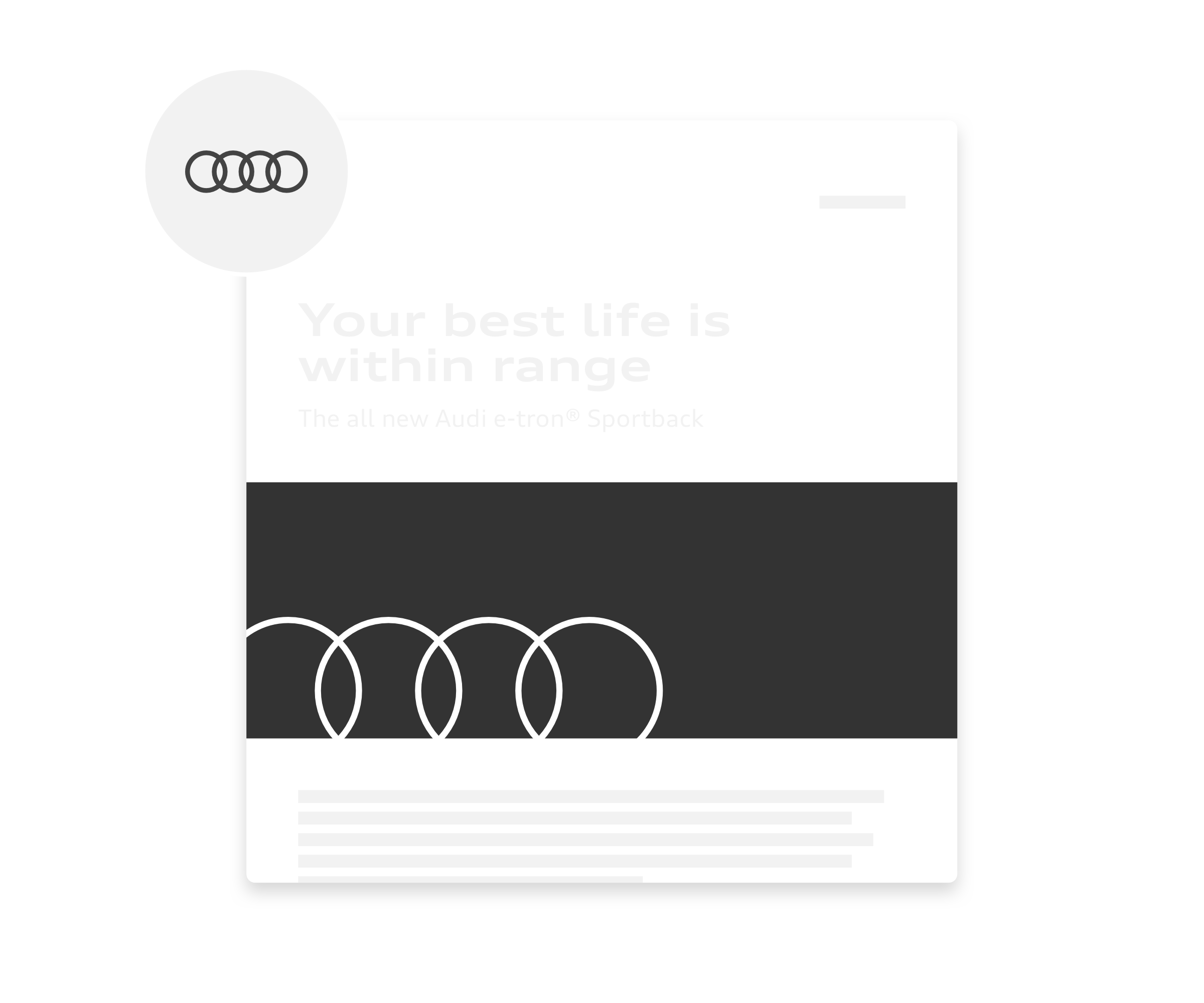
Use of rings
The Audi Rings Standard are used as the classic sender (e.g. top right in the header of the newsletter).Within the header image the rings can be used with flexible line widths and positioning.
To avoid over-branding, the Audi rings will be placed no more than twice: as a sender and in the header and/or header image. Rings in the content area or footer should be avoided.
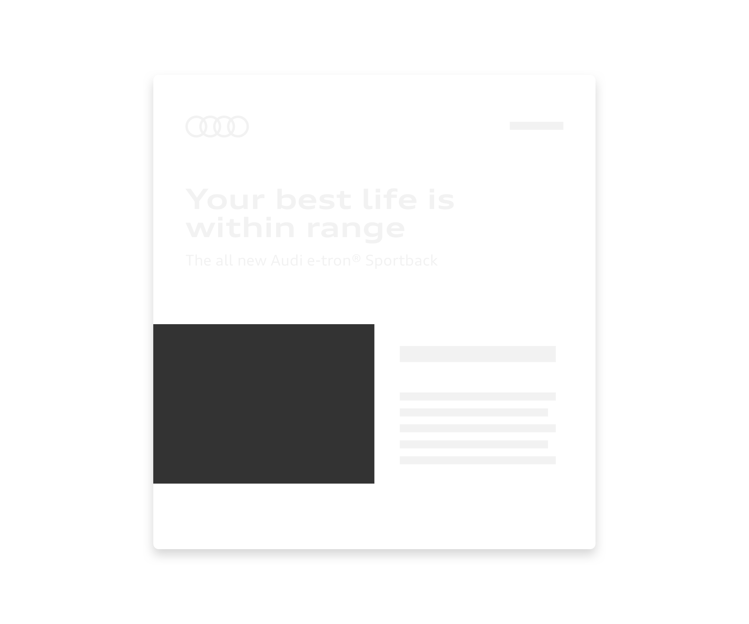
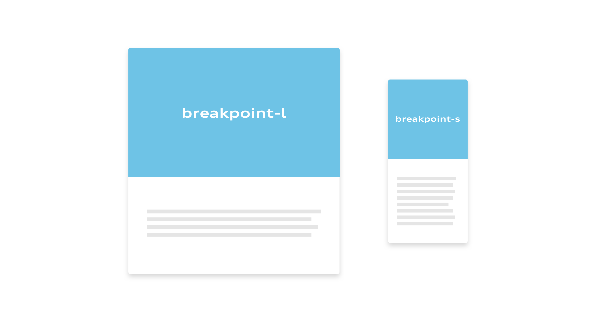
Layout and colours
The layout can be used in full-space or divided into several spaces and tiles in order to give contents a clear structure. Individual spaces can be used in a full tone in all brand colours or filled with images. The layout should never appear too fragmented and the legibility/visibility of individual elements such as type or icons must be guaranteed at all times.
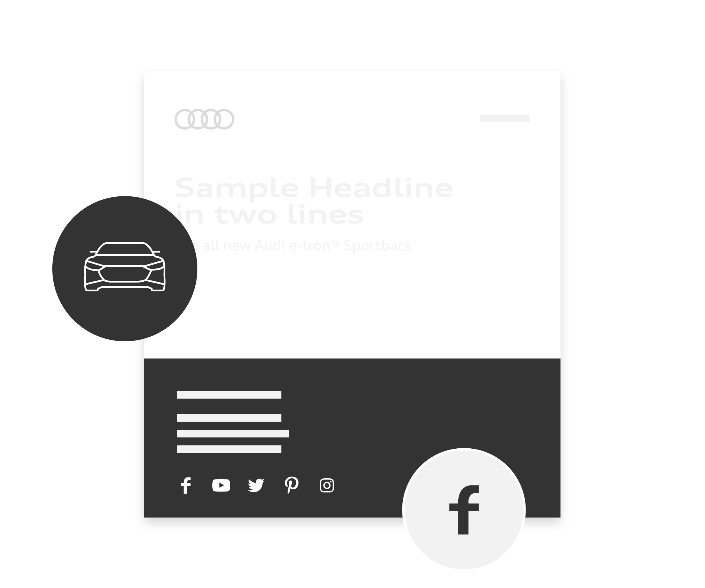
Use of icons
Audi icons are used in black or white in one of two defined sizes (24 px Small and 48 px Large). What matters is the precise effect and clear appearance of the icons within the total layout. Icons should always serve a particular function – Icons are not intended for use as a design element.
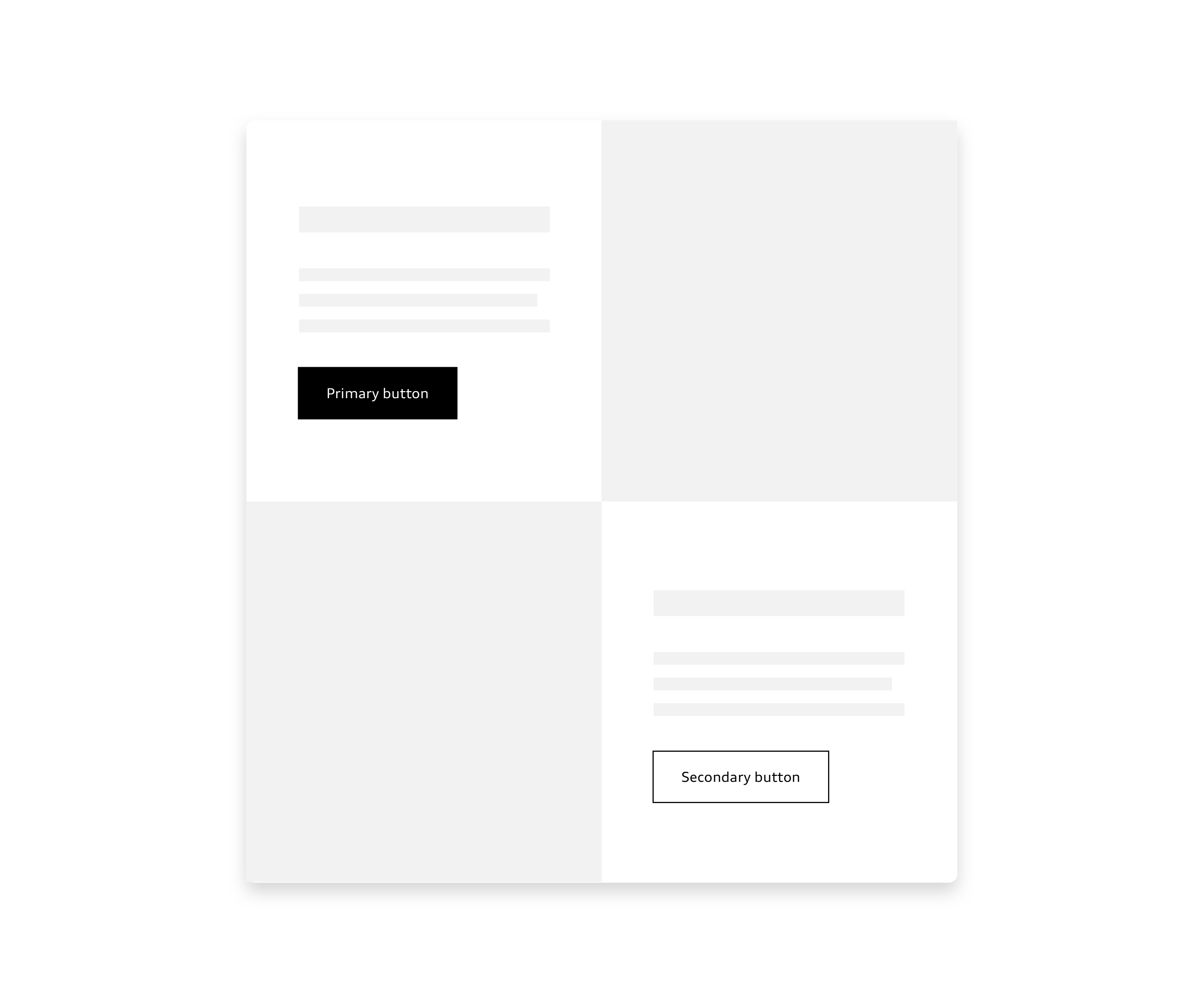
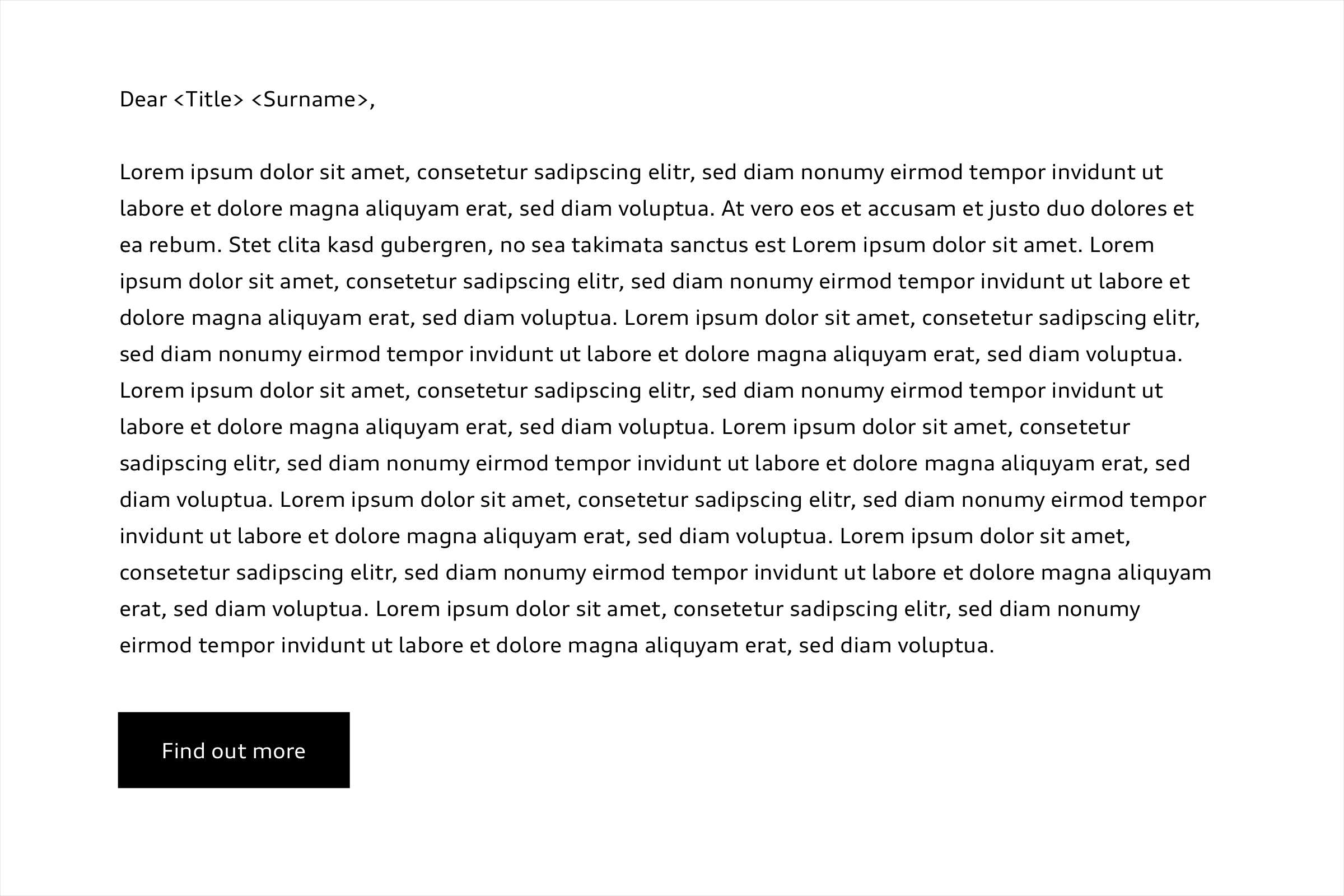
Buttons
Buttons can be used to show the user’s choice of options for actions and assign these to a clear hierarchy. The primary button generates the clearest incentive to click. It is only used for the most important calls to action in the newsletter. Text buttons and the transparent secondary buttons can be deployed for more subtle actions. The buttons are available in black, white or transparent. When positioning them, care must be taken to ensure sufficient contrast with the background. The specifications for links in body copy can be taken from the Text Styles guide. Additional buttons are not intended to be placed in the header as the entire header image can be linked.

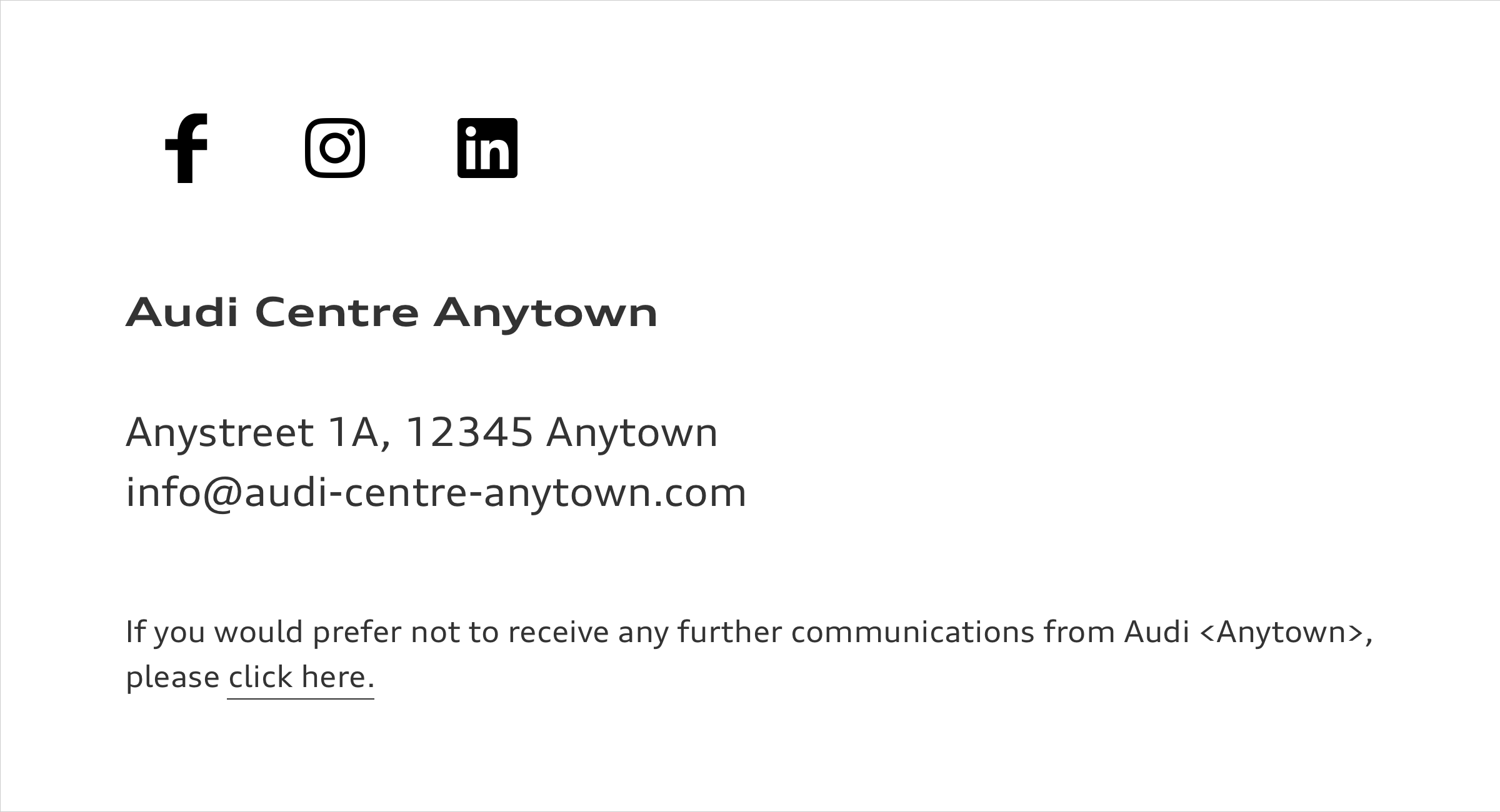
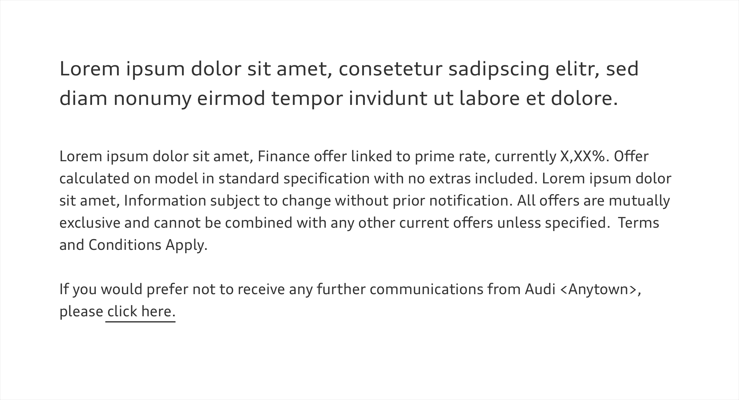
Legal notice
Information such as contacts, address as well as legal information and social media icons are placed in the footer area. Every newsletter must carry a cancellation option. The information can be placed on a black or white background. Red backgrounds are not used in the footer area in order to ensure the legibility of icons and type.
Application of Audi brand identity
To ensure that the recipient can clearly and unambiguously identify the sender, the Audi brand identity must be correctly applied – for example, with the Audi rings in the header area. The overall layout should always reflect the Audi brand appearance: with a high-quality design, clearly structured, concisely worded and reduced to its essentials.

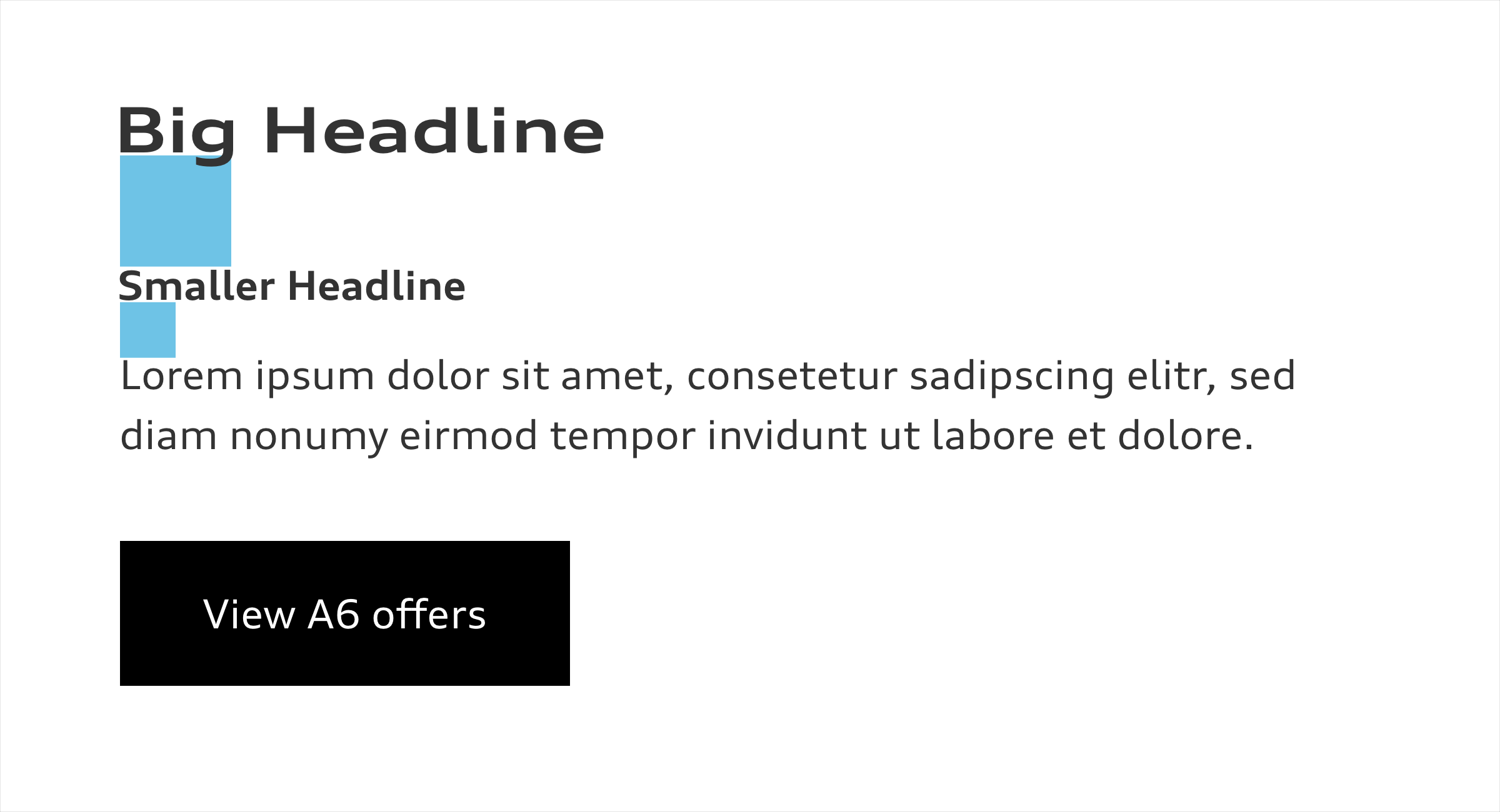
Creating hierarchies
Content should be prioritized from the top down and divided into sections to ensure that information is presented in a user-friendly fashion. This will guarantee an optimal reading flow. Line spacing and other vertical distances between elements can be defined as the multiple of a base unit. It is calculated from the base font size. The use of such a base unit will help text elements to maintain a vertical rhythm. The exact definitions can be found in the User Interface > Text Styles guide in the section “Type Sizes and Line Spacing”.
Guaranteeing legibility
The base font size for body copy is 16 px. Individual lines in the body copy should not contain more than 80 characters. The size for notes is around 12 px. Legal requirements of the market must be adhered to. The requirements for using further styles and the vertical spaces to maintain the vertical rhythm can be taken from the Text Styles guide.
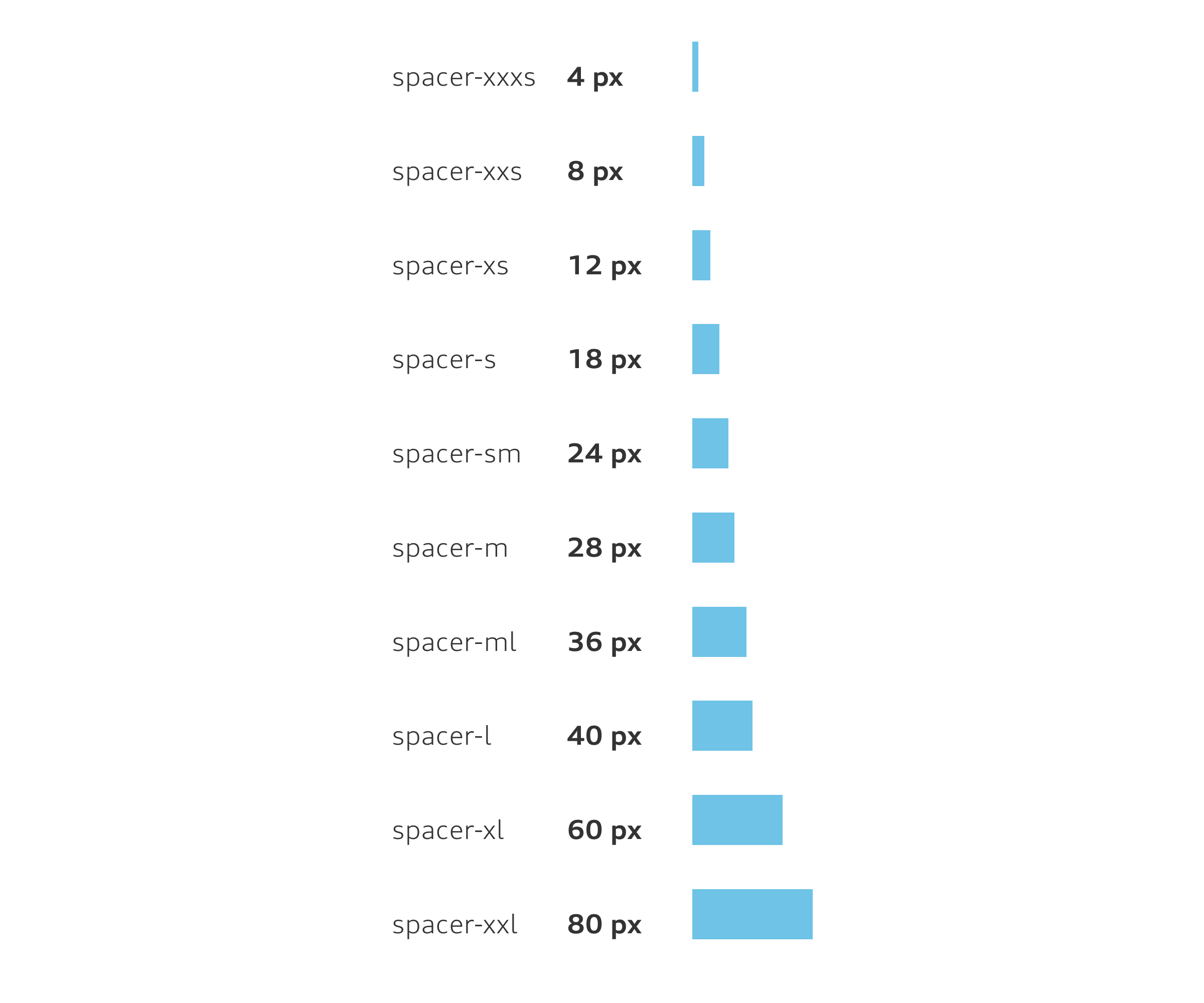
Vertical spaces
To organize content rhythmically and achieve a harmonious overall look, it is recommended to work with uniform spacing. The spacing is defined as a multiple of a base unit (4 px) and is taken from the base font size for body copy (16 px). Further information can be taken from the User Interface > Components > Text Styles guide. The following spacing is recommended:
> 4 px > 28 px
> 8 px > 36 px
> 12 px > 40 px
> 18 px > 60 px
> 24 px > 80 px
E-mailings (EDM)
E-mailings (EDM) follow the same principles as dealers’ own advertising: rings and headlines located in the header image, body copy, partner’s name and the address block as concluding information in the content section or footer. An e-mailing is distinguished from a regular newsletter by the (optional) subheader which is always used in the copy area. Disturber can be used as bars or spaces in all brand colours. Care must be taken at all times to ensure that they do not detract from the premium image. Specifications for disturber can be found in the following guide: Communication Media > Dealer Advertisement on the expandable section “Optional elements: Disturber”.
